Some experimenting with B/W toning in Lightroom
Jun 11, 2018 13:46:03 #
Constructive criticism greatly appreciated, particularly suggestions on my choice of contrast curves - I like an old "Agfa 6" level print of these abandoned or forsaken items and places. I've never been happy with the available tools in Photoshop, but the ease of editing B/W in LightRoom has me really excited. These are a few I did over the weekend. The Kitchen is the LR "Selenium" preset, the others are all individually set.
Andy
Andy
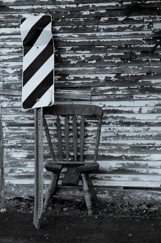
Broken Chair and Sign, Troy NH
(Download)
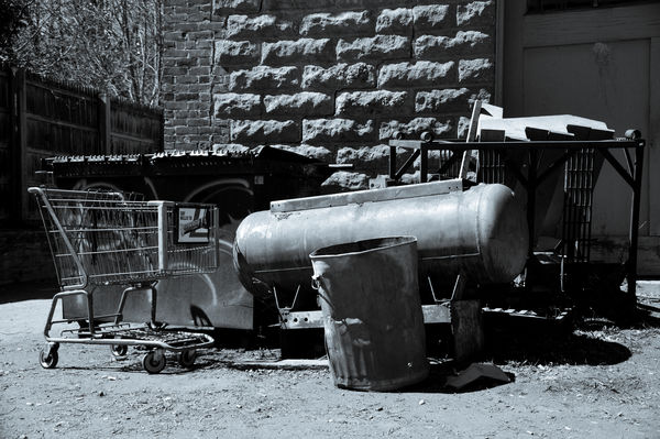
Homeless Camp Kitchen, Brattleboro VT
(Download)
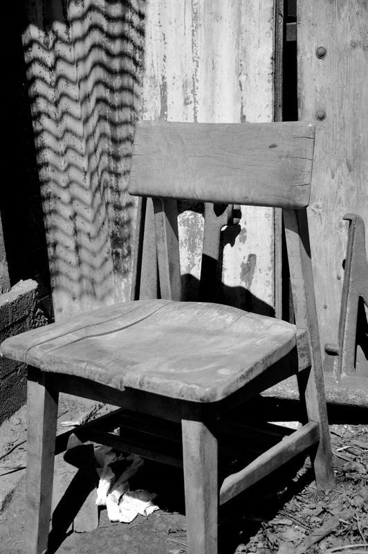
1950s Chair, Brattleboro VT
(Download)
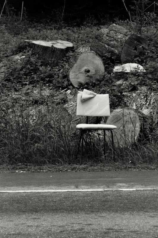
Chair and Stumps, Swanzey NH
(Download)
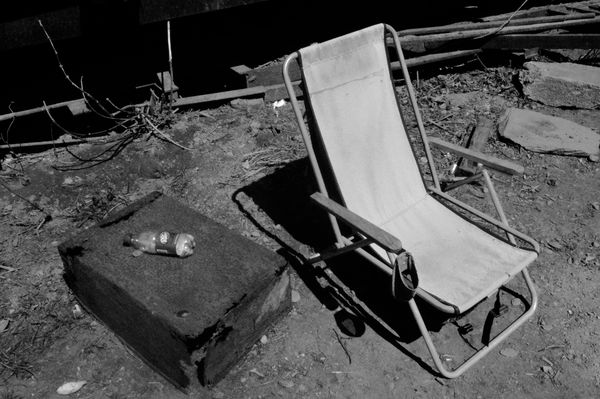
Homeless Camp Lounger, Brattleboro VT
(Download)
Jun 11, 2018 14:00:25 #
Pre-emptively - I know, I know... I just missed the composition on the 1950s chair, but was trying not to stray too far from my wife, who was clambering off on her own. But I found the shape of the chair hard to resist. I rather like the framing and cropping on the other shots.
Andy
Andy
Jun 11, 2018 14:11:07 #
I like your compositions. Lightroom's graduated, radial and brush filters are made for Grayscale conversions. Use to open up shadows and dodge and burn.
Jun 11, 2018 14:26:42 #
rgrenaderphoto wrote:
I like your compositions. Lightroom's graduated, radial and brush filters are made for Grayscale conversions. Use to open up shadows and dodge and burn.
Thanks. I am going to spend a LOT of time in the Develop module one night this week, working on some shots I'm basically happy with, but would like to perfect.
Been playing around with those filters as well, but just at the beginning stages of "previous" and "next" comparisons. It astonishes me, literally, to think of how many hours of messing about in a stuffy darkroom have been replaced by a shorter period relaxing in my armchair with a snack and a martini.
So far, I like using this software in B/W better than in color, where exaggerated detail and super saturation seem a little bit more tempting. I've worked on a few from our niece's wedding, but I don't want to produce postcards or graphic art for her - I keep reminding myself that just because "you can" doesn't mean "you should". For example, I love Ken Rockwell's camera advice and comparisons, but his approach to color work can be a little, um, "overhwhelming".
Andy
Jun 11, 2018 16:27:29 #

All were enjoyable to look at, however #1 just "clicked" for me in terms of composition, treatment, statement/content.
Thanks for giving me a way to waste some more time. Oh, wait, you said "martini." Never mind.
Thanks for giving me a way to waste some more time. Oh, wait, you said "martini." Never mind.
Jun 11, 2018 16:56:54 #
artBob wrote:
All were enjoyable to look at, however #1 just "clicked" for me in terms of composition, treatment, statement/content.
Thanks for giving me a way to waste some more time. Oh, wait, you said "martini." Never mind.
Thanks for giving me a way to waste some more time. Oh, wait, you said "martini." Never mind.
Thank you Bob! It's either that one or the kitchen that's my favorite.
Interesting to note, #1 was composed by means of shoe-leather zoom, as I walked around the scene (actually, in the middle of the street) until I got the exact angles I wanted of the chair, the sign, and the shadows. I did zoom in and out a bit, and did a bit of cropping in the camera, but it was the angular composition that was the most difficult. I often find myself doing that, with or without zoom.
Andy
Jun 11, 2018 17:24:40 #
Cany143
Loc: SE Utah
AndyH wrote:
....to think of how many hours of messing about in a stuffy darkroom have been replaced by a shorter period relaxing in my armchair with a snack and a martini.
Andy
Andy
I like to think that all those hours spent in that dank and dire darkroom were worth their weight in silver. If you did it right, you did one thing and one thing only: you made a print. Nothing else mattered, lesser concerns were put aside, and you battled the gods of time and temperature and dilution and wrestled lightning out of the enlarger head until there IT lay! and inside you something stirred, and you proclaimed ITS ALIVE!
Well almost, anyhow. Now dry, you see that your presumed ITS ALIVE print might have twitched a time or two, but ready to strike terror into the hearts of the Villagers it is not. You assess. Then you reassess. Yes! I see now! This arm needs a quarter stop more articulation! And the head! I see it now! The head needs less diffusion and glow, it needs more glower, it needs a visage stark and stricken enough that no mob's pitchforks or torches can compete. So you slip another sheet of Grade 6 into the easel, and minutes pass into hours, and hours into days, and that way madness lies. Nothing has meaning. Everything has meaning. THE PRINT is created.
It breaks loose the bonds, flies to the Bahamas and sits on a beach sipping something that has a little paper umbrella sticking out of it. You're heartbroken. Until, at long last, you discover the ultimate Truth! Adobe LightRoom!!!!!11!!1!! The process is still the same: more depth here, less tone there, yada yada yada. And minutes pass into hours....
I'd be careful with that martini thing, though.... One sometimes turns to two........ And inhibitions become........ well........... less inhibiting. In more extreme instances, circumstances like these have created serial maladaptions. "The Bride of THE PRINT" "THE PRINT -vs- the wolfman" etc.etc.etc.
<edit:> Whoops! Meant to say NICE b&w!
Jun 12, 2018 07:53:59 #

Nice work on these. That said, I’ve never been a big fan of selenium myself.
Jun 12, 2018 07:55:47 #

Jun 12, 2018 09:30:09 #
Cany143 wrote:
I like to think that all those hours spent in that... (show quote)
I know, man, it's like discovering a whole new world. I mean, you can like tone the blacks cooler, then take a toke or two and see how it plays in your brain, and then what if I bent the curve up a little in the toe? What would that look like? Oh man, maybe that's it... Like wow!
<edit:> Oops! Meant to say Thanks!
So far I've been concentrating on the organizational aspects of LR, but I'm really having fun in the Develop module now.
Andy
Jun 12, 2018 09:32:50 #
jaymatt wrote:
Nice work on these. That said, I’ve never been a big fan of selenium myself.
Thanks, John!
I have always loved the look. Had lots of fun poisoning myself with it back in darkroom days, especially on certain papers and with certain looks. The subtlety of the adjustments in LR for B/W has been a revelation.
Andy
Jun 12, 2018 09:37:08 #
fourg1b2006 wrote:
Very nice set...you did well with the processing.
Thanks Marty!
As I said above, it's a lot of fun working with these images in my armchair as opposed to a rather stuffy darkroom. The biggest difficulty seems to be in figuring out which version is best.
Anyone is more than welcome to further adjust or play around with the images. That's how we learn, right?
Andy
Jun 12, 2018 10:55:08 #

Jun 12, 2018 11:20:10 #
Chicflat
Loc: Tulsa, Ok,
AndyH wrote:
Constructive criticism greatly appreciated, particularly suggestions on my choice of contrast curves - I like an old "Agfa 6" level print of these abandoned or forsaken items and places. I've never been happy with the available tools in Photoshop, but the ease of editing B/W in LightRoom has me really excited. These are a few I did over the weekend. The Kitchen is the LR "Selenium" preset, the others are all individually set.
Andy
Andy
I have a question concerning the stumps image. Even in the download I find the vegetation inconsistent (?) with the logs and the chair. I don't know how I would change it either so what you have done will be better than I could do. Being said I wonder what you or any other UHHers would do with that specific part of the image.. I only ask in order to learn and I appologize if I have been rudely preemptive.
Jun 12, 2018 11:34:58 #
ebbote wrote:
Very good set Andy.
Thanks Earnest! It's kind of typical of the subject matter we like to shoot. I'm glad you enjoyed them. Not sure which shots are mine and which are my wife's but I'll take responsibility for the PP work.
Andy
If you want to reply, then register here. Registration is free and your account is created instantly, so you can post right away.