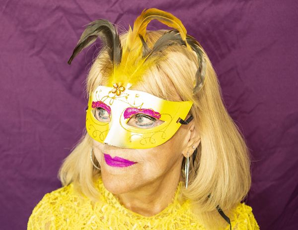
My First Portrait Ever
May 28, 2018 15:06:34 #
rdrechsler
Loc: Channel Islands Harbor, CA
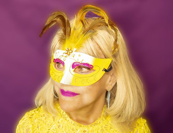
I have never staged and taken a portrait before, so this is my first attempt. I have an upcoming camera club assignment to shoot "Complimentary Colors" and I thought the yellow and purple in this treatment would be cool, especially since my wife was willing to play along. Could some of you portrait experts chime in and tell me if you think this is good enough for judging? Thanks, Dick
May 28, 2018 15:55:44 #
May 28, 2018 16:07:29 #

Not sure about for portrait, but the usual strongest color combinations are Blue-Yellow and Magenta-Green.
May 28, 2018 16:12:07 #
rdrechsler
Loc: Channel Islands Harbor, CA
Yes, but the assignment is specifically complimentary colors. My other two entries are red and green.
May 28, 2018 16:57:55 #
May 28, 2018 18:29:07 #
rdrechsler
Loc: Channel Islands Harbor, CA
d3200prime wrote:
Is that mask yellow and white or is the midsection blown out?
No, the mask is accurately portrayed. It is white and yellow.
May 29, 2018 07:49:52 #

rdrechsler wrote:
I have never staged and taken a portrait before, so this is my first attempt. I have an upcoming camera club assignment to shoot "Complimentary Colors" and I thought the yellow and purple in this treatment would be cool, especially since my wife was willing to play along. Could some of you portrait experts chime in and tell me if you think this is good enough for judging? Thanks, Dick
Nice shot Dick. Do one in vertical instead of horizontal.
May 29, 2018 08:37:20 #
May 29, 2018 09:59:06 #
StanMac
Loc: Tennessee
Just a suggestion, since the mask adds a sense of intrigue or mystery, you might try some low key or film noir style lighting for this subject.
Stan
Stan
May 29, 2018 11:46:48 #

May 29, 2018 11:59:04 #

Nice shot Dick. Like the yellow against the purple background.
/George
/George
May 29, 2018 13:12:09 #
I hate to use the word again, but I think you have been "masking" your talent for a while. DO MORE of this.
May 29, 2018 13:26:50 #

The judges will inspect the exposure on the mask and the eyes / face and suggest these should be adjusted. They'll also suggest having more distance between subject and background create a more blurred (out of focus) background. The wrinkles in the cloth draw your eyes away from hers.
May 29, 2018 14:10:38 #
bertloomis
Loc: Fort Worth, Texas
It's a nice photo but for me, the angle from which you took it is too high. That's why we can see the top of her head. Did you intend that?
May 29, 2018 15:49:25 #
rdrechsler
Loc: Channel Islands Harbor, CA
rdrechsler wrote:
Could some of you portrait experts chime in and tell me if you think this is good enough for judging? Thanks, Dick
You folks are so incredibly helpful. The comments were very educational and spot on. In response, I have made a number of changes to the image. I hope they are responsive to your input.
First, to D3200 prime, I looked at the image again compared to the mask and realized parts of it were washed out by the flash. I fixed that by using the Healing Brush in PS CC.
To Stan Mac, that's an excellent suggestion, but because the assignment is "complimentary colors" I thought it important to make the colors bright so they pop. But from an aesthitic point of view, I'm going to make some adjustments to a copy of the image to darken the lighting. I think you're right, as a pure work of art, it would add (or subtract, LOL) a lot.
To CHG Canon, I softened the skin and added some warmth and I added more yellow to the black feathers to make them more consistent with the assignment. I also added more blur to the background to eliminate the wrinkles in the fabric.
Thanks to everyone for taking the time to comment. Since this is my first portrait, I've already learned a ton from you. Much appreciated.
If you want to reply, then register here. Registration is free and your account is created instantly, so you can post right away.