"Saturate"
May 19, 2018 17:22:30 #

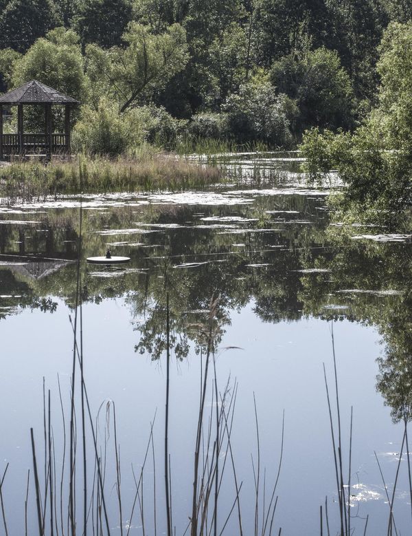
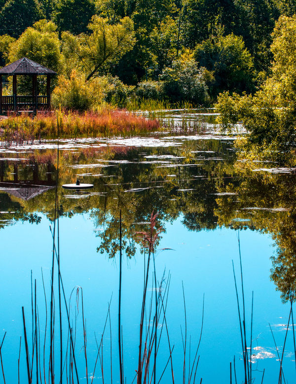
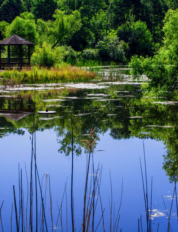
An example: the first photo seems a bit "limp." I am posting a more lively, saturated version that I like---and other possible answers. Which is "better"? What does "saturate" mean. Now, I would know what the various people replying think it means, and can learn more.
May 19, 2018 18:10:54 #
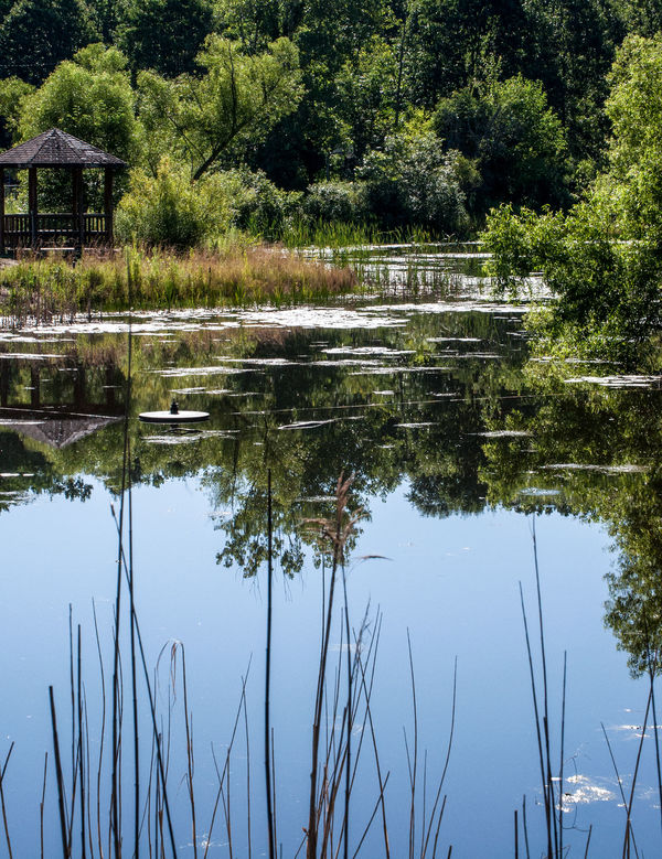
I like the third from the top and the second from bottom. All are useful depending on purpose.
May 19, 2018 19:16:14 #

Personally, I love very vivid and saturated colors, especially in certain kinds of landscape work.
Years ago, in the film era, we had to select from various films to create the level of saturation we desired. Many photographers would purposely and slightly underexpose various transparecy films to increase color saturation or overexpose certain negative color films to enrich the colors.
In my commercial work, oftentimes, I am called upon to reproduce very accurate colors in product photography- virtual color matching. In traditional portraiture, again, natural skin tones, perhaps slightly warm are the order of the day. In my personal work I enjoy creating more fantastic color palettes. Of course, I am not opposed to subtle or pastel-like renditions but when I get a chance to pump in the color, I make believe I am shooting Kodachrome 25 and underexposing by 1/2 stop. I certainly don't mind rich crazy blue skies and cyan water- why not? Hot chartreuse foliage- bring it on. It's like illustrations in children's story books.
It fun to start off with a fairly normal rendition and create many different versions and color renditions.
SATURATE!
May 19, 2018 19:20:40 #
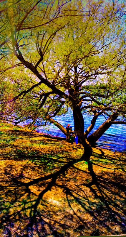
I took a shortcut through the parkway on the way home from work the other day and stopped off to shoot this with my smartphone.
May 19, 2018 19:50:00 #

artBob wrote:
An example: the first photo seems a bit "limp." I am posting a more lively, saturated version that I like---and other possible answers. Which is "better"? What does "saturate" mean. Now, I would know what the various people replying think it means, and can learn more.
Great idea Bob. Theory is great, but "Show me the money".
I signed up and will be checking in.
--
May 19, 2018 20:34:25 #
I like the third image. As for what saturation mean? There are definitions on the web but as for my answer and understanding saturation is the degree of color purity that is the dominant hue is very strong and there are little color of other hue.
May 19, 2018 21:37:08 #
BebuLamar wrote:
I like the third image. As for what saturation mean? There are definitions on the web but as for my answer and understanding saturation is the degree of color purity that is the dominant hue is very strong and there are little color of other hue.
Yes, the definition is clear, but what a person means EXACTLY cannot be unless it is shown, no?
May 20, 2018 08:54:33 #
CanonTom
Loc: Birmingham
I just signed up too Bob, and thanks for starting this. I can really learn from it myself I am sure. I, like E.L. posted above, love to saturate my landscapes, unfortunately sometimes too much, but I hate blaa dull shots. I tend sometimes to over do it on purpose a little somewhat, then use a slider to back off some.....it seems to help me find the spot I like for a particular photo. I completely agree with you Bob, that much of PP is so subjective, that "a picture is (indeed) worth a thousand words".
May 20, 2018 09:23:09 #
artBob wrote:
Yes, the definition is clear, but what a person means EXACTLY cannot be unless it is shown, no?
I could say a color with higher degree of saturation when measured with a color meter in the Lch coordinate would have a high reading on the c value.
May 20, 2018 09:54:29 #
E.L.. Shapiro wrote:
I took a shortcut through the parkway on the way home from work the other day and stopped off to shoot this with my smartphone.
Well certainly you do make your point about an overly saturated photo!
Cool.....Man
May 20, 2018 18:32:25 #
The second example is I think the most accurate representation - how the scene actually looked at the time of image capture. What we later remember is often far more saturated than it really was - a candy-coated, idealized version of reality.
But then there's the issue of how to render the image, adjusting saturation and color temperature to make it appealing and/or maximize expression. At what point is an image over-saturated? Opinions will always differ I suppose.
But then there's the issue of how to render the image, adjusting saturation and color temperature to make it appealing and/or maximize expression. At what point is an image over-saturated? Opinions will always differ I suppose.
May 20, 2018 20:31:17 #
rook2c4 wrote:
The second example is I think the most accurate representation - how the scene actually looked at the time of image capture. What we later remember is often far more saturated than it really was - a candy-coated, idealized version of reality.
But then there's the issue of how to render the image, adjusting saturation and color temperature to make it appealing and/or maximize expression. At what point is an image over-saturated? Opinions will always differ I suppose.
But then there's the issue of how to render the image, adjusting saturation and color temperature to make it appealing and/or maximize expression. At what point is an image over-saturated? Opinions will always differ I suppose.
The proverbial nail just got whacked on its proverbial head!
May 21, 2018 10:10:23 #
The perception of color is both scientific and psychological. After many years in the color print darkroom, I can SEE very infinitesimal shifts of color. For those who are familiar with color correction in printing quality control, I can see a shift of .003 in Cyan, Magenta and/or Yellow or any combination- or Blue, Yellow and Red for those who are more familiar with additive methods. In commercial photography, where fashion fabrics or colors of products are concerned, oftentimes exact color matching is called for. Of course, the dyes in the film or the inks are not exactly the same as the dyes in the cloth and pigments in the paints, so there may be minor differences but we can get pretty close. In the olden days there were films that provided more accurate and subtle colors and others that would render certain colors more vividly- we had to select accordingly.
In more artistically based work, I don't feel the need to always render accurate color- sometimes it is appropriate and sometimes its just too dull and commonplace for the mood I wish to express. To me, there is no such standard as over or under saturation- it's up to what you feel. In landscape work, sometimes I want my final image to look like something out of a children's storybook- I ain't shooting for National Geographic. Perhaps a abstraction is the order of the day. Years ago, to achieve special effects we needed to resort to radical and complex darkroom measures- solarization, posterization, cross processing, high contrast lithographic inter-negatives and more. Perhaps nowadays it's too easy!
It's impossible to assess every image as to over or under saturation without actually observing the original scene.
Sometimes I miss the "look" of the original Kodachrome- the first time I used it it was A.S.A. 16- and talk about vivid colors! Sometimes. I try to simulate the look of the older Technicolor movies- the first color imbibition process. Did any of y'all know that the actors had to wear greenish makeup because the process rendered skin tones overly magenta.
I take the same approach to grain/noise. sharpness/softness, purist/radical. Sometimes it's healthy to stray for the normal and opt for fantasy.
Anybody here remember CIBACHROME prints- saturation or what?
May 21, 2018 10:33:34 #
I do it was a very interesting product to use, Cibachrome was an expensive product to use, I had a lot of fun using it. Man O’ Man the Reds were Red hot looking?
E.L.. Shapiro wrote:
The perception of color is both scientific and psy... (show quote)
May 21, 2018 10:35:56 #
I liked Ciba for my computer art, as it produced the glossiness and saturation of the monitor on which it appeared as I made it. Nasty chemicals, though.
If you want to reply, then register here. Registration is free and your account is created instantly, so you can post right away.