Which Do You Prefer
May 14, 2018 16:57:11 #
May 14, 2018 16:59:04 #
May 14, 2018 17:00:05 #

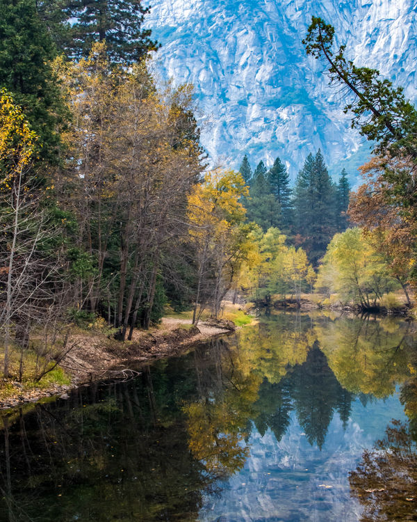
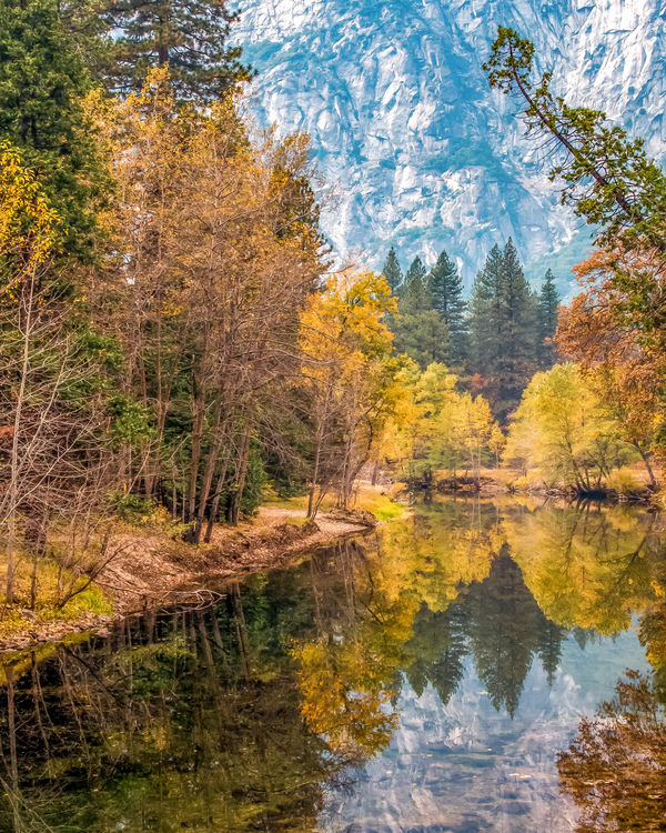
#1 - the contrasts of light and shadow are much more interesting to me than seeing uniform detail throughout.
May 14, 2018 17:03:58 #

#2 - The yellow increase on the left balances the image better.
There's a definite demarcation line at the bottom third of the first.
(I opened each in their own tab and flipped between them.)
There's a definite demarcation line at the bottom third of the first.
(I opened each in their own tab and flipped between them.)
May 14, 2018 17:11:33 #

May 14, 2018 17:12:22 #

May 14, 2018 17:13:06 #
May 14, 2018 17:15:00 #
I prefer #2 for the foliage and #1 for the mountains and reflections. Try combining the two images.
May 14, 2018 17:22:50 #
May 14, 2018 17:26:43 #

May 14, 2018 17:37:47 #
2 - by a long shot ....2 pops - could be maybe just slightly darker overall tho. No 1 is drab and too blue.
May 14, 2018 17:40:27 #
If this is going on your wall, it's a weighty decision. I believe I opt for the yellow in #2.
It's a lovely photo.
It's a lovely photo.
May 14, 2018 17:43:52 #

Steven Kuitems wrote:
Somewhere between those two
I agree with Steven; in between or # 1 Great photo!
May 14, 2018 17:54:19 #

May 14, 2018 17:55:54 #
If you could get one between the first one and the second one, I would pick that one,but otherwise the $2is my pick.
If you want to reply, then register here. Registration is free and your account is created instantly, so you can post right away.