Complementary Colors Challenge
May 5, 2018 16:24:47 #
rdrechsler
Loc: Channel Islands Harbor, CA
Over the next several months I have to produce three (3) different images using Complementary Colors. I have broad artistic license. For my first study I used a green and red bell pepper with different backgrounds (construction paper) and liberal use of PP. My five favorites are attached here. I'd love your input to help me decide which one of the five to ultimately use. I won't tell you yet which is my favorite 
Peppers on Purple
(Download)
Impressions of Peppers
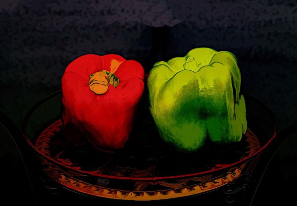
(Download)
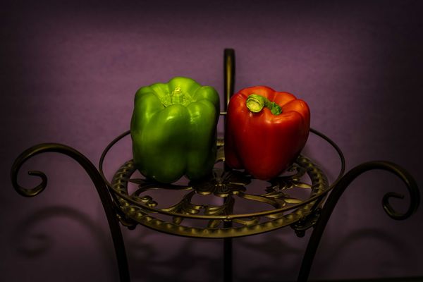
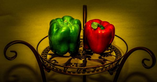
Iron Vignette
(Download)
Study in Black
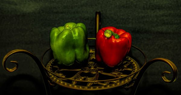
(Download)
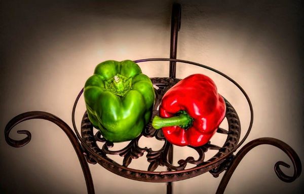
Mellow Yellow
(Download)
May 5, 2018 16:45:15 #
My favorite is "Iron Vignette," and I guess it's because the paler background brings out (or doesn't interfere with) the rfed and green of the peppers. The iron table stands out more too.
May 5, 2018 17:32:04 #
have 2.
Iron Vignette, and Mellow Yellow.
they're close.
I guess, now, Mellow Yellow.
Because I am.
Iron Vignette, and Mellow Yellow.
they're close.
I guess, now, Mellow Yellow.
Because I am.
May 5, 2018 19:42:28 #

May 5, 2018 23:33:12 #
May 6, 2018 01:41:49 #

May 6, 2018 01:48:52 #
rdrechsler
Loc: Channel Islands Harbor, CA
Katydid wrote:
Iron Vignette, because I like it best.
Thanks Katy.
May 6, 2018 01:51:24 #
rdrechsler
Loc: Channel Islands Harbor, CA
danersmiff wrote:
have 2.
Iron Vignette, and Mellow Yellow.
they're close.
I guess, now, Mellow Yellow.
Because I am.
Iron Vignette, and Mellow Yellow.
they're close.
I guess, now, Mellow Yellow.
Because I am.
That’s a good place to be.

May 6, 2018 01:55:05 #
rdrechsler
Loc: Channel Islands Harbor, CA
patrick43 wrote:
Mellow Yellow.
That’s my favorite too. I think what I’m going to do is reshoot it with the peppers in the same position as Iron Vignette. That would be the best of all worlds.
May 6, 2018 02:45:00 #


May 6, 2018 04:18:12 #
rdrechsler
Loc: Channel Islands Harbor, CA
patrick43 wrote:
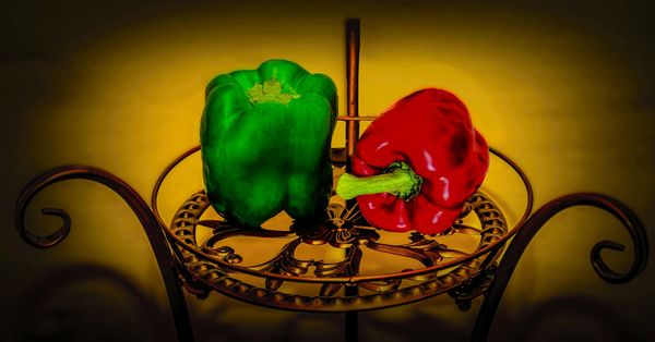
Mellow Yellow.
So how do you like this. It's Mellow Yellow with the peppers positioned differently. I think it's a lot better?
May 6, 2018 06:59:23 #

May 6, 2018 07:16:23 #
May 6, 2018 07:49:37 #

May 6, 2018 08:57:34 #
I'm voting for iron vignette, too. Short of having them chopped up in the salad I'm eating, they are the best.
If you want to reply, then register here. Registration is free and your account is created instantly, so you can post right away.