Which do you prefer?
Apr 29, 2018 22:03:00 #
Chicflat
Loc: Tulsa, Ok,
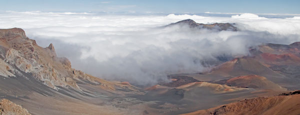
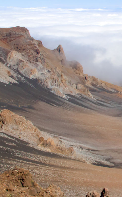
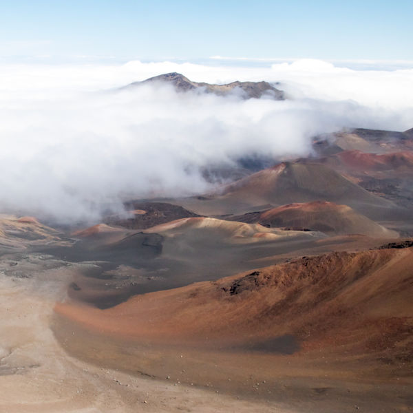
All three are actually different crops from the same base image. What I really need help with my photos is knowing what aspects of a photo holds interest.
Apr 29, 2018 22:04:53 #

Apr 29, 2018 22:05:48 #

Apr 29, 2018 22:06:52 #

Apr 29, 2018 22:23:29 #
wdross
Loc: Castle Rock, Colorado
Chicflat wrote:
All three are actually different crops from the same base image. What I really need help with my photos is knowing what aspects of a photo holds interest.
I hope to be in Hawaii some time when the clouds are like this. All I have from this same view point is 50 to 100 feet of volcano before the clouds make everything solid grey in all directions.
I agree, the first one - although I like the third one too. The first one is just stronger.
Apr 29, 2018 22:23:41 #

My preference is #3 for the rich colors and the terrific curved lines that lead our eye directly to the peek-a-boo mountain. Great contrast between the darker tones of foreground and the white of the clouds + I like the contrast of hard vs. soft, as well.
I find #1 uninteresting in comparison - mostly it's the blandness of the left side compared to the colors and shapes on the right. But the wide view does give us a nice documentary of the landscape. In #2 the weakness is in the foreground IMO - just not much there + an awkward cut of the closest rocks.
I do wish when people offered feedback in topics like this, they'd give the reasons for their choices. Kind of worthless to the OP (and all of us who are interested in seeing an image through someone else's eyes) to just tally yea's and nay's.
Apr 29, 2018 22:30:13 #

Chicflat wrote:
First Image has most impact and tells a story.All three are actually different crops from the same base image. What I really need help with my photos is knowing what aspects of a photo holds interest.
Apr 29, 2018 22:48:14 #
Chicflat
Loc: Tulsa, Ok,
suntouched wrote:
First one. The 2nd and 3rd images don't hold my interest.
Thanks
Apr 29, 2018 22:48:53 #
Apr 29, 2018 22:49:16 #
Apr 29, 2018 22:50:25 #
Chicflat
Loc: Tulsa, Ok,
PixelStan77 wrote:
First Image has most impact and tells a story.
Thank you for the observation. I have a hard time seeing story elements often.
Apr 29, 2018 22:50:40 #
wdross
Loc: Castle Rock, Colorado
Linda From Maine wrote:
My preference is #3 for the rich colors and the te... (show quote)
Your right that we should provide more. I also saw the curved lead-in line from the bottom that lead into the clouds going from lower left to upper right. I feel the mountain is just a little weak in keeping the attention from sweeping out of the picture after moving up and to the left from the bottom, curving up and back towards the cloud line, and then continuing along the cloud line to the edge of the picture. It seems too easy to "leave" the picture "early". If there were a little more mountain to the right or a little more mountain sticking out to catch the eye, then, to me, the third picture would easily pass the first one in strength.
Apr 29, 2018 22:56:19 #
Chicflat
Loc: Tulsa, Ok,
Linda, I am honored that you looked. Your doing so gives me an opportunity to say to you that your evaluations and reasoning always is instructive. #3 was the first image that I cut from the original image. The contrasts is what I saw. The "pano" was the last of the three. When I did I thought that it might be too broad to hold the eye. I think it was the parallel curves that I tried to reveal. Again, thank you for your insights; they will help me see better in the future.
Apr 29, 2018 23:05:31 #
graphic1
Loc: Carbondale illinois area
while I find Linda's comments spot on in general, I must diverge with her on this one. #1is immersive if the frame size is upped to a large size. alot to search and discover. #2 has impressive detail but not alot to hold the eye for an extended period. #3 draws me in and is quite interesting but I seem to run my eyedown and across the bottom and leave the frame before coming back in at the top right and crossing to the left and down again. the clouds really add to the third crop but I look for a feature to keep me in the frame on the right. I really believe the first one in a large format would would work well.
Apr 29, 2018 23:07:20 #
Chicflat wrote:
Linda, I am honored that you looked. Your doing so gives me an opportunity to say to you that your evaluations and reasoning always is instructive. #3 was the first image that I cut from the original image. The contrasts is what I saw. The "pano" was the last of the three. When I did I thought that it might be too broad to hold the eye. I think it was the parallel curves that I tried to reveal. Again, thank you for your insights; they will help me see better in the future.
Very much appreciated! There are a whole lotta folks on this site more accomplished than I in giving feedback, but I do try my best
 Wdross and graphic1 are adding great insights as seen from their points of view also.
 There are two specialty forums on UHH where the "norm" is to speak in depth about posted images: critique and For Your Consideration. Personally, I recommend FYC.
-
If you want to reply, then register here. Registration is free and your account is created instantly, so you can post right away.