Which one
Apr 23, 2018 07:44:54 #

After you look at an image for a while you start to lose perspective.
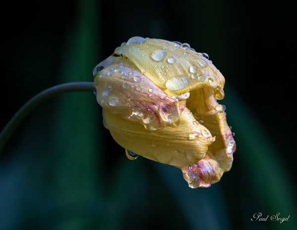
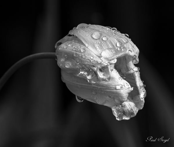
Which of these two is the better image?
Any suggestions?
This is cropped a bit so I could add to any of the sides.
Which of these two is the better image?
Any suggestions?
This is cropped a bit so I could add to any of the sides.
Apr 23, 2018 07:47:48 #

Apr 23, 2018 07:57:00 #

Apr 23, 2018 08:04:43 #
Apr 23, 2018 08:05:27 #
Apr 23, 2018 08:06:49 #
Apr 23, 2018 08:06:53 #

Apr 23, 2018 08:14:15 #

Apr 23, 2018 08:18:31 #
Apr 23, 2018 08:19:09 #


Apr 23, 2018 08:21:08 #
Apr 23, 2018 08:32:09 #

I like B&W photography often and make digital conversions myself, even shoot for the intent of B&W, but in this case I prefer your color version. The B&W seems a bit flat to me. How did you process or convert to black & white?
Apr 23, 2018 09:48:53 #

Apr 23, 2018 11:43:57 #

Apr 23, 2018 12:10:39 #
R.G. wrote:
I like the colour one, but if it was mine I think I'd desaturate the red a bit.
I see what you mean. The red is a little distracting. I’ll play around with toning it down a bit.
Thank you
If you want to reply, then register here. Registration is free and your account is created instantly, so you can post right away.