Helpful comments appreciated
Apr 9, 2018 22:41:40 #

Just starting to do PP to shape the image I want and looking for guidance as to what works and doesn't work. When is it too much, etc.
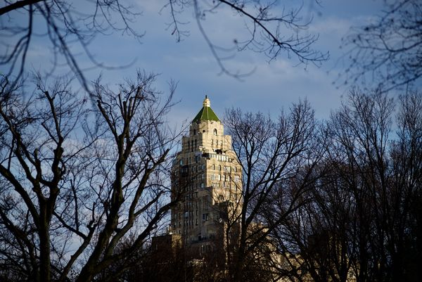
For this photo I liked the brightness of late afternoon sun on the tall building accentuating glint of the gold plated top, contrasted and framed by the darker trees already in the growing shadows.
Please look at the download.
Thoughts? and thanks!
For this photo I liked the brightness of late afternoon sun on the tall building accentuating glint of the gold plated top, contrasted and framed by the darker trees already in the growing shadows.
Please look at the download.
Thoughts? and thanks!
Apr 9, 2018 22:56:32 #

I believe the image needs work. In Lightroom I would use an exposure brush to bring out the detail on the dark side of the building. I would adjust also the bright side as it is slightly blown exposure. You could also do it in Lightroom with a Tonal Curve.
My 2 cents
My 2 cents
Apr 9, 2018 23:47:02 #
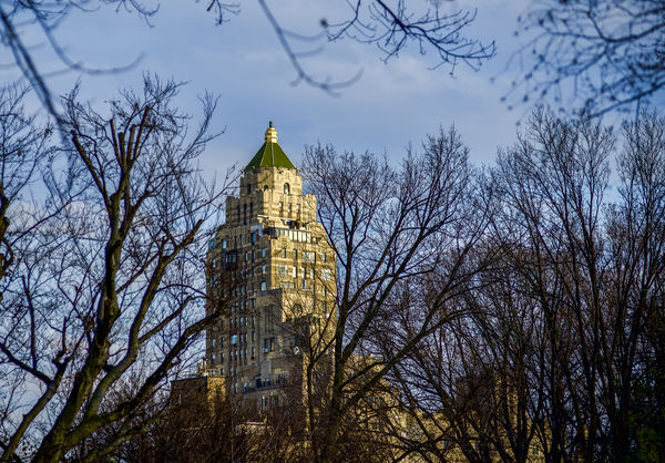
Just did a very quick edit. Did a smidge of cropping to make the building more prominent. Opened up the shadows - I like seeing the rest of the building - warmed up the building a bit. I'm sure others may have other input. A lot of it is just personal preference.
Apr 10, 2018 08:11:39 #
sueyeisert
Loc: New Jersey
The bushes,trees are too distracting. You can’t fix that. A different viewpoint is needed.
Apr 10, 2018 10:19:31 #
enygy wrote:
Just starting to do PP to shape the image I want and looking for guidance as to what works and doesn't work. When is it too much, etc.
For this photo I liked the brightness of late afternoon sun on the tall building accentuating glint of the gold plated top, contrasted and framed by the darker trees already in the growing shadows.
Please look at the download.
Thoughts? and thanks!
For this photo I liked the brightness of late afternoon sun on the tall building accentuating glint of the gold plated top, contrasted and framed by the darker trees already in the growing shadows.
Please look at the download.
Thoughts? and thanks!
The correction done improves the building. I would crop the image to make it a vertical for more impact. But, you are the creator and have a certain feel and look you are looking for. What do you think?
Apr 10, 2018 12:09:26 #

Actually, when I did the DL, the dark side of the building looked fine. There was nice detail. I can't do a DL on the revised version, so I'm not sure if it is improved or not. I wasn't sure that revision was necessary. The branches that appear to be closest to you look to have been cut off, and that's sort of distracting. The branches further away are quite nice. In a perfect world, there would have been a larger "hole" in the branches to see more of the building, but we don't live in a perfect world. I actually like buildings that "peek" through branches. I wonder if a summertime shot with lots of leaves would be interesting. It would show less of the building, but might draw even more attention to the top of the spire.
I did a virtual crop of part of the left side. It moved the building off center (centering doesn't really bother me as it does some people.), but it got rid of some of the extraneous stuff to the left (that extra branch). I'm not sure about an actual vertical crop, but perhaps a square one would be nice.
I did a virtual crop of part of the left side. It moved the building off center (centering doesn't really bother me as it does some people.), but it got rid of some of the extraneous stuff to the left (that extra branch). I'm not sure about an actual vertical crop, but perhaps a square one would be nice.
Apr 10, 2018 12:14:53 #
Thanks all for your comments! Several good and valid suggestions that give me things to consider.
I like the idea of tighter cropping - and vertical may be the way to go too.
I think bringing up the darker regions and toning down of the bright side of the building certainly helps accentuate the building. Right or wrong, I like the drama of the higher contrast, so less emphasis on the building itself, but more on the juxtaposition of the light and dark areas.
The observation that it would be nice to have had a bigger clear space for the building may have helped in several ways. I agree the chopped of branches are a bit jarring, unfortunately, AzPicLady!
I am not at my editing computer right now, but will give it another go when I have time later.
Apr 11, 2018 00:34:07 #

A good subject well-lit but, a tall building needs to be tall, frame it as a portrait rather than a landscape, ironically. The dark trees dominate and nearly swallow it. So, abandon the location, find a better position and make it vertical to accent the tallness, rather than horizontal. Have another go at it and really explore the building, it probably has some very cool details when you get to know it up close...
Aug 3, 2018 13:16:22 #

Try to find a vantage point that will allow a clear view of the building and fill most of your viewfinder with the building itself. This photo contains too much extraneous material.
Aug 13, 2018 21:12:06 #
Thanks Steve, good advice.
SteveR wrote:
Try to find a vantage point that will allow a clear view of the building and fill most of your viewfinder with the building itself. This photo contains too much extraneous material.
If you want to reply, then register here. Registration is free and your account is created instantly, so you can post right away.