Which Do You Think is Best
Mar 27, 2018 19:20:01 #
bpulv
Loc: Buena Park, CA
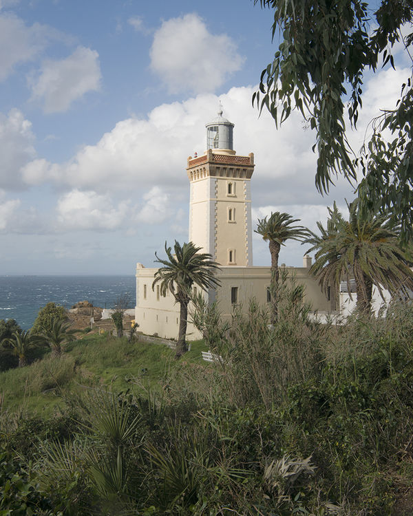
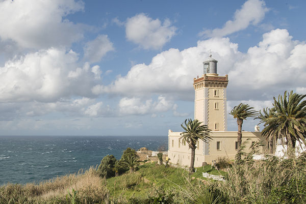
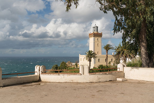
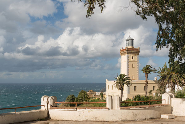
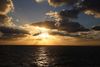
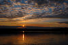
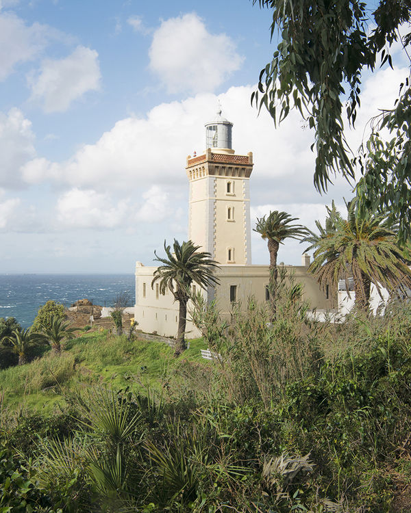
Please help me decide which one of these three treatments of the Phare Cap Spartel Lighthouse in Morocco is the best.
Mar 27, 2018 19:28:15 #

I like all three, each for their own reason. To answer your question, I'd probably lean towards the last. It shows the light house in a well composed photo. It also show a bit more of the surroundings, but still keeps the drama of the clouds and the sea as features within the photograph. I would, perhaps crop it slightly differently to reduce some of the foreground and the right side of the image slightly. This would also enlarge the light house and make it slightly more prominent.
--Bob
--Bob
bpulv wrote:
Please help me decide which one of these three treatments of the Phare Cap Spartel Lighthouse in Morocco is the best.
Mar 27, 2018 19:32:49 #

I would go with #2. The lighthouse is the star of the shot. But still it shows what it is overseeing.
Mar 27, 2018 19:40:35 #
bpulv
Loc: Buena Park, CA
rmalarz wrote:
I like all three, each for their own reason. To answer your question, I'd probably lean towards the last. It shows the light house in a well composed photo. It also show a bit more of the surroundings, but still keeps the drama of the clouds and the sea as features within the photograph. I would, perhaps crop it slightly differently to reduce some of the foreground and the right side of the image slightly. This would also enlarge the light house and make it slightly more prominent.
--Bob
--Bob
Hi Bob,
What do you think of this?
Bart
Mar 27, 2018 19:41:26 #
bpulv
Loc: Buena Park, CA
NJFrank wrote:
I would go with #2. The lighthouse is the star of the shot. But still it shows what it is overseeing.
Thank you Frank.
Mar 27, 2018 19:48:13 #

I still like 2 the best.
3 & 4 the parking lot/wall take away from the lighthouse.
3 & 4 the parking lot/wall take away from the lighthouse.
Mar 27, 2018 20:01:38 #

Mar 27, 2018 20:48:25 #
Mar 27, 2018 20:48:59 #
Mar 27, 2018 21:20:40 #
#2 by far. Great position of the horizon almost exactly at lower 3rd pt.
Colors are good. Fall-away to the ocean on the left - lighthouse is interesting - light is looking out over the ocean
(may have bumped the Contrast and pulled down the Blacks in LR a little more to give it a little more "mood" ... would be an interesting "high grain" B&W)
#1 - drab - may be editing - colors are flat
#3 - too much parking lot - even cropping out some of the parking lot still blocks the lighthouse in the background.
Tree to the right is distracting. YOu lose the lighthouse with the pakring lot and tree....
Mar 27, 2018 21:44:50 #

Mar 27, 2018 22:22:00 #

bpulv wrote:
Please help me decide which one of these three treatments of the Phare Cap Spartel Lighthouse in Morocco is the best.
Bart, I like Version 2 for the contrast and composition of the Lighthouse.
Mar 27, 2018 23:24:09 #
bpulv
Loc: Buena Park, CA
crazydaddio wrote:
#2 by far. Great position of the horizon almost ex... (show quote)
The voting is leaning toward #2 and I am too. However, just for the heck of it, I lightened the colors and adjusted the contrast on #1. Is this what you were talking about?
Mar 28, 2018 03:43:17 #

Mar 28, 2018 05:19:22 #

bpulv wrote:
Please help me decide which one of these three treatments of the Phare Cap Spartel Lighthouse in Morocco is the best.
Nice shots Bart. Like #2
If you want to reply, then register here. Registration is free and your account is created instantly, so you can post right away.