Complementary colors, Too jarring?
Mar 24, 2018 00:20:21 #
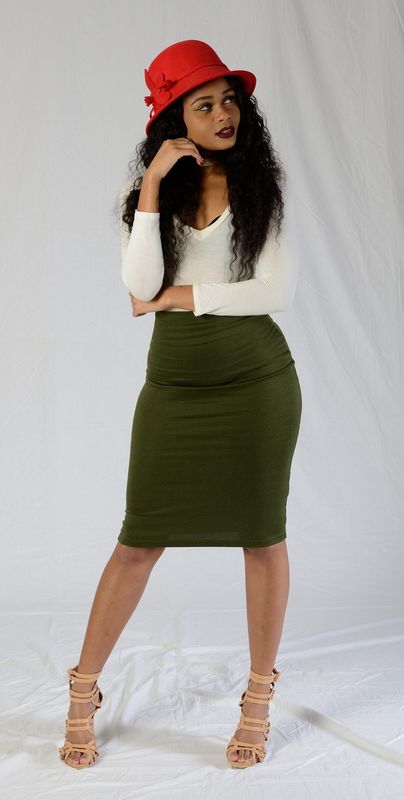
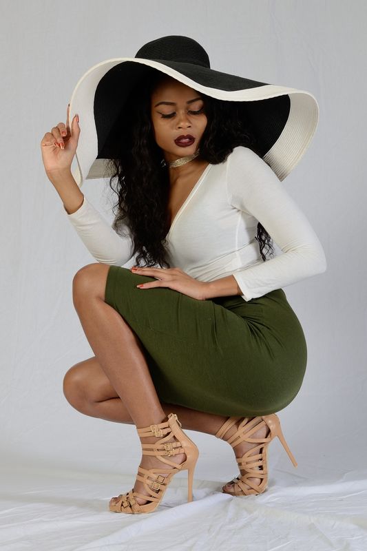
My photography group had a studio shoot recently. We had a variety of hats for the models to wear. One of the models, who was wearing a green dress, wore a red hat for some of the shots. The contrast in the colors seems a little jarring. Red and green are opposite each other on the color wheel and are complementary colors. What do people think about this? Best to avoid complementary colors? In the other photos, the models are wearing a hat that's mostly black. That seems less jarring even though the first model is wearing a white top.
Mar 24, 2018 00:40:47 #
CO wrote:
My photography group had a studio shoot recently. ... (show quote)
Nice shots.
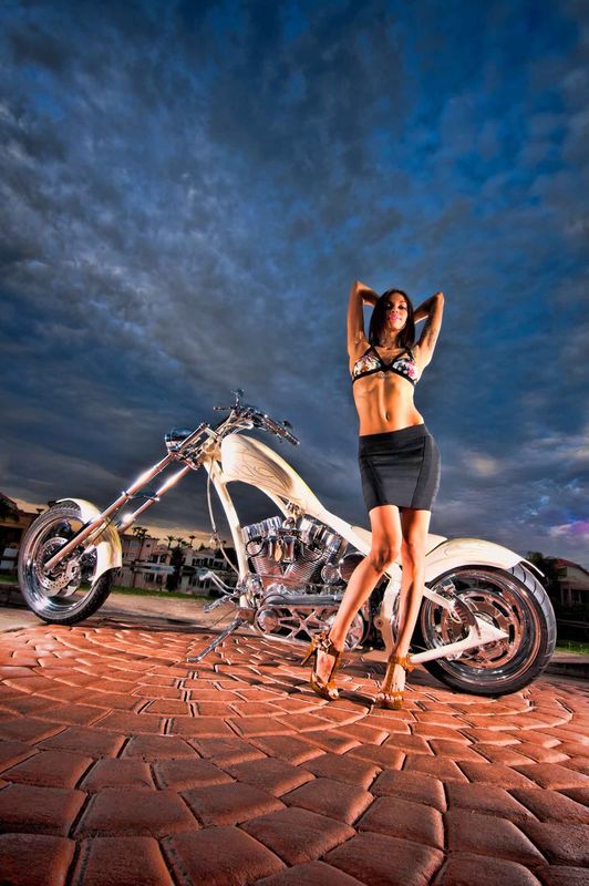
Use them to advantage. If you dont mind, heres an example. A shoot for a custom bike builder. The ground and sky are roughly opposites. Makes for a striking shot imo.
Mar 24, 2018 00:50:06 #
Angmo wrote:
Nice shots.
Use them to advantage. If you dont mind, heres an example. A shoot for a custom bike builder. The ground and sky are roughly opposites. Makes for a striking shot imo.
Use them to advantage. If you dont mind, heres an example. A shoot for a custom bike builder. The ground and sky are roughly opposites. Makes for a striking shot imo.
I can see how the opposites work with your photo. It's a high energy shot with the custom chopper motorcycle and attractive model. Cool shot.
Mar 24, 2018 21:52:06 #
To get the color and clouds, it was a 4:00am setup and started shooting at 500am. Clouds are gone by 8 or 9am that time of year.
I’m thinking your pic, matching hat works better. If the red/greens were closer together they wouldnt look “lost”. But still really good pics.
I’m thinking your pic, matching hat works better. If the red/greens were closer together they wouldnt look “lost”. But still really good pics.
Mar 25, 2018 20:00:30 #
Opposite colours often work well and can be used to great effect depending on your desired outcome. The green in the image you mention tends more towards olive which is much more muted so the effect not as pronounced. Imagine if it were a more "gawdy" green - the impact would be far more striking. You have some nice poses in those images so I'm assuming the model has a reasonable degree of experience (which always shows); much more relaxed and less forced. 
Mar 25, 2018 20:39:20 #
PaulG wrote:
Opposite colours often work well and can be used t... (show quote)
Thanks for the comments. The model in the upper two photos had modeling experience. It was the first time modeling for the model in the bottom photo. She did great considering she had never modeled before.
Apr 6, 2018 16:33:28 #

CO! Sorry I did not get on this earlier. I wanted to take enough time to give you a more comprehensive answer.
Color harmony is an important part of portrait photography and the usage of matching, opposing, complementary and colors plays a significant roles in may aspects of composition and tonal control.
Before getting into the specifics of your images let's go over a bit of theory. Event portrait makes a “statement” about the subject or tells a story to the viewer. It does not need to be a complex philosophical statement and oftentimes the simplest image is the most powerful.
The human eye and perception will will usually take the path of least resistance when viewing an image. The viewers eyes will be firstly attracted to the brightest or most dominant tone or most vivid (high chroma) colors element in a photograph. In a low key portrait with a darker background, if the subject is dressed in darker solid colors, the skin tone (on the subject's face) or color will be the most outstanding visual element in the composition. Inversely, in a high key portrait with a white background and the subject dressed in white or very light pastel colors, the skin tone will be the darkest elements and will therefore stand out and become more dominant. Since a classical portrait should empathize the subject this theses are good theories to us a a rule of thumb.
Statements- If a subject is portrayed in a classic low or high key treatment the statement may be something like “an attractive young woman in a stylish dress”. If her costume is extremely colorful ir garish, the statement may change to a “bright red dress being worn by an attractive young lady” and the image becomes more of a fashion statement or a fashion photograph. That's OK too- it depends what you want to create and the statement you want to make. An image of a person dressed in a very colorful traditional ethnic garb such as worn in some East Indian and African cultures societies, that's great too- these all make for interesting, different or augmented statements. A portrait of a man in a dark business suit may simply say“ a gentlemen” or “businessman” . The same guy, pictured in a red military tunic will say “soldier”.
Skin tones are usually warm tomes- tans, reds, browns, warm blacks, sepia, olive, red, warmer pinks etc. If we use cold colors in the background such as blues, cooler greens etc, this accentuates the warmth of the skin tomes. If we use warm tones in the background, we get more of a monochromatic effect.
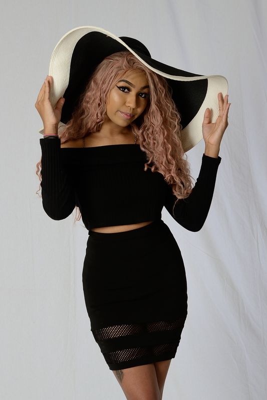
In your images, #3 is the most classical portrait-like treatment. The solid black outfit helps call attention to you model's face and expression. Her face is nicely framed in the lines of her hat and the position of are arms and hands- very nice treatment! The other two images are leaning more toward a fashion theme. In may cases the elements of portraiture and fashion photography overlap and in some cases the are extremely different. Of course the red hat does draw the eye. Here's a little test you can do with any image: Turn the image upside or sideways, if it is a print, turn it around so you are seeing the back- the blank paper or mount. If it is a screen image, cover the monitor. Then quickly flip the print or uncover the monitor quickly and note what you see first. That element will usually dominate the image and place the viewer's eyes where you want them to be or cause a distraction.
These are no “carved in stone” rules unless you insist being a purist- nothing wrong with that either! These are some of the tools and elements you have to work with and use can use the to make whatever visual statement you wish to express. You can express harmony and subtly or wreak havoc with people's eyeballs and create tension and chaos or land somewhere in-between. You are the artist!
Color harmony is an important part of portrait photography and the usage of matching, opposing, complementary and colors plays a significant roles in may aspects of composition and tonal control.
Before getting into the specifics of your images let's go over a bit of theory. Event portrait makes a “statement” about the subject or tells a story to the viewer. It does not need to be a complex philosophical statement and oftentimes the simplest image is the most powerful.
The human eye and perception will will usually take the path of least resistance when viewing an image. The viewers eyes will be firstly attracted to the brightest or most dominant tone or most vivid (high chroma) colors element in a photograph. In a low key portrait with a darker background, if the subject is dressed in darker solid colors, the skin tone (on the subject's face) or color will be the most outstanding visual element in the composition. Inversely, in a high key portrait with a white background and the subject dressed in white or very light pastel colors, the skin tone will be the darkest elements and will therefore stand out and become more dominant. Since a classical portrait should empathize the subject this theses are good theories to us a a rule of thumb.
Statements- If a subject is portrayed in a classic low or high key treatment the statement may be something like “an attractive young woman in a stylish dress”. If her costume is extremely colorful ir garish, the statement may change to a “bright red dress being worn by an attractive young lady” and the image becomes more of a fashion statement or a fashion photograph. That's OK too- it depends what you want to create and the statement you want to make. An image of a person dressed in a very colorful traditional ethnic garb such as worn in some East Indian and African cultures societies, that's great too- these all make for interesting, different or augmented statements. A portrait of a man in a dark business suit may simply say“ a gentlemen” or “businessman” . The same guy, pictured in a red military tunic will say “soldier”.
Skin tones are usually warm tomes- tans, reds, browns, warm blacks, sepia, olive, red, warmer pinks etc. If we use cold colors in the background such as blues, cooler greens etc, this accentuates the warmth of the skin tomes. If we use warm tones in the background, we get more of a monochromatic effect.
In your images, #3 is the most classical portrait-like treatment. The solid black outfit helps call attention to you model's face and expression. Her face is nicely framed in the lines of her hat and the position of are arms and hands- very nice treatment! The other two images are leaning more toward a fashion theme. In may cases the elements of portraiture and fashion photography overlap and in some cases the are extremely different. Of course the red hat does draw the eye. Here's a little test you can do with any image: Turn the image upside or sideways, if it is a print, turn it around so you are seeing the back- the blank paper or mount. If it is a screen image, cover the monitor. Then quickly flip the print or uncover the monitor quickly and note what you see first. That element will usually dominate the image and place the viewer's eyes where you want them to be or cause a distraction.
These are no “carved in stone” rules unless you insist being a purist- nothing wrong with that either! These are some of the tools and elements you have to work with and use can use the to make whatever visual statement you wish to express. You can express harmony and subtly or wreak havoc with people's eyeballs and create tension and chaos or land somewhere in-between. You are the artist!
Apr 6, 2018 19:32:25 #
E.L.. Shapiro wrote:
CO! Sorry I did not get on this earlier. I wanted ... (show quote)
Thanks for the analysis. I see what you mean about the first two photos being more of a fashion theme and the lower photo more a portrait. It looks like someone's attire can make a huge difference in how the photo will be perceived.
If you want to reply, then register here. Registration is free and your account is created instantly, so you can post right away.