Composition questions
Mar 18, 2018 07:43:52 #
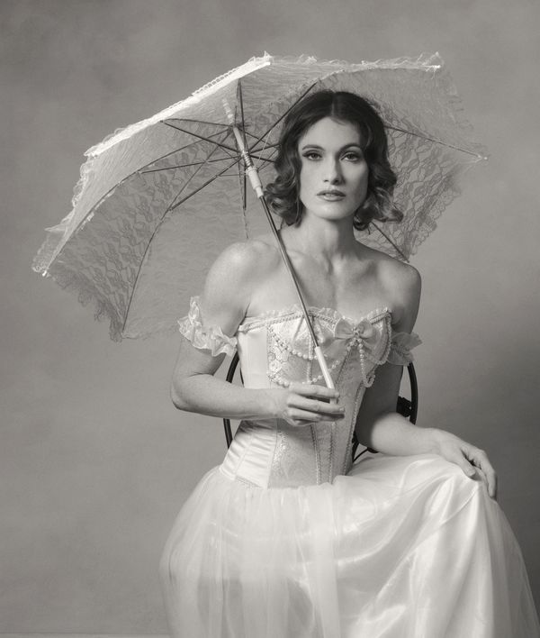
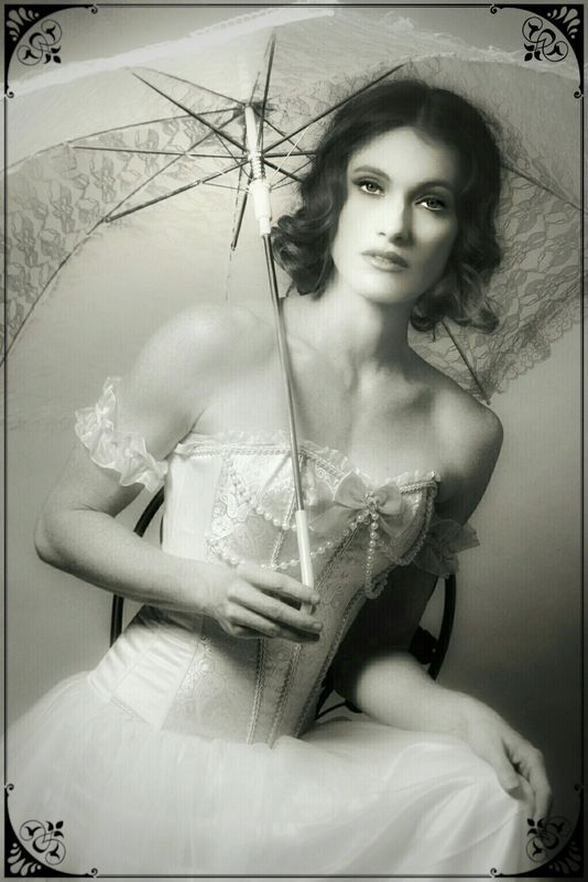
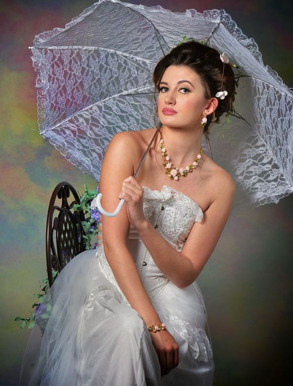
I took these photos recently at a studio photo shoot. In the upper photo, I have the model moved to the right edge of the photo because her parasol extends to the left a lot. Would a different composition be better?
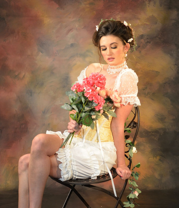
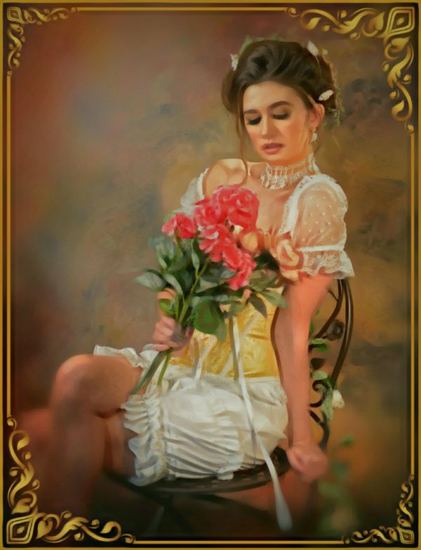
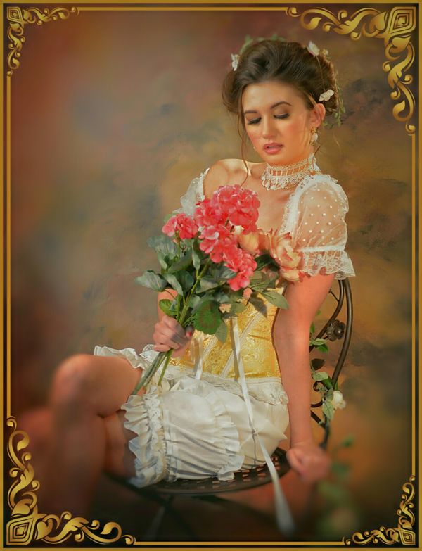
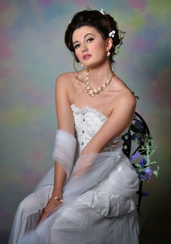
In the lower photo, we don't see the model's eyes at all because she's looking down. Should we strive to have the model's eyes always visible or is this alright?
In the lower photo, we don't see the model's eyes at all because she's looking down. Should we strive to have the model's eyes always visible or is this alright?
Mar 18, 2018 08:01:57 #
I think that worked. Though there seems to be a bit of conflict between the parasol and the direction she's looking and the direction her body is pointing. Otherwise, I'm quite comfortable with the overall concept.
--Bob
--Bob
CO wrote:
I took these photos recently at a studio photo shoot. In the upper photo, I have the model moved to the right edge of the photo because her parasol extends to the left a lot. Would a different composition be better?
In the lower photo, we don't see the model's eyes at all because she's looking down. Should we strive to have the model's eyes always visible or is this alright?
In the lower photo, we don't see the model's eyes at all because she's looking down. Should we strive to have the model's eyes always visible or is this alright?
Mar 18, 2018 09:06:17 #
CanonTom
Loc: Birmingham
CO wrote:
I took these photos recently at a studio photo shoot. In the upper photo, I have the model moved to the right edge of the photo because her parasol extends to the left a lot. Would a different composition be better?
In the lower photo, we don't see the model's eyes at all because she's looking down. Should we strive to have the model's eyes always visible or is this alright?
In the lower photo, we don't see the model's eyes at all because she's looking down. Should we strive to have the model's eyes always visible or is this alright?
I definitely think you got it right. I think the model placement with parasol balances well in the photo. As to the eyes in the second, I think the downward look is a part of the mood created. I am wondering what is on her mind.
I did have an additional thought, but I would not change her eyes in photo two..but in a photo three, ...that thought is I wonder how the mood might be altered if she were posed exactly as in number 2, with downcast eyes but opened and her chin only slightly lifted so she is now looking directly into the camera...
Just amateur comments here so take with a grain or two of salt..........great photos as they are!
Tom
Mar 18, 2018 11:42:08 #
rmalarz wrote:
I think that worked. Though there seems to be a bit of conflict between the parasol and the direction she's looking and the direction her body is pointing. Otherwise, I'm quite comfortable with the overall concept.
--Bob
--Bob
Thanks for the comments about the photo. I took a lot of photos of her. I've been wondering how well this composition works.
Mar 18, 2018 11:44:44 #
CanonTom wrote:
I definitely think you got it right. I think the ... (show quote)
Thanks for your comments. I have some photos of her where her chin is slightly lifted. Her pose is not the same as the gal in photo #1 but she is looking into the camera. I've been trying to avoid having the models turn their eyes too much to the side.
Mar 18, 2018 18:07:33 #
CanonTom
Loc: Birmingham
CO wrote:
Thanks for your comments. I have some photos of her where her chin is slightly lifted. Her pose is not the same as the gal in photo #1 but she is looking into the camera. I've been trying to avoid having the models turn their eyes too much to the side.
My favorites are the original 2 as well as the third. They are all keepers though. Great job!
Mar 20, 2018 18:11:32 #
Hi, CO!
Thanks for posting theses portraits- I like the kinda old fashioned look- the costume and the parasol along with the painterly background.
I have some refinement suggestions and some compositional ideas. If you would like an in-depth critique, let me know.
Good work!
Ed
Thanks for posting theses portraits- I like the kinda old fashioned look- the costume and the parasol along with the painterly background.
I have some refinement suggestions and some compositional ideas. If you would like an in-depth critique, let me know.
Good work!
Ed
Mar 20, 2018 20:14:11 #
E.L.. Shapiro wrote:
Hi, CO!
Thanks for posting theses portraits- I like the kinda old fashioned look- the costume and the parasol along with the painterly background.
I have some refinement suggestions and some compositional ideas. If you would like an in-depth critique, let me know.
Good work!
Ed
Thanks for posting theses portraits- I like the kinda old fashioned look- the costume and the parasol along with the painterly background.
I have some refinement suggestions and some compositional ideas. If you would like an in-depth critique, let me know.
Good work!
Ed
Yes, I'd like to have your critique and suggestions.
Mar 21, 2018 10:12:50 #
CO, thanks again for the opportunity to work with your images.
Theses images have great potential. Oftentimes there are good basic images with effective lighting and good poses and expressions, however, some of the visual impact is lost in final composition and balance of cretin tonal elements.
Although we are not necessarily making prints in this exercise, I refer my cropping, finally composing images and balancing tones and color as CUSTOM PRINTING. Even if I am working on a screen image, I set it up as if I was going to prepare a salon print, competition print, or a display print for my showroom.
In your first image, the black and white shot, I found the pose slightly stagnant so I gave it a slight tilt and cropped a bit tighter to place more compositional emphasis on the subject's face and expression. I dodged the ribs and mechanism of the parasol but burned in a bit to maintain detail in the lacey fabric to coordinate with thee detail in the dress. I increased the structure and contrast in the face to bring up the Rembrandt lighting effect. The I added that “wrought iron” kinda border to pick up on the chair. We still have the theme of the parasol but it does not dominate the composition.
The next color image has great potential- it it is reminiscent a lovely old tapestry or painting.
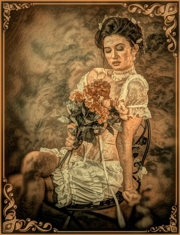
Working with painted backdrops can be a bit challenging in that they do offer good color and tonal mass and a painterly effect but the can become a bit distracting and begin to call attention to themselves unless the are lighted in a more subtle manner and rendered in softer focus. Sometimes there is too much background light or too much spill form the other lights. The remedy is to burn in during editing and apply some local softening. I like to keep the background light erin the direction the subject is posed in or gazing into and darkening the opposite side of the background- this adds to the composition and draws the eye toward the subject. In this image, I created a vignette at the bottom of the composition to that the subject's leg is not abruptly cut at the calf. Sometimes this “cut” causes difficulty in a ¾ length image. Again, I went for a slightly tighter crop. I tweaked the color saturation and structure of the flowers to pick up more on her lipstick color. The retro look of the image tempted me to experiment with some textures and framing. The texture effect may be a bit much but that's all I have on my smartphone app. I am getting some TOPAZ plug ins on my new processing system at the studio. The have Montensin type texture screens that can be applied in different strengths and location on the image. Your image would also make for a nice canvas print finish.
In the original pose, it might be an alternative pose to lower the flowers to show more of the bodice of the dress and the detail therein. A lower position of the flowers also makes for a more flowing line of the arms.
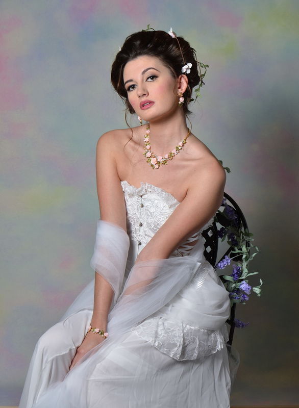
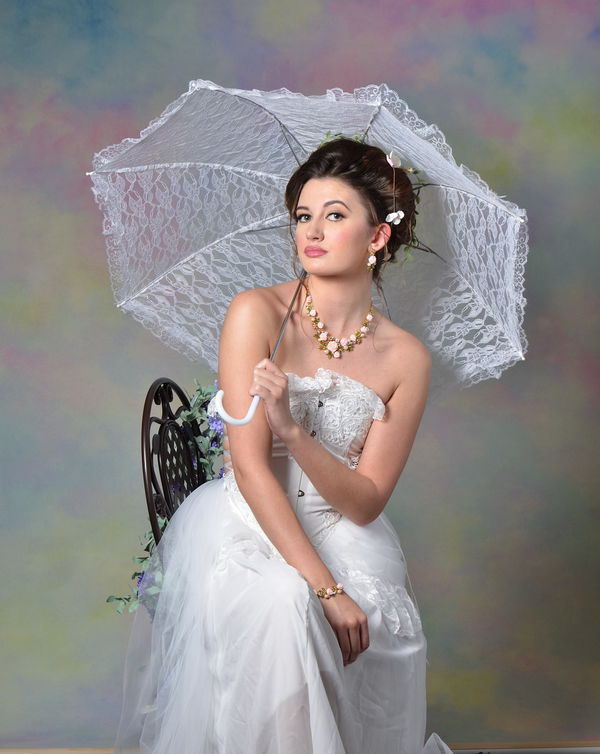
On the last two color images, again I got into some background management to place more emphasis on the subject but still maintain the original key of your image, I intensified the blue tones in the background to pic up on the blue flowers in the image and emphasized the fabric in the parasol to coordinate with the detail in the dress.
I am working out of town, away from my home base and studio, so I am communicating on my smartphone. The images may be of lesser quality but I wanted to give you some ideas that you may want to apply to you own edits. I hope this helps.
In many conversations on this site, there seems to be an aversion to post-processing where folks feel that everything has to come right out of the camera. In portraiture, a certain amount of “darkroom” tweaking and retouching was always traditional and this carries over to digital processing. Also-on some of the model shoots where many photographers are working, it may be difficult or impossible to set up lighting and background exactly as one would in their own studio or home setting.
The images are in the next reply box.
Mar 21, 2018 10:23:22 #
Images
Photography by CO
Photography by CO
Mar 21, 2018 17:20:06 #
E.L.. Shapiro wrote:
CO, thanks again for the opportunity to work with ... (show quote)
Thanks for your advice. I can see how the editing and applying different borders can improve the images. I never really thought about borders that much. I like the wrought iron border you applied and how it works with the chair in the photo. I can see how the backdrop may be a little distracting in some of the shots. I have a lot more photos from this shoot I can work with also.
Mar 21, 2018 18:16:57 #
Great! Post some of your edits. I would love to see what you do with them.
In portraiture, finishes, borders, mattes and frames lend those special touches.
In portraiture, finishes, borders, mattes and frames lend those special touches.
If you want to reply, then register here. Registration is free and your account is created instantly, so you can post right away.

