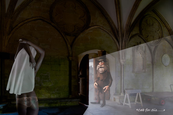
A Taxi for The Convent - A Composite for Critique
Mar 7, 2018 18:35:47 #

This is the result of my night school efforts. Regulars here have seen several of my composites previously, and I think I may have posted a shot of the cab driver at some time as well.
It's a light-hearted picture - and I've put some panties on the nun in order to avoid any offence to anyone, please critique it in that light.
The problem I've had previously was making the various elements of a composite blend together tonally, so they look like one image. Here, I've applied methods learned and hope I've achieved an acceptable result.
The elements consist the background, the cab driver, the hansom cab, the nun, her briefs and the habit. The nun's elements and the cab are borrowed images, the background and cab driver are my own, All taken at different times under different conditions of course. I haven't spent too long on the briefs as they are not part of the final image - I could have just put a black circle for UHH but it detracted too much.
How do you think I've done with the finished effect?
Mar 8, 2018 04:48:47 #
You do some fantastic things and the blending etc. looks good. Not sure about the light through the door, if it was the sun or moon being higher that would be angled down. Should the man be more in shadow on the right and more of his shadow on the floor. Am I being over critical ? if you have done this to display your talent for composit pictures then you have succeded
Mar 8, 2018 07:19:00 #

Magic indeed. At times it is hard to blend all parts taken in one snap... let alone blending many shots ... Magic indeed.
I look at the cab drive first, then see what he is seeing and then my eyes are grabbed back to the driver.
I look at the cab drive first, then see what he is seeing and then my eyes are grabbed back to the driver.
Mar 8, 2018 08:02:14 #
Bigal wrote:
You do some fantastic things and the blending etc. looks good. Not sure about the light through the door, if it was the sun or moon being higher that would be angled down. Should the man be more in shadow on the right and more of his shadow on the floor. Am I being over critical ? if you have done this to display your talent for composit pictures then you have succeded
Hmm, the light beam is an exercise and I’m not too sure about it myself really. Not bothered by the angle though, it’s just the brightness from the outside meeting the gloom of the inside, with no particular directional source. Whether it’s better as a picture with or without it is debatable, and it certainly has taken some of the shadow detail out of the man and his shadow. He’s a model my daughter made for an Aardman film (don’t know if you get their films in the States?) and I’d been looking a a composite to include him in for a while.
I don’t think you’ve been over-critical at all - I appreciate you interest. Thanks for commenting.
Mar 8, 2018 08:11:02 #
Thanks dpullum, glad you like the result. Also pleased you’re seeing the driver before the nun. I felt the white habit might be too much of a pull on the eyes. There are so many little exercises involved in the composition I loose track of some. Most troublesome was, having picked a black and white image for the nun, changing her to a colour image. In the end it was simple enough but it took me forever to master!
Thanks for taking the time to comment.
Thanks for taking the time to comment.
Mar 8, 2018 08:25:50 #
magnetoman wrote:
This is the result of my night school efforts. Reg... (show quote)
Dave, I love the comical approach to an excellent concept. It is a difficult task to blend various elements into one image, but when it's successful, as in this one, then one should be proud of the achievement. Although, there is one issue that is bothersome and that is the way the ray of light is coming through the door. All is well, except the hard line of ray at the top. I feel it should be feathered and blended into darkness. I know you have mentioned that the light doesn't bather you, but maybe you should give it another thought.
Dave
Mar 8, 2018 09:23:05 #

Excellent work indeed, and interesting discussions....as I sit here looking at light coming through my door, it looks very hard, but as I get closer to it, there is a "slight" feathering at the very edge, so maybe it depends on time of day, or our distance from the ray of light...just a thought...but fine work indeed!
Mar 8, 2018 12:01:50 #
Dave Chinn wrote:
Dave, I love the comical approach to an excellent ... (show quote)
Yes, that light is going to keep being a nuisance I reckon.
No doubt you're right Dave, as was Bigal earlier (when I should have taken more notice of the comment). If the light source was obviously intense then I reckon the edge would be sharp but as I'm depicting a 'bright outside' sort of day, it should probably be softer. It was a finishing exercise and probably intended for more intense light sources. My picture didn't lend itself to a narrow beam. Actually, I wonder whether to remove it altogether - I could then let the cabman's dodge and burn, plus his shadow, depict the difference between outside light and inside gloom. I think he looked better that way really.
Nice to have you call-in Dave, I appreciate your advice as always. You should call back into FYC more often - it's a safe place nowadays, and your comments are always helpful.
Mar 8, 2018 12:04:21 #
rlaugh wrote:
Excellent work indeed, and interesting discussions....as I sit here looking at light coming through my door, it looks very hard, but as I get closer to it, there is a "slight" feathering at the very edge, so maybe it depends on time of day, or our distance from the ray of light...just a thought...but fine work indeed!
I reckon the edge should definitely soften as it lengthens, i.e. sharpish at the door end and soft at the pictures edge. Thanks for your thoughts laugh, I do appreciate them.
Mar 9, 2018 07:48:14 #
magnetoman wrote:
Yes, that light is going to keep being a nuisance ... (show quote)
Dave, I wouldn't remove the light. It adds to the creativity and details of the image. I would polish it up some, as I'm sure you already have. My opinion is that all composites are a work in progress. There's always something that needs tweaking. I really do like the concept and think you have done a wonderful job and I hope you haven't been discouraged in any way. Your opinion is the one that matters most. All of us need a little guidance at times. In the past, your comments and suggestions have helped me to see beyond the forest, so I hope my comments haven't been a discouragement. I look forward to seeing any improvements you have made.
Dave
Mar 9, 2018 13:48:40 #
Dave Chinn wrote:
Dave, I wouldn't remove the light. It adds to the ... (show quote)
Certainly not discouraged Dave, just thought it may be better without the bright light. Haven’t had time to get back to it yet but I will over the weekend.
I’m never discouraged by thoughtful critique, it’s all positive to me and I always appreciate the help.
I’ll add the revised view in due course.
Dave.
Mar 9, 2018 23:26:07 #
magnetoman wrote:
This is the result of my night school efforts. Reg... (show quote)
I think it is spectacular. The light coming in the door is just right. The shadow on the floor works really well. It shows imagination, creativity and a good deal of skill putting it together. It must have taken a long time to do; but I think the final result is worth the effort. As you mentioned, the panties are less than convincing; but they are not part of the final version so that does not bother me at all. A fine effort.
Erich
Mar 10, 2018 04:15:36 #
ebrunner wrote:
I think it is spectacular. The light coming in the door is just right. The shadow on the floor works really well. It shows imagination, creativity and a good deal of skill putting it together. It must have taken a long time to do; but I think the final result is worth the effort. As you mentioned, the panties are less than convincing; but they are not part of the final version so that does not bother me at all. A fine effort.
Erich
Erich
Thanks Erich, glad you like it, and glad you decided to comment.
It did take an age to do and was only completed after taking advice on final blending from the course tutor. Generally I find compositing fairly straight forward but colour toning is another matter altogether and I have to seek advice from my wife every time, she has a better eye than me.
If you want to reply, then register here. Registration is free and your account is created instantly, so you can post right away.