Dingle Peninsula
Mar 5, 2018 20:46:14 #

Mar 5, 2018 22:18:12 #

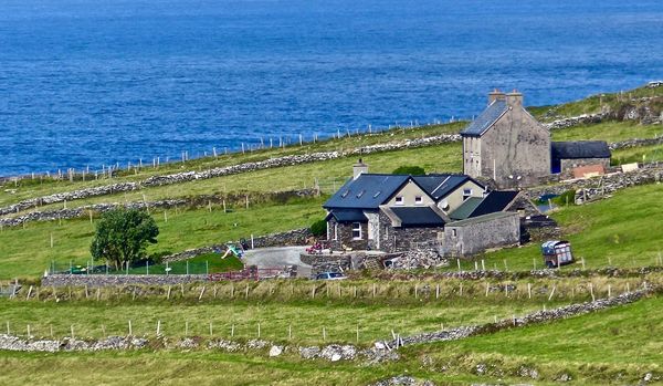
Well, I like it. The colour and density are good. It's well balanced. On top of that, it's a very pleasant scene.
Mar 5, 2018 22:19:24 #
Dan Downie
Loc: Rochester, NY
Maybe try cropping to get rid of the fence and hedgerow at the bottom of the photo, leaving the fence line running at an angle to the second long fence line running the width of the photo. It's a nice scene.
Mar 5, 2018 22:25:07 #

I love Dingle. We were there last September.
I think the ocean is a bit too royal blue. It is usually a more ominous inky blue to greeny black color. I like the way the stone walls zig zag through the frame. Not sure exactly where this was taken, but it would have been nice to see the Blasket Islands in the background.
Do you have any more? Can't get enough of Dingle.
Mar 5, 2018 22:44:28 #

I agree, it's a very nice scene. Personally, I would crop a bit off the top to cut down on the water and also close to the tree on the far left edge so as to focus more on the buildings. The fencing and stone walls add a lot of interest.
Mar 6, 2018 07:15:20 #
Beautiful!
If you take me with you on the next trip I'd be happy to provide some hands-on instruction😊
Love Dingle and all the West Coast!
If you take me with you on the next trip I'd be happy to provide some hands-on instruction😊
Love Dingle and all the West Coast!
Mar 6, 2018 07:25:22 #

Mar 6, 2018 08:39:56 #

I like it just the way it is. The only thing I’d do differently is to take out the rocks/fence/whatever at the very bottom of the photo. Nice work.
Mar 6, 2018 09:02:25 #

It would have been better to look at it larger than this sample. When confronted with a subject like this what I do is to take several shots from different positions and then I select what looks better and has in my opinion a better visual design.
Like it is it looks pretty good to me. The oblique lines add interest to the shot.
Like it is it looks pretty good to me. The oblique lines add interest to the shot.
Mar 6, 2018 12:13:13 #
Crop it.
There are several focal points. My thoughts are the homestead should be the focal point and cropped to reflect that. Having too many focal points makes for a confusing image, often referred to as "busy". Cropping will remove some of the unneeded sky and fences.
But then I come from the "Keep It Simple School", or KISS. That is why I always have a hard time doing landscapes.
Mar 6, 2018 12:15:51 #

If you want to reply, then register here. Registration is free and your account is created instantly, so you can post right away.