Color grading
Feb 15, 2018 18:36:54 #

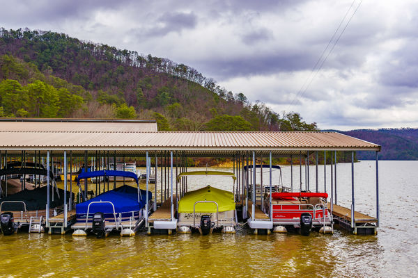
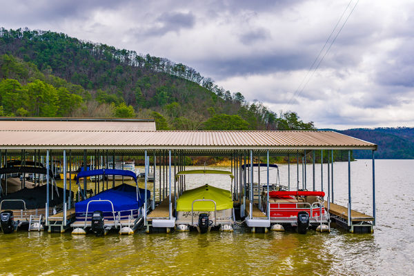
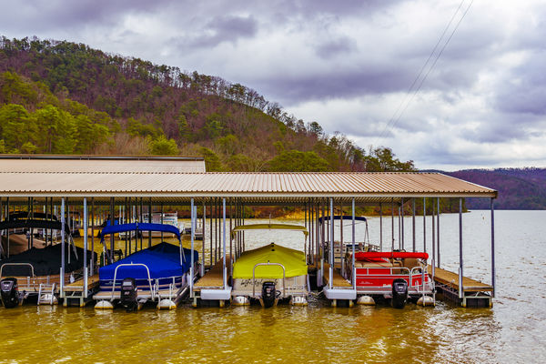
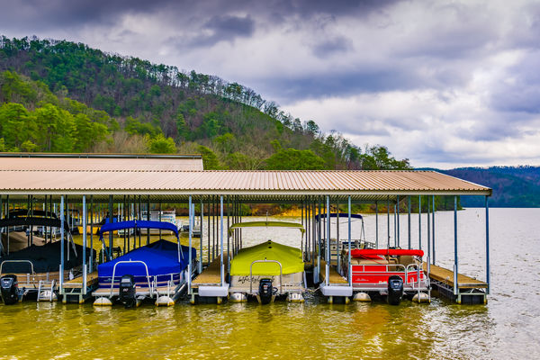
Which color grading do you like or prefer #1, #2, or #3? #4 before color grading. Critics and comments are welcome.

Feb 15, 2018 19:14:55 #

canondigiphoto wrote:
Which color grading do you like or prefer #1, #2, or #3? #4 before color grading. Critics and comments are welcome.
I'm not sure what you mean by "color grading". But #2 looks like it has the most natural or best WB of the group to me, but could stand to be a bit brighter like #4. Were these shot as jpgs with a WB adjust around Cloudy (#2), or tweaked after the fact as Raw with ACR or manually with some other PP? They are all similar, yet different. Pretty wild with the primary colored boats. I was looking more at the water, sky, trees, soil, etc. to judge color balance.
Feb 15, 2018 19:33:24 #

Feb 15, 2018 22:00:51 #
To me, the differences are so small I'm having a difficult time seeing any relevant difference. What annoys me with the photos though is the wires coming out of the top right.
Feb 16, 2018 11:50:10 #

Feb 16, 2018 14:39:11 #
Updated after your comments. Thanks to everyone.
Feb 17, 2018 02:17:33 #
tcthome
Loc: NJ
Looking at the dock/boat area its hard to tell but , when you look at the backround the greenery looks more natural & alibe or in season more in #2 .
If you want to reply, then register here. Registration is free and your account is created instantly, so you can post right away.