Matheson Hammock and Macro Shots
Feb 13, 2018 20:33:57 #
Hi all,
These pictures were taken while back, maybe 6 months ago. Let me know what you all think.
These pictures were taken while back, maybe 6 months ago. Let me know what you all think.


Feb 13, 2018 22:50:22 #

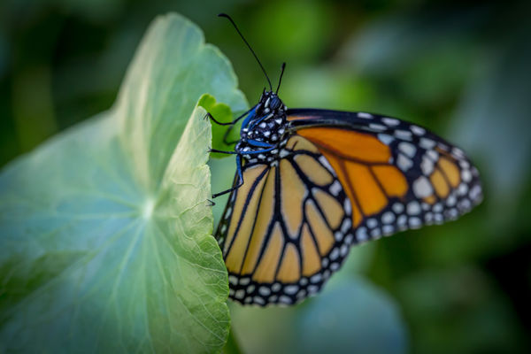
You need to give numbers especially on macros. Butterfly definitely needed more DoF.
Feb 14, 2018 05:38:18 #

Feb 14, 2018 10:47:49 #

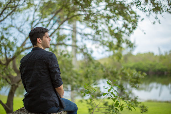
I am NOT a people photographer, so you need to take what I say with a grain of salt. The first one is really nice and really highlights the guy. In the second one, you have nice separation between the subject and the background, but I wonder why you placed the subject at the busiest part of the background. His face gets a bit lost in the background. I really like the third one, but I think I would have gone for a tad more DOF. I like the butterfly. I think the separation is really nice. I actually like the shallow DOF in that one.
Feb 14, 2018 13:34:45 #

Please don't be offended, but the first image is too centered both horizontal and vertical. Let me explain. Looking at the main subject, her is centered in the image. I would have liked him to be more at the one-third position, cropping the elevated rock on the right side. Vertically, the horizon bisects the image and at the waist of your subject. if you move the horizon so that it is positioned at his legs, not ar a movable joint. My 2 cents worth. On the 2nd image, I would like to see the tree branches somewhere else, not protruding from his head. Again, my perspective. These are my opinion, and just like the human anatomy, everyone has one. I go along with the other member's thoughts, too. You need more Depth of Field (DOF) to really bring out the detail, but too mush hides the main subject in the background. Continue, this is a never-ending learning process, don't quit just because some people shoot you down. Learn from these comments and you will improve your imaging. Bill
Feb 14, 2018 16:17:18 #
If you want to reply, then register here. Registration is free and your account is created instantly, so you can post right away.