Fishing Floats
Jul 11, 2012 17:49:32 #
Mulberry
Loc: Isle of Wight, UK
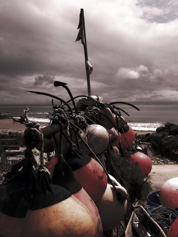
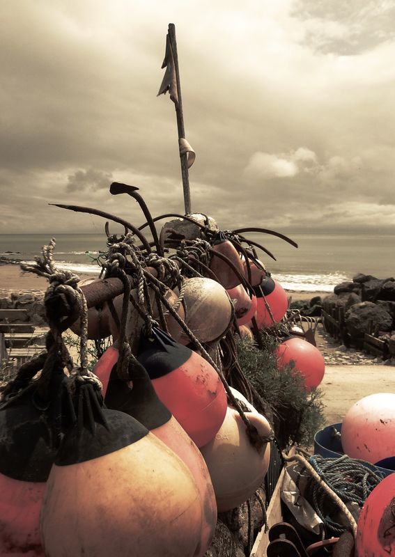
Slightly different PP - any comments or preference?
Number 1
Number 2
Jul 11, 2012 19:18:44 #

Jul 11, 2012 19:21:46 #
jk48
Loc: Camarillo, California
JoeB wrote:
I really like #1, has lots of drama to it.
Again I will say to you what a judge said to me about my Raven on a Rooftop..."almost" Somehow something is missing...can't put my finger on it..but just a barely competent amateur over here..
Jul 12, 2012 07:00:09 #
Jul 12, 2012 07:26:18 #

Jul 12, 2012 08:41:52 #

I also like #1. It has the feel of a high contrast B&W and the color gives the effect of being hand-colored. Very nice work. I'd have no trouble hanging this one!
Jul 12, 2012 09:46:44 #

In #1, on the left side, the rope makes it look as if a man was kneeling down by the water. Both pictures are great, however #1 is my favorite.
Jul 12, 2012 11:36:09 #
Mulberry
Loc: Isle of Wight, UK
Thanks for all your replies and comments. I prefer No 1, too, but wanted to see what others thought.
Jul 12, 2012 12:23:24 #
Mulberry
Loc: Isle of Wight, UK
flyingcrown1 wrote:
I also like #1. It has the feel of a high contrast B&W and the color gives the effect of being hand-colored. Very nice work. I'd have no trouble hanging this one!
Thanks. I hope others agree when I offer it for sale!
:-)
Jul 12, 2012 17:01:17 #
konica135
Loc: Ormond Beach, FL
jk48 wrote:
Again I will say to you what a judge said to me about my Raven on a Rooftop..."almost" Somehow something is missing...can't put my finger on it..but just a barely competent amateur over here..
JoeB wrote:
I really like #1, has lots of drama to it.
Again I will say to you what a judge said to me about my Raven on a Rooftop..."almost" Somehow something is missing...can't put my finger on it..but just a barely competent amateur over here..
Maybe it's that blues are missing - picture seems flat.
If you want to reply, then register here. Registration is free and your account is created instantly, so you can post right away.