Composition (or lack thereof!)
Feb 8, 2018 16:25:35 #
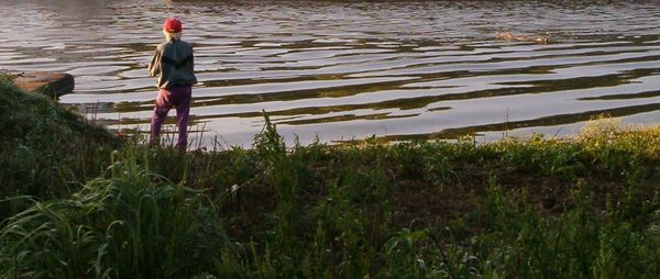
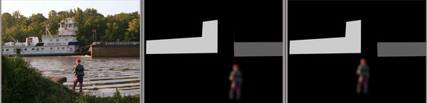
This photo was taken back in 2013, with a 3.2mp HP Photosmart 735. It was my first digital camera, given to me by my Dad around '05, and I think that particular model came out around '03 sometime. I'm well aware of its limitations; what I'm asking for today is a critique on how the photo itself is composed, rather than how the exposure turned out. It was an unplanned shot; my wife and I were fishing from the bank of the Cumberland River when the barge train just came chugging along. I had the camera fairly close by but it still took a few seconds to get organized and shoot, and of course I only had one shot; by the time it was written to the (64mb!) card the pushboat had already gone by. To my admittedly untrained eye, it seems like a decent composition, but I'd be interested in what folks with superior knowledge and experience think. The attached photo has "store original" enabled.
I should add that at that time (2013) this wasn't the only camera I owned; also had a Nikon Coolpix P80 (a p/s a little higher on the scale) and within a year I bought my Fuji S-1 bridge camera. Today I have a Nikon D5300.
I should add that at that time (2013) this wasn't the only camera I owned; also had a Nikon Coolpix P80 (a p/s a little higher on the scale) and within a year I bought my Fuji S-1 bridge camera. Today I have a Nikon D5300.

Feb 8, 2018 19:15:19 #
I know what I think, but tell us what YOU think. What does the shot say to you? And if it says "I'm good", then, it's good.
Now me, I'd crop it to a 1 x 2 or even a 1 x 2.5 (that is for every 1" high, 2 or 2 1/2" long). Cut off most of the sky. Then have it custom framed and put in my hallway alongside the rest of my Hallway of Fame pictures.
Now me, I'd crop it to a 1 x 2 or even a 1 x 2.5 (that is for every 1" high, 2 or 2 1/2" long). Cut off most of the sky. Then have it custom framed and put in my hallway alongside the rest of my Hallway of Fame pictures.
Feb 8, 2018 22:56:16 #
Joe Blow wrote:
I know what I think, but tell us what YOU think. What does the shot say to you? And if it says "I'm good", then, it's good.
Now me, I'd crop it to a 1 x 2 or even a 1 x 2.5 (that is for every 1" high, 2 or 2 1/2" long). Cut off most of the sky. Then have it custom framed and put in my hallway alongside the rest of my Hallway of Fame pictures.
Now me, I'd crop it to a 1 x 2 or even a 1 x 2.5 (that is for every 1" high, 2 or 2 1/2" long). Cut off most of the sky. Then have it custom framed and put in my hallway alongside the rest of my Hallway of Fame pictures.
Well, I've liked it enough that I kept it for close to 5 years now, but it is after all a snapshot that I made at a moment's notice, meaning I think it's a good picture but the good in it is due more to good luck than to skill or artistry on my part. If I'd been able to plan the shot and release the shutter at exactly the right time, I'd have tried to live up to the Rule of Thirds; everything is just about smack in the middle of the frame as it is now. And I agree with you about the cropping since that's a pretty ho-hum sky as it came out in the exposure. It does have a discernible fore, middle and background, so that's a point in its favor, as are the ripples in the water.
Thanks very much for your critique. I hope to hear from others as well.
Feb 9, 2018 07:12:10 #

sjb3 wrote:
This photo was taken back in 2013, with a 3.2mp HP... (show quote)
You asked about the composition. I think the composition s...... - No, I won't be honest, I'll be tactful. The whole right hand of the picture says nothing. The sky says nothing. The foreground says nothing. The hill on the left is disturbing. If it was the push boat that inspired you to take the shot - you missed it.
The picture needs a major crop. There is nice light on your wife. I think there is potential for a close crop with your wife, the rock and the water ripples, or your wife, the rock and the front of the push boat. However, you don't have enough resolution for that much crop.
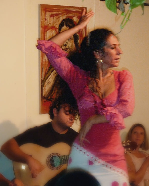
I apologize if I have been too blunt. Obviously, the picture means something to you if you held onto it this long. If it is a memory, that should be enough. It doesn't have to be compositionaly splendid to be of value to you. One of my favorite pics is this one I took in a dim Flamenco club in Saville, Spain. The picture is blurry, color cast and out of focus and taken hand held with a P&S with serious time lag. But to me, it is a work of art. All I see is the intensity and passion of the dancer - 'gravitas'. My photography has come a long way since then, but I always include this in my collection because it speaks to me for some reason. I am impervious to criticism of it.
Feb 9, 2018 09:46:33 #
repleo wrote:
You asked about the composition. I think the comp... (show quote)
Before replying, I cropped the photo as you described. Just for educational purposes; I agree with you that there's little resolution to start with so a close crop would be hopeless. You have nothing to apologize for; tactful bluntness is a valuable character asset (I like to think I have it myself). So speaking bluntly about myself, I have to admit that I don't have an artist's eye and am not likely to acquire one this late in the game. That being said, I can still take a decent photo from a strictly technical viewpoint, both in the camera and in post-processing. Joining this forum is an attempt at going from "decent" to "Hey, that's pretty darned good!" and the way to do that is by doing what I'm doing here on this thread. I very much appreciate your taking the time to look at my picture and provide constructive criticism.
And while I don't have an artist's eye when it comes to making a photo, I can easily enough recognize it when I'm looking at it (I think that's what is meant by "_______________ has a firm grasp of the obvious), and despite the flaws you itemized, the picture of the dancer is just what you said it is, a work of art. If you could go back in time and do it over, you'd have a masterpiece.
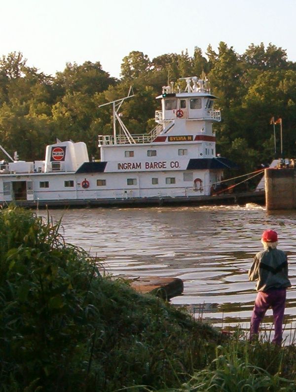
Chong, Rock(?) & Ripples
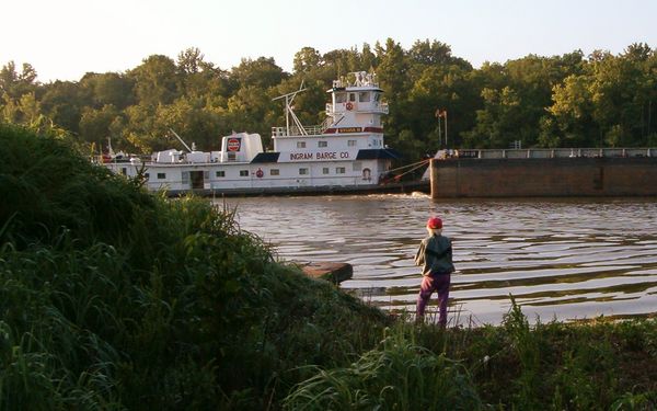
Chong, Rock & Front of Boat
Feb 9, 2018 09:54:16 #
sjb3 wrote:
Before replying, I cropped the photo as you descri... (show quote)
WOW!!! Much better. They are both really nice. Resolution is much better than I expected too. I am so relieved you didn't take offense at my response.
Feb 9, 2018 10:13:07 #

I did a virtual crop that took out a good bit of the sky and quite a bit of the right hand side. It moved the person just to the right of center and emphasized the hill a bit. Wasn't sure I was going to like that, but it did have better balance than the original. I think cropping out the barge totally loses a bit of the river atmosphere, so if it were mine, I wouldn't do that. It does look crooked to my eyes, but then I have an astigmatism, so I have trouble seeing what's straight. You might take a level line to the water. But perhaps part of the story you want to tell is the size of the cargo that the tug is moving, so perhaps my suggestion wouldn't be helpful in that case.
Feb 9, 2018 11:12:00 #
AzPicLady wrote:
I did a virtual crop that took out a good bit of t... (show quote)
You know, you just hit the nail on the head with the words "the story you want to tell". I can't honestly say that I ever had storytelling in mind when I made a photo; probably another reason why I don't have an artist's eye. I tend to see something interesting and just decide to take a photo but without any conscious composing on my part. I look through the viewfinder and if it looks right to my (philistine?) eye, Click! About the original looking crooked: If you're meaning the pushboat looks that way, it's because the (very powerful) motors at the stern have the prow raised a bit from their combined effort pushing what I seem to remember as 2 or 3 loaded barges tied together; it was 2013 and my memory isn't what it used to be.
Anyway, back to your critique. Is the attached what you had in mind? And thanks very much for your time and attention.
Cropped with C to right of center
Feb 9, 2018 11:15:17 #
sjb3 wrote:
You know, you just hit the nail on the head with t... (show quote)
That's pretty close to what I looked at. I didn't know if you wanted to keep to the original format or not. I think probably I took a smidge more off the right. As to the leveling, look at the water line. Water is usually level unless there's a perspective issue. Here there isn't.
Feb 9, 2018 11:22:07 #

I find the seawall line and standing subject alignment distracting.
Feb 9, 2018 14:13:06 #

Is it a shot of the barge or a shot of the angler? If it's a shot of the barge, it doesn't work because too much is missing and it's not an inspiring or interesting view. If you made it a shot about the angler there's more potential for success. Cropping closer to make the angler the obvious subject will help and should create a more intimate feel for the shot. The barge then becomes context (the angler is obviously fishing in a busy canal/river) so you don't have to eliminate the barge completely by cropping. But you do have to give the angler more prominence. Try to create a feeling of being given an intimate glimpse into the private world of the angler.
Feb 9, 2018 23:12:23 #
Thanks very much to all the folks who have taken the time to look at my picture and tell me what they think. I believe artists are born, not made, so I'll just take all this good advice to heart, incorporate it into subsequent work and try to become a better photographer. It seems to me, from what I've gathered here, that when one is about to take a photo, one should approach it like a game of chess--thinking a move or two ahead and not just point and "shoot from the hip", so to speak. Thanks again.
Apr 18, 2018 14:13:42 #
Regardless of any crop. I can't get by the fact that you chopped of the stern of that boat.
Apr 18, 2018 20:16:18 #

There's a "fatal flaw" of composition that I see: lining up two objects. The angler and the barge align, and even worse, the barge is to big an element and the angler is to the right. To get a pleasing asymmetrical balance, the angler would have to be slightly left and the barge diminished.
However, as others have pointed out, if you like something for some reason, it is okay. I, however, have seen almost always that when a person identifies what is the "grabber" in a photo, makes that the focal point, and moves stuff around or crops to create a good composition, the photo is better.
However, as others have pointed out, if you like something for some reason, it is okay. I, however, have seen almost always that when a person identifies what is the "grabber" in a photo, makes that the focal point, and moves stuff around or crops to create a good composition, the photo is better.
Apr 25, 2018 21:00:02 #

If you want to reply, then register here. Registration is free and your account is created instantly, so you can post right away.