Darren's Poster
Jan 15, 2018 11:36:58 #
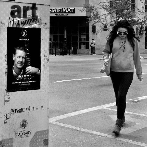
Awhile back I spent some time in the city and came across my friend Darren's poster. I stood around waiting for a shot, each light change brought a herd of various pedestrians in groups. Luckily this one showed up that seemed to match Darren's music idiom. Unfortunately there were lots of unwanted "glitches" in the shot. Thanks to the practice with pp offered in Erich's MIYV feature I took another round out of this. What do you think....
.
.
Jan 15, 2018 14:07:44 #

I like it.
As I stare at it the State and Mat sign keeps attracting my eye because the lettering is pretty bright. You might consider burning those letters down a little bit (darkening them).
As I stare at it the State and Mat sign keeps attracting my eye because the lettering is pretty bright. You might consider burning those letters down a little bit (darkening them).
Jan 15, 2018 14:42:33 #
Good point JD. Already did a tad, your fresh eyes caught the unnecessary highlight when mine remembered the original. Thanks.
Jan 15, 2018 15:08:43 #
dansmith wrote:
Awhile back I spent some time in the city and came across my friend Darren's poster. I stood around waiting for a shot, each light change brought a herd of various pedestrians in groups. Luckily this one showed up that seemed to match Darren's music idiom. Unfortunately there were lots of unwanted "glitches" in the shot. Thanks to the practice with pp offered in Erich's MIYV feature I took another round out of this. What do you think....
.
.
An excellent street shot. Without explanation, nobody would know that the poster is your friend's, but that information, while interesting, is irrelevant to the shot. I did not notice any glitches, so you masked them well. I hope the buy across the street is trying to light a cigarette out of the wind. Further contemplation on his stance is a bit disquieting. lol I like this shot a lot.
Erich
Jan 15, 2018 15:31:04 #
Thanks Erich. Cloned out extra people around the main character, decided to leave the smoker (?, hope so..) in front of the restaurant, really the "State and Main. Cloned out an ugly lamppost so easier to bring across the T. Post had a big metal treble clef on it which would have been ok but it looks better gone.
Jan 16, 2018 08:14:56 #

Jan 16, 2018 15:25:06 #

dansmith wrote:
Awhile back I spent some time in the city and came across my friend Darren's poster. I stood around waiting for a shot, each light change brought a herd of various pedestrians in groups. Luckily this one showed up that seemed to match Darren's music idiom. Unfortunately there were lots of unwanted "glitches" in the shot. Thanks to the practice with pp offered in Erich's MIYV feature I took another round out of this. What do you think....
.
.
A very nice street shot, with meaning because of the connection with the musician. You dispatched the extra humans with nice pp that can't be seen which is our goal in such cases. Agree with JD's suggestion about lowering the brights in the sign across the street (can't believe you altered the text on it!), but that is a small issue compared to those you've already conquered. Good balance between the walker and the sign, with enough context of interest in the background between.
Jan 17, 2018 21:15:39 #
jaymatt wrote:
That would work well in the street section, I believe. Nice shot.
Thanks jaymatt. Just might post it there, all too quiet on that section.
Jan 17, 2018 21:21:23 #
minniev wrote:
A very nice street shot, with meaning because of the connection with the musician. You dispatched the extra humans with nice pp that can't be seen which is our goal in such cases. Agree with JD's suggestion about lowering the brights in the sign across the street (can't believe you altered the text on it!), but that is a small issue compared to those you've already conquered. Good balance between the walker and the sign, with enough context of interest in the background between.
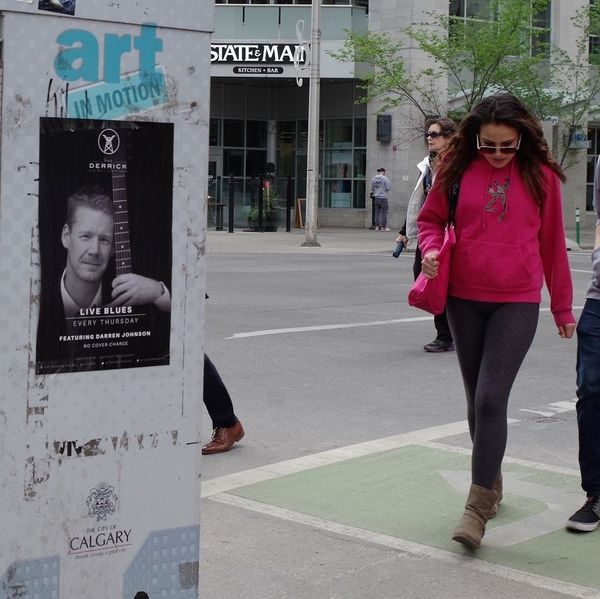
Thank you minniev. Got lazy with the sign. Here's a cropped original for comparison showing the adorned lamp post. I hate clutter.
If you want to reply, then register here. Registration is free and your account is created instantly, so you can post right away.