Check out Travel Photography - Tips and More section of our forum.
How do you decide when an image is good enough for a poster-size blow-up?
Jan 15, 2018 15:49:55 #
John_F wrote:
To get the rest of it, check these.
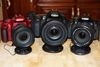
Nice photographic copies, there, John ...
I like the rich color tone of the table, too ...
And those cut marks came out good, too ...
What did you use, John?
Jan 15, 2018 15:59:53 #
Chris T wrote:
Hereyago, B ...
The same Topic Post title which appears on every single page of this thread:
How do you decide when an image is good enough for a poster-size blow-up?
The same Topic Post title which appears on every single page of this thread:
How do you decide when an image is good enough for a poster-size blow-up?
It just seems you are inquiring about how "circle of confusion" is defined than about how it might pertain to deciding when an image is good enough for poster-size printing.
Jan 15, 2018 16:31:42 #

Just an iPad wih no hint toward masterpiece status.
Chris T wrote:
Nice photographic copies, there, John ...
I like the rich color tone of the table, too ...
And those cut marks came out good, too ...
What did you use, John?
I like the rich color tone of the table, too ...
And those cut marks came out good, too ...
What did you use, John?
Check out Smartphone Photography section of our forum.
Jan 15, 2018 17:39:48 #
bcrawf wrote:
It just seems you are inquiring about how "circle of confusion" is defined than about how it might pertain to deciding when an image is good enough for poster-size printing.
Well, B ... I do have to admit the circle John introduced, confused the hell outta me ....
If it's related directly to my Topic Post title, then, I guess - a definition is called for ...
Jan 15, 2018 17:42:28 #
John_F wrote:
Just an iPad wih no hint toward masterpiece status.
Really, John?
You took those with an i-Pad, huh?
Good tones ... rich, warm colors ... not bad, at all ....
Love the cut marks in the table - excellent DOF !!!!
Jan 18, 2018 16:10:14 #

Chris T wrote:
Let's say you want to fill a wall ... with a 20x24, or a 30x40 ... or even a 40x60 ... what makes it worth the effort?
(third attempt)
I look at the picture for good composition. Then I look for sharpness by zooming in as much as possible. If the zoomed-in piece looks sharp on my 32-inch TV, then I proceed with printing. The attached picture is a 3x4 foot display. It even looks sharp from 6 inches. It was taken with a Sony A7Rm2 camera and the 90mm G macro lens (which has been #2 in sharpness on the DXOMARK list of lenses since they tested it on the A7Rm2. Note: DXOMARK rates lenses sharper when they are tested on higher megapixel sensors, so their ratings will change over time.)


Jan 18, 2018 17:17:09 #
Logan1949 wrote:
(third attempt) br I look at the picture for good ... (show quote)
Logan ... which piece is this?
Or - is the top shot the window through which you can see the Apple Blossom?
So, you reckon you have the second-most sharp lens there is, do you, Logan ... when used with the Sony a7R Mk. II ? .... Neat!
Check out Film Photography section of our forum.
Jan 18, 2018 19:42:27 #
This is a white Dogwood tree.
The close-up is in the lower, left corner.
The original photo was split, 4x4, into 16 close-ups.
A DXOMARK rating is only accurate when compared against lenses tested against the same sensor size and the same number of megapixels. Fewer megapixels in the sensor earn a lower lens sharpness rating than more megapixels (even if the lens tested with fewer megapixels is actually sharper).
Jan 18, 2018 22:11:01 #
Logan1949 wrote:
This is a white Dogwood tree.
The close-up is in the lower, left corner.
The original photo was split, 4x4, into 16 close-ups.
A DXOMARK rating is only accurate when compared against lenses tested against the same sensor size and the same number of megapixels. Fewer megapixels in the sensor earn a lower lens sharpness rating than more megapixels (even if the lens tested with fewer megapixels is actually sharper).
The close-up is in the lower, left corner.
The original photo was split, 4x4, into 16 close-ups.
A DXOMARK rating is only accurate when compared against lenses tested against the same sensor size and the same number of megapixels. Fewer megapixels in the sensor earn a lower lens sharpness rating than more megapixels (even if the lens tested with fewer megapixels is actually sharper).
Oh, I see, Logan ... thought perhaps it was something like that ....
I couldn't find the blow-up, though ... matched them all, too ... guess I was looking too high up (because of the branch formation - connecting with sky)
If that's how DxOMark does their testings, it would seem most unreliable, dontchathink, Logan?
PS - I see it, now .... thanks for pointing it out to me ....
If you want to reply, then register here. Registration is free and your account is created instantly, so you can post right away.
Check out AI Artistry and Creation section of our forum.