photographing oil paintings
Dec 25, 2017 21:35:33 #
Drb68
Loc: Utah
I am looking for the best way to photograph oil/water color paintings.....lens and lighting preferred. I will be using a tripod and a D200. Thanks.
Dec 25, 2017 21:43:37 #
Drb68 wrote:
I am looking for the best way to photograph oil/water color paintings.....lens and lighting preferred. I will be using a tripod and a D200. Thanks.
You need to set up non glare lighting, diffusers on the lights and angled.
You will need a flat field lens to avoid distortion, macro lenses are flat field so use one of those from enough distance to just fill the frame with the painting. Focus carefully, use mirror lockup and shutter delay plus a remote release if you have one.
Dec 25, 2017 22:49:15 #
Old Timer
Loc: Greenfield, In.
Indirect lighting, I like to use natural light at a right angle to the painting. The painting needs to be on the same plain as the camera or you will get the perspective off. If inside use bounce flash of the ceiling or walls. You do not want direct flash as you will cause a glare effect. So experimenting and you should find what will work in your condition. Also go to the search as this has been discussed there in the past.
Dec 25, 2017 22:54:46 #

Drb68 wrote:
I am looking for the best way to photograph oil/water color paintings.....lens and lighting preferred. I will be using a tripod and a D200. Thanks.
This response was provided to me a few months ago by member Gene51. Hope it helps.
If you are just looking to make copies to be matted and framed and you don't want to spend a fortune in lighting to take the image and even more when you print, I suggest you place the artwork on an easel, near an open garage door where blue sky and no direct sunlight is coming in. Set your camera on a tripod, slightly above the artwork so that you can aim it down towards the work which will be angled slightly back - the goal here is to have the camera sensor parallel to the art. Do a custom white balance using a white or gray card, and use the gray card to determine your exposure. Make sure the work is flat, use an Fstop of F8, a low ISO, like 100, and whatever shutter speed you need to make the exposure correct. You will get very decent reproductions. You can then decide if you are ok with C prints - chromogenic (silver emulsion) prints shot with a laser and deveoped using C41 chemistry - with the paper options (not many but it may be good enough) - or you want a more "artsy" feel and quality using fine art paper. The $20 price seems to indicate you are leaning towards the former. You can get these done at Costco, Mpix, White House Custom Color, Bay Photo etc. You can expect to pay between $7 and $9.50 fro an 11x14. If you use Bay photo and you are ok with doing image corrections yourself, you can get an 11x14 for $4.00. The others will be in that range, more or less.
Dec 26, 2017 00:00:35 #
Here's a similar thread from some years ago. I find that using natural light, outdoors on a "cloudy bright" day, works well too, since the most important parameter is even, glare-free lighting.
Rectangular distortion in the image, while undesirable and avoidable, can usually be remedied with post-processing software.
http://www.uglyhedgehog.com/t-174793-1.html
Rectangular distortion in the image, while undesirable and avoidable, can usually be remedied with post-processing software.
http://www.uglyhedgehog.com/t-174793-1.html
Dec 26, 2017 07:04:01 #
Drb68 wrote:
I am looking for the best way to photograph oil/water color paintings.....lens and lighting preferred. I will be using a tripod and a D200. Thanks.
Here you go.
http://www.artistsnetwork.com/articles/art-demos-techniques/how-to-photograph-a-painting-step-by-step
https://www.artistsandillustrators.co.uk/how-to/marketing-your-art/708/how-to-photograph-your-artwork
https://canvasgicleeprinting.com/how-to-photograph-your-paintings-for-print-reproduction/
Dec 26, 2017 10:09:38 #

Take at a distance... use flash if permitted... the camera should be at an angle so lights are not reflected... then is Post use the prospective to make the painting back to being a rectangle. yes gray cards are great but a white paper is fine.... hole it in the same photo as the painting.
If you read Jerry's references you prob know better than my suggestions.
If you read Jerry's references you prob know better than my suggestions.
Dec 26, 2017 10:25:27 #
Drb68 wrote:
I am looking for the best way to photograph oil/water color paintings.....lens and lighting preferred. I will be using a tripod and a D200. Thanks.
FWIW ...
Several decades ago I needed/wanted to make some Kodachrome slides of some existing work ...
The house I was renting had an open, south facing porch on which I could set up my "artwork" (... leaned against the back of a simple lawn chair (!), so the flat surface was at about the angle of a music stand easel) and camera (facing south at the same angle) ... I used a 90-180 Macro zoom lens to ensure a rectilinear, flat field (originals were smaller than 11x14 ... the slightly longer focal length allowed for some distance between the camera and the object ... a regular 50mm-or-60mm Macro lens will possibly work better for larger surfaces) + to make framing easier on multiple images which varied slightly in size) ... essentially, providing "northern light" ...
IMO, the color balance was perfectly neutral.
Dec 26, 2017 11:07:14 #

As mentioned, your lights should be at 45 degrees from the right and left of the art. The textured surface of an oil painting can produce refections into your lens, which can be reduced with a polarizing filter.
Dec 26, 2017 12:36:23 #

In my commercial photography practice, I have been photographing oil painting and other art works for many years- I do quite a bit of this kind of specialized work for museums, art collectors, archival records of collections and individual pieces, galleries, artists, and individual owners of valuable paintings. The purposes of theses photographs are for lithographic reproductions (making of prints), publication ion books and art publications and for insurance and evaluation reasons.
As mentioned in the article in the link, the only best way to do this kind of work is with the cross-polarization method whereby a circular polarizer is used on the camera and polarizing filter are used one each of two lights placed at 45 degrees to the camera/subject axis and at each side of the artwork. Of course, this method is only applicable if you have access and permission to do this work. If you are visiting a museum or gallery where flash is permitted but you can not set things up, the other improvised methods that are suggested in this thread would apply. Where flash in prohibited, available light is your only alternative but a polarizing filter may be of some advantage.
For most oil (brush) paintings, the 2 light method is advisable. An interpretive method using only one light is advisable for palette knife paintings or bas relief work where surface texture needs to be apparent in the reproduced image.
I use fairly high power electronic flash units in ordinary parabolic reflectors with the polarizing filters in place. You need top make sure that the polarized orientation is observed as per the marks on the frames of the polarizing screens.
It is essential that the lighting across the entire artwork is even. A hand held light meter is required to make incident readings at each corner of the painting and at the center of the paining as well. The lights should be adjusted so that each of the corner readings are exactly the same and the center reading may be about one stop more. The center reading is the exposure starting point- exposures should be bracketed in 1/3 stop increments on both sides of the readings. You can the select the most authentic density.
An 18% gray card and a color reference chart (such as a Macbeth Color Checker or a Kodak reproduction color scale) shod be included outside of the composition field. This will assist in obtaining the best possible color balance in final editing and for the purpose of lithographic reproduction.
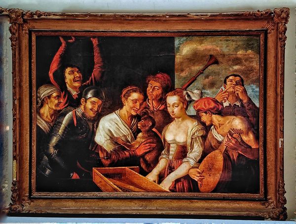
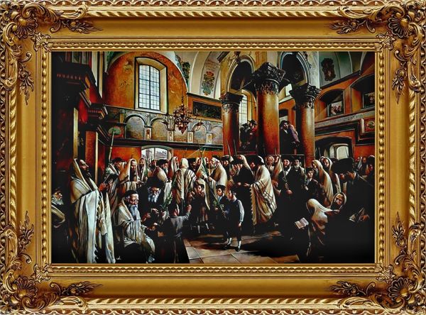
I am on the road between now and the New Year but I have a few examples of this work in my i-Phone "portfolio"- so I will post them in the next reply post. The quality will not be indicative of the original files but it will give you some idea of the lighting. Theses paintings were very large 40x60- and 60x80 inchers and were in their original frames. Theses were photographed on location with the aforementioned lighting method.
Th camera should be equipped with a normal or slightly longer that normal lens of apo or macro qualities. It is important the the camera be paralleled to the artwork and perfectly centered. A high quality circular polarizing filter is recommended.. The polarizing material that is used over the lights can be obtained in an acetate material. The are somewhat expensive, however, I have had and used my set for over 20 years.
I hope this helps- Happy holiday season and a great new year in 2018!
As mentioned in the article in the link, the only best way to do this kind of work is with the cross-polarization method whereby a circular polarizer is used on the camera and polarizing filter are used one each of two lights placed at 45 degrees to the camera/subject axis and at each side of the artwork. Of course, this method is only applicable if you have access and permission to do this work. If you are visiting a museum or gallery where flash is permitted but you can not set things up, the other improvised methods that are suggested in this thread would apply. Where flash in prohibited, available light is your only alternative but a polarizing filter may be of some advantage.
For most oil (brush) paintings, the 2 light method is advisable. An interpretive method using only one light is advisable for palette knife paintings or bas relief work where surface texture needs to be apparent in the reproduced image.
I use fairly high power electronic flash units in ordinary parabolic reflectors with the polarizing filters in place. You need top make sure that the polarized orientation is observed as per the marks on the frames of the polarizing screens.
It is essential that the lighting across the entire artwork is even. A hand held light meter is required to make incident readings at each corner of the painting and at the center of the paining as well. The lights should be adjusted so that each of the corner readings are exactly the same and the center reading may be about one stop more. The center reading is the exposure starting point- exposures should be bracketed in 1/3 stop increments on both sides of the readings. You can the select the most authentic density.
An 18% gray card and a color reference chart (such as a Macbeth Color Checker or a Kodak reproduction color scale) shod be included outside of the composition field. This will assist in obtaining the best possible color balance in final editing and for the purpose of lithographic reproduction.
I am on the road between now and the New Year but I have a few examples of this work in my i-Phone "portfolio"- so I will post them in the next reply post. The quality will not be indicative of the original files but it will give you some idea of the lighting. Theses paintings were very large 40x60- and 60x80 inchers and were in their original frames. Theses were photographed on location with the aforementioned lighting method.
Th camera should be equipped with a normal or slightly longer that normal lens of apo or macro qualities. It is important the the camera be paralleled to the artwork and perfectly centered. A high quality circular polarizing filter is recommended.. The polarizing material that is used over the lights can be obtained in an acetate material. The are somewhat expensive, however, I have had and used my set for over 20 years.
I hope this helps- Happy holiday season and a great new year in 2018!
Dec 26, 2017 12:41:24 #
Dec 26, 2017 15:09:21 #
amfoto1
Loc: San Jose, Calif. USA
brucewells wrote:
This response was provided to me a few months ago ... (show quote)
All this is good advice....
My Mom was a prolific painter and we photographed all her work. I've also done some of it for other artists.
I'll add a few things that might help, with relatively common gear you may already have or might acquire at moderate cost...
A short telephoto prime lens used from 6 or 8 feet distance or greater (depending upon the size of the painting vs focal length) will work best.... That typically has the least distortion and little concern about flat field since you're stopping down.
If you must use a zoom, avoid the wide angle or extreme telephoto focal lengths. Those will tend to cause problematic distortions such as barrel or pincushion.
When using longer shutter speeds mirror lock up (or Live View) and a remote release to trip the shutter of the camera, to avoid any chance of camera shake blur. If you don't have a remote release (wired or wireless), your camera's delay time might serve instead. By using that, any vibrations caused by touching the camera will have subsided before the image is taken.
Try not to mix types of light. The above recommendation using indirect daylight is good. Thanks to being able to set a custom white balance with digital imaging, other types of lighting also can be used if necessary... flash, halogen, tungsten are all fine.... so long as a custom white balance is set. However, avoid household fluorescent, sodium vapor and LED, since all those cycle on and off rapidly (at 60hzin the U.S.). It's so fast we don't notice it with our eyes, but causes huge problems with exposure accuracy and color balance with most cameras (some cameras now have Anti-Flicker mode that helps counter-act it and that does a pretty good job... but still isn't 100%). There are stabilized fluorescent and LED lighting especially for photography, but those are a lot more expensive than common household types of lighting.
Also DO NOT bounce flash. That introduces a lot of potential problems, including color tints because bounce surfaces are seldom perfectly white. There's also substantial waste of light when bouncing... due to some of it being absorbed by the bounce surface and even more of it being scattered away from your subject.... plus the significant increase in distance the light needs to travel when bounced (light "falls off" exponentially with distance).
If the painting surfaces are reflective, you may have problem with glare. Use a circular polarizing filter on your lens to counteract that with the oil paintings. Watercolors usually are matte finish, so you may not see glare or reflections with those. But if the watercolors are framed under glass, you should remove them temporarily so that there's no reflection, glare or loss of image quality due to the glass. If you don't have a circular polarizer, this would be a good time to invest in one. I recommend B+W F-Pro and XS-Pro. In fact, their "plain old" MRC are fine, too... but are being discontinued and are harder to find, plus there's usually little different in price. For copy work such as this, B+W's cheaper "SC" or "single coated" also would be fine, but would be less useful for other purposes such as shooting outdoors in more challenging lighting conditions.
If your lens and/or camera has stabilization, turn it off while doing this work. It's not needed since you're using a tripod and may cause problems. At the very least, stabilization tends to cause some slight "image drift" that can be a problem with very careful compositions. At worst, some IS will actually cause shake blur when there's no movement for it to correct, because the camera is solidly locked down on a tripod.
It's also usually best to switch off autofocus and focus manually. This is often better done with Live View (or even better with the camera tethered to a laptop or tablet so you can view the image on a larger screen).
Yes, use the gray card as described above to set a white balance and accurate exposure. But I'd also recommend with each painting that you should make two shots... one with the gray card included in the image, the other without it. This gives you a reference shot for each painting that can be used in post processing. In many editing software you can "sample" the gray card in the reference image, to further fine tune color rendition. In fact, a more advanced method is to use a MacBeth Color Checker panel in each test shot. It has a neutral gray section, along with a series of "pure" samples of many other colors for reference.
Finally, if you do your own post processing, for best results your computer monitor really should be graphic quality, with a wide color gamut (Adobe RGB or better) AND it needs to be accurately color calibrated with a device such as Datacolor Spyder or an X-Rite. An uncalibrated monitor will nearly always be too bright, causing you to adjust images too dark.... as well as a bit off in the way it renders colors, causing you to mis-adjust them, too. Any monitor will change over time, too... gradually losing brightness and shifting color rendition. So it needs to be re-calibrated periodically (how often is up to you... I do it ever 60 days, unless I'm doing an important job when I might do an additional calibration, just to be sure).
Dec 27, 2017 17:27:07 #
I don't know how you were able to get good lighting on the frame and the art in one shot.
E.L.. Shapiro wrote:
Examples- from i-phone storage.
Dec 28, 2017 22:58:55 #
Cross polarization has little or no effect on reflections from metallic surfaces so if the frames are actually gold leaf, they will usually be rendered normally. On very large paintings, it is oftentimes not practical to remove the painting from the frame, especially on antique and very old pieced. In any case, I light and expose for the painting and correct for the frame in editing.
Dec 29, 2017 10:48:22 #
How do you prevent the shadows from the frame casting on the painting?
E.L.. Shapiro wrote:
Cross polarization has little or no effect on reflections from metallic surfaces so if the frames are actually gold leaf, they will usually be rendered normally. On very large paintings, it is oftentimes not practical to remove the painting from the frame, especially on antique and very old pieced. In any case, I light and expose for the painting and correct for the frame in editing.
If you want to reply, then register here. Registration is free and your account is created instantly, so you can post right away.