color or black and white??
Dec 20, 2017 23:16:53 #

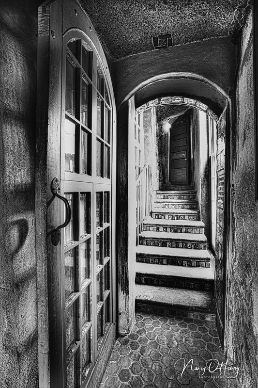
Please help! I'm having difficulty understanding what makes a "good" black and white photo. Have I processed this color photo to be a "good" black and white or not? What makes a "good" black and white?? Inquiring minds want to know!

Dec 20, 2017 23:23:00 #
Dec 20, 2017 23:26:36 #

Contrast is a good indicator usually if the histogram has 2 peaks in the darks and lights, it may work well as black & white.
Another maybe. Does the color enhance the photo? If not maybe black & white.
Is there color in the scene, sometimes its a very monochrome day.
Sometimes high iso noise can cause a photo to be best as black & white
Another maybe. Does the color enhance the photo? If not maybe black & white.
Is there color in the scene, sometimes its a very monochrome day.
Sometimes high iso noise can cause a photo to be best as black & white
Dec 21, 2017 00:01:07 #
Dec 21, 2017 00:08:43 #
I focus on my backgrounds, but I care more about the relationship between my subject and background, rather than a particular color. . Black and white allows me to begin to think about key elements (lighting, composition, elements in and out of the frame) that I might otherwise not focus on as much when I am thinking about making colors work together.
Dec 21, 2017 03:16:17 #

Strong contrast with good definition makes for a good Black and White photograph.
Your Black and White conversion is a good effort. However, there are areas on the steps
were the light coming from the right needs addressing, toning down.
Your Black and White conversion is a good effort. However, there are areas on the steps
were the light coming from the right needs addressing, toning down.
Dec 21, 2017 06:28:20 #

I have a very simple rule for photography in general, if you like it like it is then it is a good b&w or color image.
With b&w you should have a good representation of the different tonalities of the subject. Contrast when properly used goes a long way. Subjects with bright and shadow areas are typical b&w subjects.
Of course there are rules and pictures tend to look better and pleasing to the eye when those rules are followed...or wisely broken.
Dec 21, 2017 06:36:51 #

This is a tough one..I think it works well either way!...many say for a good B&W..you have to have black blacks, and white whites, but I have seen many great B&W's that don't hit the 0-255 marks!!
Dec 21, 2017 08:56:29 #

When I view these, I see the color first in the color version, and the scene first in the black and white. Therefore, I’ll go with the black and white because the scene is the point of the shot here, I think.
Dec 21, 2017 09:11:12 #

I very much like the subject and composition. While both version are attractive, I prefer the B&W for impact. Well done.
Dec 21, 2017 10:16:28 #
gvarner
Loc: Central Oregon Coast
OHenry wrote:
Please help! I'm having difficulty understanding what makes a "good" black and white photo. Have I processed this color photo to be a "good" black and white or not? What makes a "good" black and white?? Inquiring minds want to know!
I think you have an excellent black and white. The color in the color version distracts from the detail and contrast in the other.
Dec 21, 2017 11:55:52 #
gvarner wrote:
I think you have an excellent black and white. The color in the color version distracts from the detail and contrast in the other.
It is pretty much monochrome in color, varying strong shades of nicotine brown which is very much in your face, this I think tends to detract from the detail. Maybe a little desaturation of that might help the colored tiles in the stairs pop out more. It might ruin the atmosphere too there is a nice light to the scene.
Dec 21, 2017 19:00:50 #

i think the b&w really brings out the window shadows ! The hex floor pattern stands out more in the b&w. I'm no professional by any means but i know what i like...
If you want to reply, then register here. Registration is free and your account is created instantly, so you can post right away.