what do you think? gave me all you got: I can take it!
Dec 16, 2017 10:20:00 #
pooralice
Loc: merced, ca
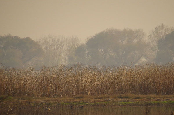
entered this picture in a contest and it was picked as one of the best, but I need to know why? what would you do to change it? I wanted to be foggy and I know that is what the judge liked about it; I find it depressing.
Dec 16, 2017 10:26:40 #
Nice shot. The controversy would be about the composition. Classic "layer cake" compositions are not often seen in photography except by amateurs and artists (witness Andreas Gursky's work). Maybe the judge was thinking how nice the earth tones look in a post-painterly abstraction type composition. In other words, I would think the judge leans more towards avant gardism than traditionalism in photography composition. You lucked out with the judge in this case. This pic wouldn't stand a chance in most photog. competitions.
Dec 16, 2017 10:35:31 #

pooralice wrote:
entered this picture in a contest and it was picked as one of the best, but I need to know why? what would you do to change it? I wanted to be foggy and I know that is what the judge liked about it; I find it depressing.
I think it looks more 'moody' than depressing Alice. I do indeed like your image.
Dec 16, 2017 10:51:39 #

pooralice wrote:
entered this picture in a contest and it was picked as one of the best, but I need to know why? what would you do to change it? I wanted to be foggy and I know that is what the judge liked about it; I find it depressing.
For me it looks flat first of all. The color is dull and lack of contrast. Maybe PP you can revive it I don’t know? Good luck!
Dec 16, 2017 10:55:38 #
Dec 16, 2017 11:01:40 #
pooralice
Loc: merced, ca
Yes, it need something interesting in the foreground, but I wasn't going to add it (too much work) and the color is dull and does lack of contract, but when I tried to added with pp I just could not get it right. that's why it depress me.
Dec 16, 2017 11:46:25 #

pooralice wrote:
entered this picture in a contest and it was picked as one of the best, but I need to know why? what would you do to change it? I wanted to be foggy and I know that is what the judge liked about it; I find it depressing.
Alice, I can see why it was picked as one of the best.It reminds me of a fine painting. Outstanding image. I would maybe tweak it slightly in PS or Lightroom
Dec 16, 2017 11:51:18 #
The question is why did it win not how to improve it. To repeat, the judge likes minimalism.
Dec 16, 2017 12:03:22 #

What was the venu? What was it being compared to? Are the results online somewhere? Was there a theme? The mood is calming, but no real subject matter. Hard to guess what the judge was thinking.
Dec 16, 2017 12:11:44 #
It is the slightly slanting shape of the tree right of center that gives the composition an unusual expressive quality. The fact that your approach to composition is so similar to how a master landscape painter would go about it may perhaps have been the primary reason this image stood out in the competition. If the judge involved understood the Arts, particularly with concern to the history of traditional painting, he/she would have certainly picked up on the significance of such a detail within the composition.
Dec 16, 2017 12:29:05 #
I'm involved in judging photography competitions all the time. I'm not trying to be unkind but my thoughts are you won the luck of the draw with this judge. You may not be as lucky next time when you have a superior composition and don't win. So take it for what it is and enjoy. An individual win doesn't prove much unless you can repeat your success over and over in different venues. Such are the vagaries of photography competitions.
Dec 16, 2017 12:54:08 #
pooralice
Loc: merced, ca
I pasted this from the show: the Carnegie Arts Center is celebrating the variety of artistic creativity found in California’s Central Valley. This year the show will feature works by the area’s most accomplished photographers. Entries will be accepted from throughout California and the exhibition will be juried by well-known photographer Ted Orland.
Nothing is online yet.
Nothing is online yet.
Dec 16, 2017 13:37:15 #
Dec 16, 2017 14:29:02 #

Well, posting this in the right section of the board would be a great step... Foru your consideration comes to mind...
Now this will end up in the gallery before long.
Now this will end up in the gallery before long.

Dec 16, 2017 14:55:47 #

Most people would rate this as being under-processed. The reason why you got away with it is because under-processed suits the scene. Misty shots tend to be lacking in contrast and colour.
On top of that, the composition is a bit bland, but some might describe it as suitably minimalist. One possible answer - cropping in from the right side would focus the attention on the part of the background that has variety and visual interest.
On top of that, the composition is a bit bland, but some might describe it as suitably minimalist. One possible answer - cropping in from the right side would focus the attention on the part of the background that has variety and visual interest.
If you want to reply, then register here. Registration is free and your account is created instantly, so you can post right away.