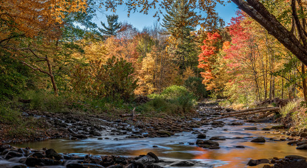
Woodland Valley Creek, two versions (PL)
Dec 6, 2017 08:11:55 #

First was with an 85mm PC-E, D800 in portrait orientation, series of 5 HDR (2 exposure bracket) positions, merged in Lr. Exposure was .8 and 2.5 sec both at F16, slight tilt for DoF for each image, HDR mered in Lr. Foreground was desaturated slightly and adjusted for color temp using radial filters in Lr to compensate for the difference between color temps in the sunlit trees (warm) vs the shade and tree canopy (cool and green) in the foreground.
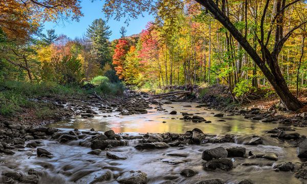
Second image was taken with a 45 PC-E, no HDR, just exposing for the highlights, 5 positions merged in Lr, foreground desaturated as in the first image.
Critical comments, and questions, welcomed!
Second image was taken with a 45 PC-E, no HDR, just exposing for the highlights, 5 positions merged in Lr, foreground desaturated as in the first image.
Critical comments, and questions, welcomed!
Dec 6, 2017 08:27:43 #

Gene, these are both beautiful. I read how carefully you adjusted and the end result is totally natural and pleasing!
Dec 6, 2017 08:39:33 #

Both are quite good. Prefer #1. Love the light and the detail in the shade. HDR achieves what it was intended to do.
Dec 6, 2017 09:03:11 #

I also prefer #1, not because of the tighter crop but because the second one looks over exposed, at least on my monitor.
Dec 6, 2017 09:52:38 #

Your usual fine work!
I also prefer the first one. The tighter crop and the resultant composition difference are more attractive to me. In the 2nd image my eye is immediately drawn to the, by comparison, semi bald water.
I also prefer the first one. The tighter crop and the resultant composition difference are more attractive to me. In the 2nd image my eye is immediately drawn to the, by comparison, semi bald water.
Dec 6, 2017 13:07:38 #
MichaelH
Loc: NorCal via Lansing, MI
I prefer #2 if I view it minus half of the smoothed water area at the bottom. That portion's lack of color seems to take a little away from the image. Both are very beautiful. [I "browser cropped" the second image by just fitting it in a browser window and pulling the bottom of the window up to hide some of the bottom - totally non-destructive.] If I had to choose "as is" then the first would be my choice. It also has more non-green foliage color in the reflected water. 
Dec 6, 2017 15:04:41 #
Great feedback! I was leaning towards #1 myself, but the second image can be reworked to improve it based on everyone's comments. A v2.0 on #2 tomorrow (I hope).
'
'
Dec 6, 2017 15:08:39 #
Gene51 wrote:
Great feedback! I was leaning towards #1 myself, but the second image can be reworked to improve it based on everyone's comments. A v2.0 on #2 tomorrow (I hope).
'
'
FWIW, the reason I prefer the first is the autumn colors in the water. I’m a sucker for that.
I’m enjoying all of your panoramas. The week I had off it rained like Noah was in town; the week I’m back at work, sunny..... what else?
I think our weather man is Mr. Murphy.

Dec 6, 2017 19:57:09 #
MichaelH wrote:
I prefer #2 if I view it minus half of the smoothe... (show quote)
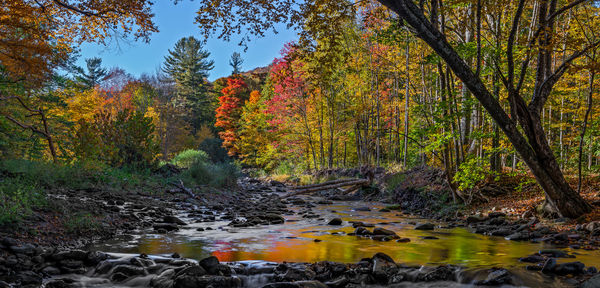
Ok, how does this #2 - V2.0 look to you guys? I think I incorporated all the helpful critique . . .
Dec 6, 2017 20:14:44 #
Dec 6, 2017 20:28:23 #
Gene51 wrote:
Ok, how does this #2 - V2.0 look to you guys? I think I incorporated all the helpful critique . . .
Errr. No. You did add some pop to it but you cropped it when you should have left the original. My opinion of course and nothing else.
Why do I think that?
The huge splash of color in the water distracts from the rest... Or tone it down in the water.
Dec 6, 2017 21:31:42 #
MichaelH
Loc: NorCal via Lansing, MI
Gene51 wrote:
Ok, how does this #2 - V2.0 look to you guys? I think I incorporated all the helpful critique . . .
Damn this doesn't feel right giving this work criticism as it is so good.
But I liked the color of the original non-HDR and would only remove about half of the less colorful smooth water zone. Maybe include those two big rocks on the right (and crop it at the adjoining rock just downstream). And again I must say these are beautiful images.
Did you move your tripod between shots or just swap lenses?
Dec 6, 2017 22:03:33 #
MichaelH wrote:
Damn this doesn't feel right giving this work criticism as it is so good. .../...
When a feedback is requested, it is not criticism. I think we can all learn from something like this. It does not mean our opinion is 'right' but offering a different point of view can hopefully help ALL of us, not only the thread op.
I have a thread in 'for my consideration' where I asked the same feedback (not a panorama). Opinions and perceptions were given. Some I agreed with, other not. This is a way of life but by no means these are criticisms, just honest answers, which we all need.
Dec 6, 2017 22:31:35 #
Rongnongno wrote:
Errr. No. You did add some pop to it but you cropped it when you should have left the original. My opinion of course and nothing else.
Why do I think that?
The huge splash of color in the water distracts from the rest... Or tone it down in the water.
Why do I think that?
The huge splash of color in the water distracts from the rest... Or tone it down in the water.
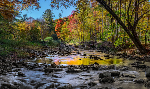
Done!
You guys can discuss what else needs to be done. RGG - you will sum up the recommendations and post. And I will respond with V4.0

One of the issues I am having is that the images appear much more saturated and contrasty in UHH that they do in Lr or in my prints. So I have to be careful when I post strongly colored material.
Dec 6, 2017 22:33:39 #
Rongnongno wrote:
When a feedback is requested, it is not criticism.... (show quote)
Agree. I applaud those holding divergent opinions in remaining respectful. Unfortunately, this is not an altogether common experience in UHH. I can understand Rongnongno’s concern about the bright reflection in the water as an “eye draw”. My opinion is that the second image is better when cropping off right at the point of the log jam but I still prefer image #1.
If you want to reply, then register here. Registration is free and your account is created instantly, so you can post right away.