Another Why Your Photographs Might Suck...By Request from selmslie
Nov 18, 2017 13:47:30 #

OK, here's two almost identical captures. The first letting the camera decide and using Auto in ACR. The second letting the photographer decide, including the initial exposure, and then using only my default initial settings in ACR. Those are the only adjustments done to these two photos. Let the discussion begin.
Yes, Scotty, the meter was set to Matrix for the first one, spot for the second.
So, even with just using my initial ACR adjustments, done with every photo I process, the image is more true to life than what Adobe Auto thinks it should look like.
--Bob
Yes, Scotty, the meter was set to Matrix for the first one, spot for the second.
So, even with just using my initial ACR adjustments, done with every photo I process, the image is more true to life than what Adobe Auto thinks it should look like.
--Bob


Nov 18, 2017 14:00:43 #
ricardo7
Loc: Washington, DC - Santiago, Chile
With the exception of the somewhat "bright" building in the first photo I think
it is better than the second. The color balance is more pleasing, the blacks are
richer and the greens are greener. The building appears to be textureless
concrete so I don't think the exposure is blown out, just very bright. It could
be reduced a bit, but not to the extent of the second rendition. My vote, as
qualified, is for the first photo.
Nov 18, 2017 14:09:26 #
Ricardo, the second is the truer color of the building and the surroundings. Using Auto overexposed the image, the point of the post.
--Bob
--Bob
ricardo7 wrote:
With the exception of the somewhat "bright" building in the first photo I think
it is better than the second. The color balance is more pleasing, the blacks are
richer and the greens are greener. The building appears to be textureless
concrete so I don't think the exposure is blown out, just very bright. It could
be reduced a bit, but not to the extent of the second rendition. My vote, as
qualified, is for the first photo.
it is better than the second. The color balance is more pleasing, the blacks are
richer and the greens are greener. The building appears to be textureless
concrete so I don't think the exposure is blown out, just very bright. It could
be reduced a bit, but not to the extent of the second rendition. My vote, as
qualified, is for the first photo.
Nov 18, 2017 14:14:08 #
The second image looks more like how the scene would have appeared looking through dark, brown-tinted sunglasses, while the first image appears as if captured in extremely bright sunlight, which, going by the clear sky and hard midday shadows, it likely was at the time. Based on that, I'd say the first image is a more realistic rendering, while the second image presents an idealized rendering of the scene.
Nov 18, 2017 14:14:09 #

rmalarz wrote:
Ricardo, the second is the truer color of the building and the surroundings. Using Auto overexposed the image, the point of the post.
--Bob
--Bob
If you say so. I wasn't there. I have been in similar locations and the first image looks quite credible to me. The second one looks like what I would see after I put my Serengeti sunglasses on.
Nov 18, 2017 14:15:35 #
I wouldn't want the first building in my neighborhood. Way too bright; hurts the eyes. Not knowing the building I can't say if it is really as yellow/amber as the second, but the white pavement stripes are knowable, and are too saturated. Perhaps drop the yellow sat by 15 points (in Hue/Sat in PSE) and then use the eye-dropper in Levels and place the bright side of the building at about 243 (on the 1-255 scale) for a comfortable level of maximum brightness. And tear down that flagpole, whatever, cuts the pic in half!
Nov 18, 2017 14:17:15 #
rmalarz wrote:
Ricardo, the second is the truer color of the building and the surroundings. Using Auto overexposed the image, the point of the post.
--Bob
--Bob
That is quite a surprise. Usually a meter will automatically underexpose images with large areas of white (snow, sand etc).
Nov 18, 2017 14:17:40 #

rmalarz wrote:
OK, here's two almost identical captures. The firs... (show quote)
Those of us who shot slide film learned long ago that camera metering systems misjudge scenes including light-colored buildings, so we had to over-ride the camera's decision to get a picture looking closer to the actual scene.
Nov 18, 2017 14:23:36 #
Perhaps that is what is driving the over exposure propensity of PS ACR. Wanting to make the photo more idealized to people's taste.
--Bob
--Bob
rook2c4 wrote:
The second image looks more like how the scene would have appeared looking through dark, brown-tinted sunglasses, while the first image appears as if captured in extremely bright sunlight, which, going by the clear sky and hard midday shadows, it likely was at the time. Based on that, I'd say the first image is a more realistic rendering, while the second image presents an idealized rendering of the scene.
Nov 18, 2017 14:26:35 #

Nov 18, 2017 14:30:19 #

Bob, Just for S&G I copied both downloaded images into PS and checked their histograms. The first image was biased to the right SURPRISE! The 2nd mostly balanced.
and folks, for those of you who might not have visited the Phoenix area, adobe is a very popular color.
and folks, for those of you who might not have visited the Phoenix area, adobe is a very popular color.
rmalarz wrote:
--Bob
--Bob
Nov 18, 2017 14:30:36 #

rmalarz wrote:
Perhaps that is what is driving the over exposure propensity of PS ACR. Wanting to make the photo more idealized to people's taste.
--Bob
--Bob
That would actually make sense. The people who wrote the program don't know what you actually saw. They probably posted 5 versions of the same image on UHH and wrote the program based on UHH member's preferences.
Yikes! That would be scary.

--
Nov 18, 2017 14:31:00 #
Woody, don't be distracted by the shiny objects. The discussion surrounds the use of Auto in both camera and Photoshop. Additionally, it's not a problem to be solved by discussing changing settings. I can take the original and process it to appear more like the actual scene. These examples are to show what trusting your camera and processing software will do to an image.
This all started when I found, quite by accident, and article that discussed a way to set each slider automatically. I noted that when I did that, PS tended to push things to the right, thus getting to the point of appearing to be overexposed. The biggest question is why?
--Bob
This all started when I found, quite by accident, and article that discussed a way to set each slider automatically. I noted that when I did that, PS tended to push things to the right, thus getting to the point of appearing to be overexposed. The biggest question is why?
--Bob
woodyH wrote:
I wouldn't want the first building in my neighborh... (show quote)
Nov 18, 2017 14:33:31 #
Exactly the point. However, I'll put my 2 cents in, in that it is not the most attractive color they could have painted that building. But, that's beside the point of the post.
--Bob
--Bob
Rich1939 wrote:
Bob, Just for S&G I copied both downloaded images into PS and checked their histograms. The first image was biased to the right SURPRISE! The 2nd mostly balanced.
and folks, for those of you who might not have visited the Phoenix area, adobe is a very popular color.
and folks, for those of you who might not have visited the Phoenix area, adobe is a very popular color.
Nov 18, 2017 15:27:54 #
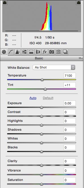
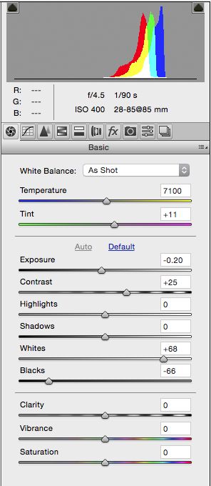
As a further study, and proof that ACR pushes things to the right, here's a couple that were done at the suggestion of an esteemed colleague, another UHH member. This will eliminate the exterior decorators in the house criticizing the color of the building. I used a gray card.
I photographed a gray card using P mode on the camera and Matrix metering, as suggested by Selmslie a few posts ago. I guess the phrase read em and weep might be appropriate at this point.
Auto definitely pushes to the right. Now the question is why?
--Bob
I photographed a gray card using P mode on the camera and Matrix metering, as suggested by Selmslie a few posts ago. I guess the phrase read em and weep might be appropriate at this point.
Auto definitely pushes to the right. Now the question is why?
--Bob
rmalarz wrote:
OK, here's two almost identical captures. The firs... (show quote)

If you want to reply, then register here. Registration is free and your account is created instantly, so you can post right away.