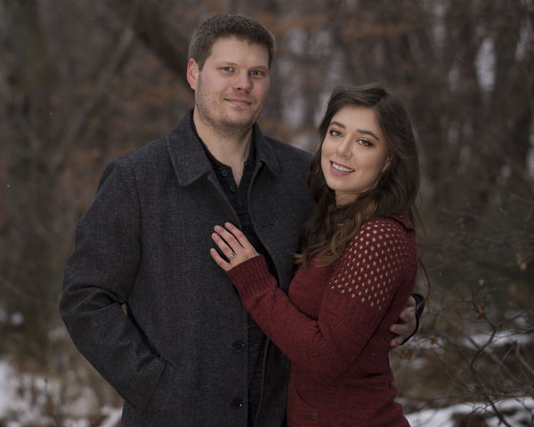
Save-the-date Photo
Nov 7, 2017 15:35:31 #

Honest critique please.
Flash used
1/250 sec
f/3.5 100mm
ISO 400
22°
10mph north wind
Flash used
1/250 sec
f/3.5 100mm
ISO 400
22°
10mph north wind
Nov 7, 2017 15:45:41 #

The people are photographed rather nicely. I think the left and right edges of the photograph should be cropped closer to the subjects. That puts more attention towards them, rather than the background behind them.
--Bob
--Bob
Nightski wrote:
Honest critique please.
Flash used
1/250 sec
f/3.5 100mm
ISO 400
22°
10mph north wind
Flash used
1/250 sec
f/3.5 100mm
ISO 400
22°
10mph north wind
Nov 7, 2017 15:47:10 #
rmalarz wrote:
The people are photographed rather nicely. I think the left and right edges of the photograph should be cropped closer to the subjects. That puts more attention towards them, rather than the background behind them.
--Bob
--Bob
Thanks Bob. I think I have quite a few verticals that accomplish that.
Nov 7, 2017 16:21:04 #

You know that I love it, though it seems a little darker here than on FB. I wonder if it was a touch brighter.....
Nov 7, 2017 16:26:05 #
Country's Mama wrote:
You know that I love it, though it seems a little darker here than on FB. I wonder if it was a touch brighter.....
That always happens to me here. I thought that the moment I posted it and I am so glad you said it. Now I know I'm not just going crazy. Same pic from same computer.
Nov 7, 2017 16:32:01 #
Nightski wrote:
That always happens to me here. I thought that the moment I posted it and I am so glad you said it. Now I know I'm not just going crazy. Same pic from same computer.
I think it happens a lot here also. It is weird because it doesn't always happen.
Nov 7, 2017 17:06:12 #
Nightski wrote:
Honest critique please.
Flash used
1/250 sec
f/3.5 100mm
ISO 400
22°
10mph north wind
Flash used
1/250 sec
f/3.5 100mm
ISO 400
22°
10mph north wind
Nice looking couple. Well-composed photo. Perhaps blur the somewhat distracting branches on the right side of the shot.
Nov 7, 2017 17:34:03 #

Nightski wrote:
Honest critique please.
Flash used
1/250 sec
f/3.5 100mm
ISO 400
22°
10mph north wind
Flash used
1/250 sec
f/3.5 100mm
ISO 400
22°
10mph north wind
Wow..windy. Nive image..I would like to see them closer to each other and get a perspective that eliminates that dark branch on the male to improve it.
Nov 8, 2017 05:47:53 #

Nice shot. Only thing I would do different is move the young lady's head closer to his shoulder. Head in this position looks like she is pushing away.
Nov 8, 2017 06:02:12 #
Overall, it’s not bad but agree with Country's Mama ‘bout brightening the image. Pose and expressions are good and I like the limited and subdued colors. The fill-in flash intensity is just ‘bout perfect but would serve better if a foot higher. As shot, the female is not much taller than the flash and isn’t as appreciably affected by upward cast shadows but the guy has unfortunate nose and cheek shadows…
Nov 8, 2017 09:55:33 #
Most of the time If I make any suggestions I will download and try something first, open in Photoshop and take a look to see what might be done. On this occasion I did open in Photoshop and got a big surprise. The photo is so much better in when viewed in Photoshop that I can't justify any of my original thoughts. The woman's skin is outstanding in Photoshop, not so much here or in download page.
The only thing I might change, if you are going to make a print, is to lighten/brighten a small bit but only for the version I would print from. When sending out for prints I have been disappointed in that the printing process loses a bit of detail and the picture is a bit darker than on my monitor.
I think you have an outstanding picture here with a wonderful pose. Thanks for sharing.
Nov 8, 2017 11:52:31 #
Jim-Pops wrote:
Most of the time If I make any suggestions I will ... (show quote)
Thank you for looking more closely, Jim, and thank you for the kind comments,
Nov 8, 2017 11:59:54 #
fuminous wrote:
Overall, it’s not bad but agree with Country's Mama ‘bout brightening the image. Pose and expressions are good and I like the limited and subdued colors. The fill-in flash intensity is just ‘bout perfect but would serve better if a foot higher. As shot, the female is not much taller than the flash and isn’t as appreciably affected by upward cast shadows but the guy has unfortunate nose and cheek shadows…
Yes. You are spot on. I don't have a flash stand so I had to find a place to put it. I was quite disappointed by the shadows, but had a horrible time correcting for them. The color was off om my correction attempts. I did do quite well with the red skin on the ears and nose of the male. I opened my info window in Photoshop and moused over the skin that was not red near the ear. Wrote down the RGB numbers that showed up. Then I added a curves mask. Click option-shift on the red skin. Went into Red, Green, Blue channels and adjusted the output numbers to the ones I had recorded. Command-Control i for invert. White brush at 33% opacity to bring back the right skin color on ears and nose. Some areas needed more correction than others, so using less opacity worked well. However, I tried this with the shadows and I just couldn't get the color right and I think it's because I needed an exposure adjustment as well and it was too hard trying to get the right combo of color and exposure. Does that make sense?

Nov 9, 2017 00:24:04 #
vooda
Loc: Bribie Island,QLD,Australia
I retouched your very nice photo in PS CS6 with Topaz plugins... A closer crop, brightened, less shadow, denoised and a lot of content-aware to get rid of dust spots and other eye catching nasties.. I feel the composition gives it that "OOPS, we have been sprung", moment, so obviously the young lady would pull back slightly... I hope you approve of my retouch... Stay safe...John C
Nov 9, 2017 20:28:17 #
vooda wrote:
I retouched your very nice photo in PS CS6 with Topaz plugins... A closer crop, brightened, less shadow, denoised and a lot of content-aware to get rid of dust spots and other eye catching nasties.. I feel the composition gives it that "OOPS, we have been sprung", moment, so obviously the young lady would pull back slightly... I hope you approve of my retouch... Stay safe...John C
Thank you for your kind gesture, John. I will download before deleting it from the page as edits aren't allowed in the Photo Critique Section.
If you want to reply, then register here. Registration is free and your account is created instantly, so you can post right away.