Around The Lake District
Oct 25, 2017 09:24:12 #

I hope you enjoy these shots from my Spring trip earlier this year. I'll be returning shortly. Anybody have suggestions on improvement - whilst loving the landscape, I don't find it easy to photograph or pp? Everywhere you look is lovely, but soooo big! Any assistance appreciated.
Oct 25, 2017 09:58:35 #

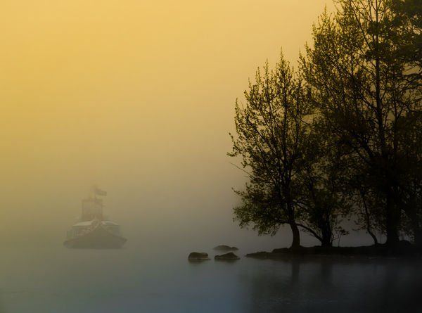
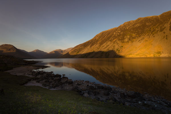
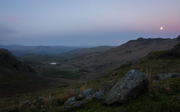
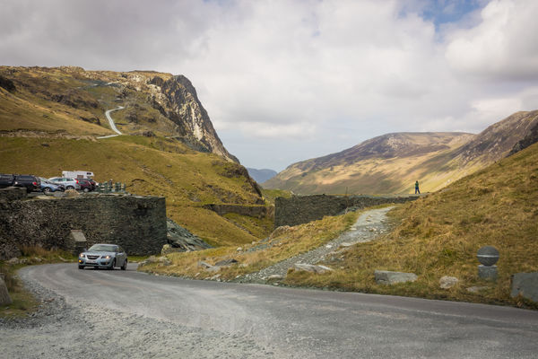
These are very nice as a series or individually. The first, fourth and last are especially strong to me, the first being my favorite. The second and fifth appear overly dark on the thumbnails but not really on the downloads. Which may mean that if you decide to print them, you'll want to be very careful. The second is a very beautiful image but has a slightly muddy cast to it; for me a simple curves adjustment would make this one outstanding. The moon in #3 looks like my moons and I'm ever searching for a cure (weak detail if when shooting a landscape, a red ring around the edge that gets worse if you try to retrieve detail). I like #4 for being exactly what it is, along with having a very balanced and effective composition. That last one is just a fabulous composition, rich in geometry and artistic design; I might be tempted to try to get more out of the colors, but the delicate approach you have used is quite nice, and I would probably be wrong to try and wring more out of it.
Very nice series, I enjoyed it a lot.
Very nice series, I enjoyed it a lot.
Oct 25, 2017 10:10:42 #
minniev wrote:
These are very nice as a series or individually. T... (show quote)
Thanks for a thoughtful critique Min, that’s just what I’m after.
Not sure why the titles haven’t loaded, I did add them.
That first one is the steam yacht Gondola and is a composite (which won’t surprise as its me, and the flags should’nt be blowing around or the mist would have cleared).
I play with selective saturation a lot when pp-ing landscapes - surely it must vary from near to far? That’s my theory anyway.
Glad you enjoyed them.
Oct 25, 2017 12:29:12 #
Oct 25, 2017 12:55:42 #
Frank2013 wrote:
Not much to say after minniev speaks..nice magneto
Thank you Frank.
Oct 25, 2017 15:01:10 #

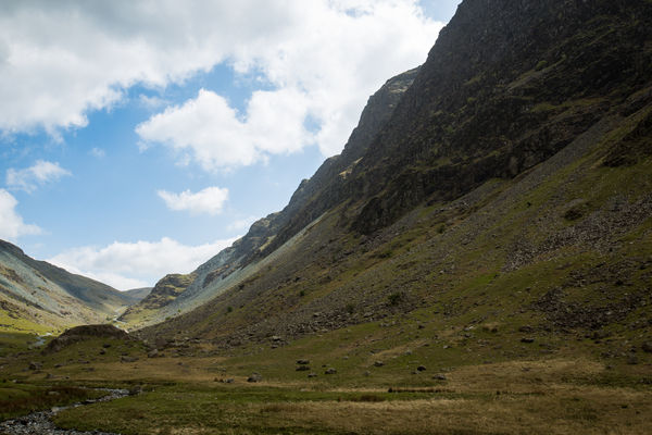
To my eye, some of the darks are a bit too dark. I suspect that #3 would benefit from having the distant stuff lightened and the foreground slightly darkened. I'm not suggesting that you turn it into a daylight shot, but you could keep the soft late evening light and still have a more eye-catching hillside.
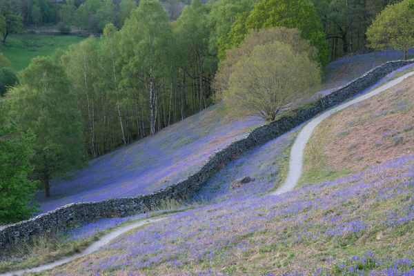
It's a pity that the bluebells won't be there when you go back.
It's a pity that the bluebells won't be there when you go back.
Oct 25, 2017 16:08:48 #
I understand that number 1 is a composite but that doesn't concern me. I think it is outstanding. The others are pretty good as well apart, perhaps, for the last one.
Might have to schedule a visit to the Lake District next spring or autumn.
Might have to schedule a visit to the Lake District next spring or autumn.
Oct 25, 2017 16:22:16 #
R.G. wrote:
To my eye, some of the darks are a bit too dark. I suspect that #3 would benefit from having the distant stuff lightened and the foreground slightly darkened. I'm not suggesting that you turn it into a daylight shot, but you could keep the soft late evening light and still have a more eye-catching hillside.
It's a pity that the bluebells won't be there when you go back.
It's a pity that the bluebells won't be there when you go back.
I think you and I see contrast differently RG - I’m an old man and suspect my contrast perception isn’t anything like as good as yours. I have lightened the background by degrees according to distance - purely arbitrarily of course, nothing scientific! I’ve also darkened the foreground (and increased saturation) slightly.
Our screens may differ as well but I expect it all comes down to my eyesight.
Yes, I’ll miss the bluebells but there’ll be something to compensate, I just don’t know what!
Oct 25, 2017 16:29:54 #
amersfoort wrote:
I understand that number 1 is a composite but that doesn't concern me. I think it is outstanding. The others are pretty good as well apart, perhaps, for the last one.
Might have to schedule a visit to the Lake District next spring or autumn.
Might have to schedule a visit to the Lake District next spring or autumn.
Glad you like them amersfoot. Thanks for commenting.
Both seasons are great for the area, although spring may be a little easier to predict timewise. We caught the bluebells but missed the daffodils, which would have been a week or two earlier. Last year we were on Dartmoor for autumn and it was perfect for colour. Same time this year will miss it! Just depends on the weather.
Oct 25, 2017 19:41:26 #

magnetoman wrote:
Thanks for a thoughtful critique Min, that’s just what I’m after.
Not sure why the titles haven’t loaded, I did add them.
That first one is the steam yacht Gondola and is a composite (which won’t surprise as its me, and the flags should’nt be blowing around or the mist would have cleared).
I play with selective saturation a lot when pp-ing landscapes - surely it must vary from near to far? That’s my theory anyway.
Glad you enjoyed them.
I enjoyed all your shots, but I do like your composite the best. You matched the colors perfectly to make it looks as if it’s part of the original photo. I wanted to quote this particular reply as you commented on the first thing I noticed: the blowing flag on a glass surface. Two options would be to delete the flag, or paint in some rougher water. Additionally, I’d add a blueish gray waterline to separate the boat from the water and to help it create a little forward motion as the gondola breaks through the water. Aside from that, I think you did a really nice job!

Oct 26, 2017 03:26:36 #
donolea wrote:
I enjoyed all your shots, but I do like your compo... (show quote)
Thank Don, I’ll revisit this one.
The composite I mentioned to you the other day is actually this one: www.uglyhedgehog.com/t-491909-1.html
Would appreciate any comments.
Dave.
Oct 26, 2017 06:13:15 #
I like #1, #2, and the last one. They all draw me in and take some time to see all aspects of the picture. #1 is my favorite, just clone out the waving flag and its perfect. I also like your last one because it is something most of us have never seen before with all the blues. Just wonderful in the download page.
Oct 26, 2017 07:08:35 #
Jim-Pops wrote:
I like #1, #2, and the last one. They all draw me in and take some time to see all aspects of the picture. #1 is my favorite, just clone out the waving flag and its perfect. I also like your last one because it is something most of us have never seen before with all the blues. Just wonderful in the download page.
Thank you Jim. Those bluebells were unexpected - I hadn’t realised how widespread they’d become. A week or so earlier and we’d have caught the daffodils made famous by Wordsworth - and, indeed, planted by him and his sister!
I tried photographing individual bluebell plants but decided the best effect was with a sward.
Oct 26, 2017 12:59:08 #

Oct 26, 2017 14:32:44 #
Bushpilot wrote:
A nice series, beautiful country, the first one is my favorite.
Thank you Bushpilot, glad you like them.
If you want to reply, then register here. Registration is free and your account is created instantly, so you can post right away.