too much?
Oct 24, 2017 14:23:45 #

Oct 24, 2017 14:28:36 #
Wish this was multiple choice
But I'll stick with what is missing -----
The PHOTOGRAPH
OH my goodness now I see it --- Let you have an opinion just as soon as I take a look
But I'll stick with what is missing -----
The PHOTOGRAPH
OH my goodness now I see it --- Let you have an opinion just as soon as I take a look
Oct 24, 2017 14:32:53 #
Looks fine though a tad dark --- EXIF not at all helpful
All -in- all : I would be happy with that shot
All -in- all : I would be happy with that shot
Oct 24, 2017 14:36:14 #
Oct 24, 2017 15:01:14 #
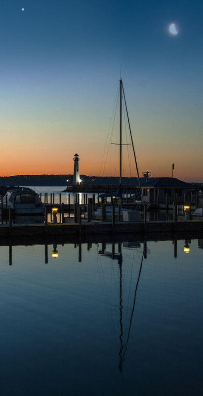
I don't find it to be too dark. However, the light in the upper left corner is a distraction that pulls my attention there instead of elsewhere. Also, why is the moon that dingy, flat, grey tone? Burning it in like that when it brings no additional texture or detail does nothing for it. Otherwise, it is well done image of a good subject.
Oct 24, 2017 15:05:45 #

Too static for my taste: it is a rare landscape that benefits from a 50-50 split with the horizon.
Oct 24, 2017 15:15:58 #
Good comments... the star and moon were in the sky but not in the frame. There must have been just enough mist in the sky to blur the moon I moved them in in PP... Not certain that it helped... It looked nice to the naked eye. No one noticed that they weren't reflected in the water.
Yes to the horizon being right in the center (vertically...) I wanted to include the reflection of the mast.
Yes to the horizon being right in the center (vertically...) I wanted to include the reflection of the mast.
Oct 24, 2017 17:31:42 #

PhotoKurtz - One thing that might have been done to improve this image might be to change the angle 180°. I copied the image and opened it in Lightroom CC (mobile) on my iPad. When I moved the exposure slider, I could see the sailboat for the first time. The boat was on the other side of the pier and obscured by thick pilings. If you had walked around where the boat was and tried to get to that wooden shack behind the boat, you might have been able to shoot back toward the unobscured sailboat and adjacent boats tied up at the pier. Yes, I would have brightened the scene and added Clarity (rather than Contrast) and Dehaze. From there you might think about balancing the color (Temp, Tint and Vibrance) while keeping the Saturation subdued. Just my 2¢ worth. /Ralph
Oct 24, 2017 17:42:07 #
Thanks, Ralph. I shot that direction to keep the lighthouse in the distance in view. I'll try a couple of your suggestions. I had lightened the shadows slider to bring up the buildings. Thanks.
Oct 25, 2017 09:12:19 #

The shadow areas, mainly around the building could benefit from opening those dark areas in Photoshop. For my taste and if it was my photograph I would clone the star on the top left.
After opening the shadow areas you could need to add some contrast, perhaps a tad of sharpness.
Great shot.
After opening the shadow areas you could need to add some contrast, perhaps a tad of sharpness.
Great shot.
Oct 25, 2017 09:18:24 #
Oct 25, 2017 09:47:19 #
camerapapi wrote:
I would clone the star on the top left.
Wgat do you mean "clone the star?" You mean block it out? I can just hide that layer.
Oct 25, 2017 10:09:39 #

To my mind, a better composition would have been to go on the other side of the dock and photographed the light house with reflection, the moon, and the sunset.
Oct 25, 2017 14:54:21 #
DonB
Loc: Port Royal , Tn
First thing I noticed, lantern in the lighthouse is not on. I can agree with the others, however to each his own.
Oct 25, 2017 17:18:54 #
PhotoKurtz wrote:
Algoma Pierhead Light in July. What's missing?
Since you asked, I don't really care for the composition! It looks like an image split in half!
If you want to reply, then register here. Registration is free and your account is created instantly, so you can post right away.