Color or B&W
Oct 19, 2017 07:55:54 #

Oct 19, 2017 07:59:58 #
Oct 19, 2017 08:03:33 #

Oct 19, 2017 08:10:24 #
Oct 19, 2017 08:12:17 #
Oct 19, 2017 08:19:59 #
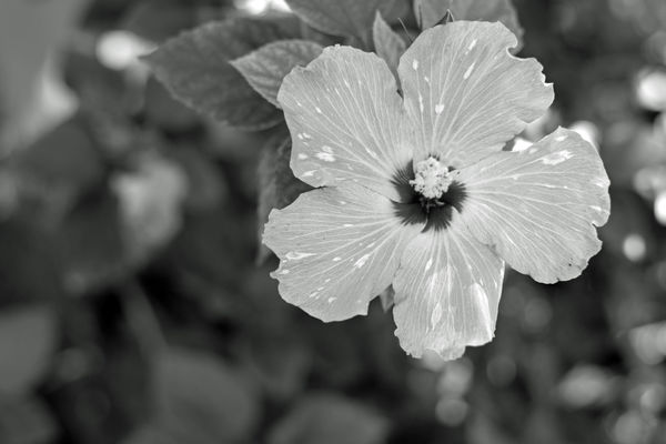
Flowers call for COLOR.....oft times foliage alone works beautifully in B&W.....
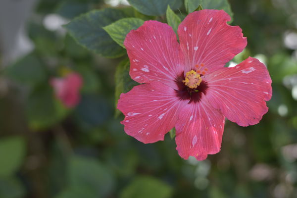
Hibiscus flowers are very bright or very rich in the reds so lighting is especially important for pleasing images in my humble opinion.....
Hibiscus flowers are very bright or very rich in the reds so lighting is especially important for pleasing images in my humble opinion.....
Oct 19, 2017 08:25:35 #

Color, but the colors in your photograph need improvement. That red is dull and not representative of a real hibiscus, at least not the colors of hibiscus I am used to see here in South Florida.
If you use Photoshop go to Adjustments>Vibrance. A window will open with two parameters, Vibrance-Saturation. Vibrance improves dull colors while saturation is a universal control. Move the Vibrance arrow to the right to taste and if necessary use saturation.
If you like it like it is simply ignore me.
Oct 19, 2017 08:32:20 #

Oct 19, 2017 08:50:05 #
leftj
Loc: Texas
itsbill wrote:
What is your preference?
In many photos, Color or B&W are not mutually exclusive. They are both beautiful in their own way. Some photos are just more captivating in B&W. You know it when you see it.
Oct 19, 2017 09:06:14 #

I prefer black & white images, but sometimes color is the only thing that works for the image. Here is one of my black & white images. You can see more on FB @doublegimages.

Oct 19, 2017 09:10:52 #

itsbill wrote:
What is your preference?
In this instance, I feel the color is best.
Rich...
Oct 19, 2017 09:12:25 #

Oct 19, 2017 09:14:57 #
Oct 19, 2017 09:19:05 #
Color, but punch it up a bit, more contrast. B&W might work if more contrast, too.
Oct 19, 2017 09:34:45 #

If you want to reply, then register here. Registration is free and your account is created instantly, so you can post right away.