Critique Amature Photo Session ( Please)
Jun 28, 2012 13:03:57 #

Jun 28, 2012 14:14:59 #
Betzoley wrote:
I am only an amature
Very nicely done, like #2 the best like the color and smile on the model
Jun 28, 2012 14:28:00 #

#1: I like the post processing treatment. Her left hand and some rocks are blown out a bit unfortunately. There is also a bit of reflection into the lens about the same place as her left hip. Other than that...it's good...I like it.
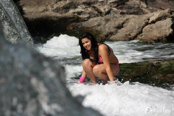
#2: I don't know...it just dosen't thrill me. I think that the lighting isn't helping...its' flat and not "3D"...some other time of day would probably have helped a lot...you know....warm side lighting.
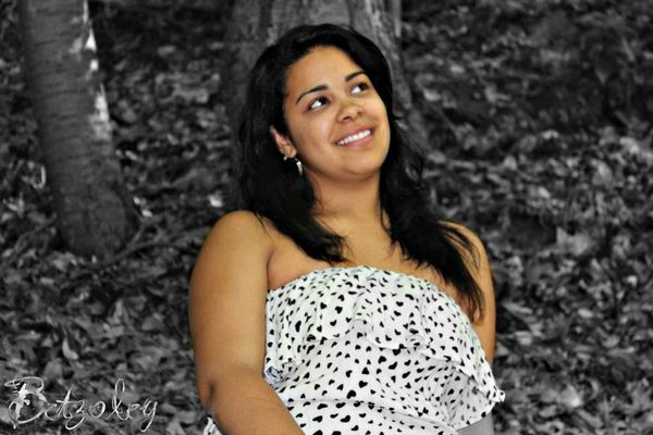
#3: I think maybe the same thing goes here also.
Don't get the impression that I think they stink..they don't...I'm just offering what I see could be improvement.
#2: I don't know...it just dosen't thrill me. I think that the lighting isn't helping...its' flat and not "3D"...some other time of day would probably have helped a lot...you know....warm side lighting.
#3: I think maybe the same thing goes here also.
Don't get the impression that I think they stink..they don't...I'm just offering what I see could be improvement.
Jun 28, 2012 14:37:09 #

rpavich wrote:
#1: I like the post processing treatment. Her left... (show quote)
Good advice :thumbup:
Jun 29, 2012 10:03:58 #
Jun 29, 2012 11:10:52 #
Jun 29, 2012 11:23:43 #


Jun 29, 2012 11:24:46 #

Jun 29, 2012 11:43:56 #

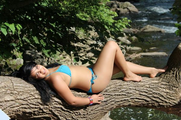
Additional #2 #3 #4 and #5 I really like....well done, and such a pretty model.
Jun 29, 2012 11:59:46 #

rpavich wrote:
#1: I like the post processing treatment. Her left... (show quote)
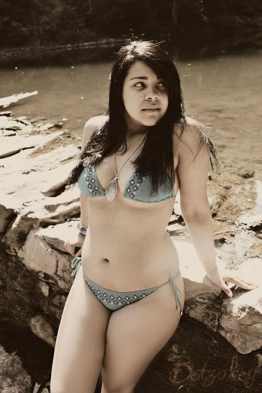
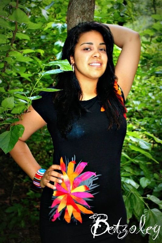
I would like to add the posing in #1 is off, she looks like she has to pee (sorry). You also cropped her right at the knee, try not to crop any any of the body's natural joints. She also has some dark shadowing happening under her eyes, a reflector would have helped there.
#2 also has posing issues, with her body type this pose is making her look thicker than she is. Arching her back some and sucking in her tummy a little would have given the pose more shape and flow and as a result given her a more thinning and natural look. Her one leg that is stretched out fades into the shade, you want to have a natural even light for the whole body.
#3 doesn't look as sharp as the other 2.
#4 the skin tone is off, she looks to yellow on this monitor. You can see the white of her bra under the dress, this takes away from the over all image. Her one arm just disappears behind her head, she has no hand. Watch for disappearing limbs. And of course you have a tree growing out of her head, that's a big, big no no.
#5 I like this one, the treatment is nice (a little to strong for me peronsonal but I like where you are going with it). I like how she is looking off camera in this one, it works well. Focus looks pretty good as well.
#6 - even thou the post work looks pretty close to #5 (which I liked) it just doesn't connect with me as much on this one, I think it's the difference in the lighting. It looks to harsh here. You've also cropped her strangly at the legs. Her top is riding up a little and should have been adjusted. And there are some shadows on her face that should have been avoided.
All in all they are pretty nice, with #5 being my favorite.
Jun 30, 2012 13:16:33 #
Pretty model. I like number two, but I do have to agree with MWAC, does make her look a little heavier than she appears in the other photos. Thanks for posting
If you want to reply, then register here. Registration is free and your account is created instantly, so you can post right away.