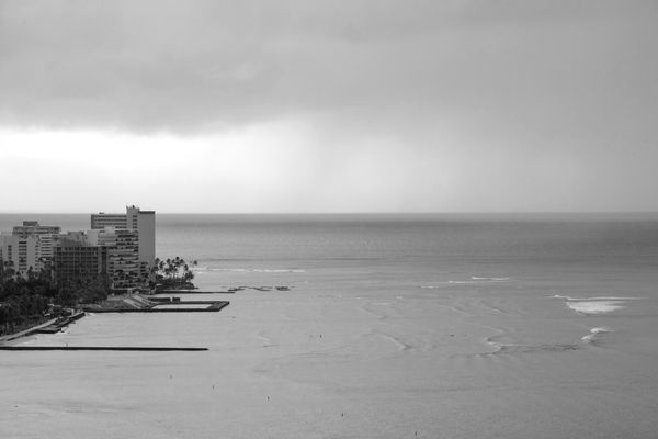
Waikiki Beach
Sep 15, 2017 11:35:07 #
Chicflat
Loc: Tulsa, Ok,
Is this ok as a black and white? I am not really confident as to whether I have a good eye for the style. In this shot I thought the sweep of flat surface would lend itself to b&w, or, is there too little contrast to make it a good subject for the mode?
Sep 15, 2017 11:39:01 #
Sep 15, 2017 11:46:46 #
Sep 15, 2017 11:49:30 #

My first question about this picture is, "What is it about?" The composition doesn't give a strong answer to that. Whether it's good as B+W depends in part on what you're trying to convey with the image.
While many B+W images have strong contrast, that's not a universal, so the fact that this is low contrast is not automatically a strike against it. If there were strong colors in the original that distracted from what you wanted in the image, that might be enough to try B+W.
In general, B+W works better in images with strong texture or strong, bold elements. However, I have seen some wonderful B+W images taken on foggy days, so again, it's not universal.
I find the alignment of the rooftop with the horizon to be distracting. I would have found a slightly different vantage point to avoid that, if possible. If it were my photo, and I wanted the buildings to be the main subject, I would have made them larger in the frame and slightly more toward the center. If the sea is the subject, I'm not sure what I'd do. There's nothing to lead the eye.
YMMV, and these are just my opinions.
Sep 15, 2017 12:00:04 #

Sep 15, 2017 12:00:42 #

I don't think it works as a black and white. I don't see enough different tones and they seem to run together. But even worse is the lack of composition. There is nothing on the right to balance the Left.
Dennis
Dennis
Sep 15, 2017 12:21:22 #
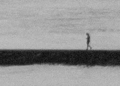
The most interesting part of the picture is the lone figure walking on the foreground pier.
Sep 15, 2017 14:47:49 #
Chicflat
Loc: Tulsa, Ok,
Thanks for your remarks. Part of the problem here is that I was shooting from my hotel room window Limited chance to change pov. I appreciate your recognition of the lacks of focal point. I think that is part of my problem. I just don't see it sometimes - rarely in advance.
Sep 16, 2017 07:15:00 #
Sep 16, 2017 10:26:21 #
I think it just needs cropped. If the right 3rd of the image and the top 1/4th of the image are cropped in, it seems to become much more visually interesting and there is more contrast in the image. I think I like it!
Sep 16, 2017 11:28:39 #
Sep 16, 2017 11:29:42 #
Sep 17, 2017 00:07:00 #
mmmm. All are to picky. I think you are experimenting and are getting close.
I'd only add, maybe pan a bit left to show a bit mor city...
Keep it up!
I'd only add, maybe pan a bit left to show a bit mor city...
Keep it up!
Sep 17, 2017 11:59:29 #
Chicflat
Loc: Tulsa, Ok,
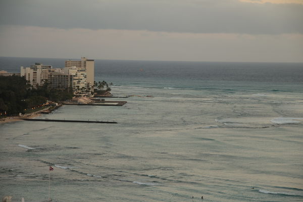
Thanks, but for now I need the picky. My conversion did not capture what I thought was some nuance in the water. I have seen that in other's work. Here is rhe original:
Sep 18, 2017 08:07:03 #
Chicflat wrote:
Thanks, but for now I need the picky. My conversion did not capture what I thought was some nuance in the water. I have seen that in other's work. Here is rhe original:
Instead of B&W you might try pop the colors up a bit. I am liking the color version better than the B&W.
If you want to reply, then register here. Registration is free and your account is created instantly, so you can post right away.