Lydia Paige
Sep 13, 2017 20:42:16 #
she's back.
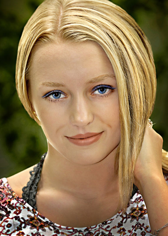
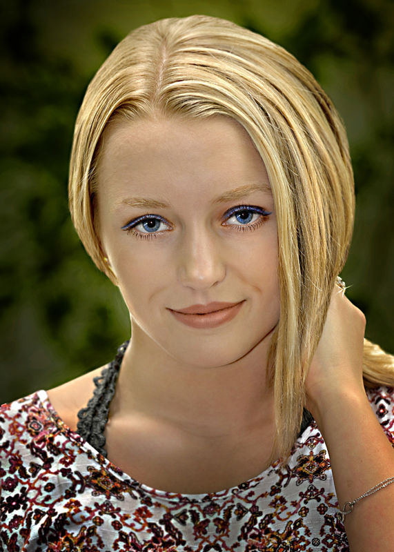
yes, they are that blue. I even softened them a little because they are SO blue, they tend to look a little phony.
yes, they are that blue. I even softened them a little because they are SO blue, they tend to look a little phony.
Sep 13, 2017 20:58:07 #
Very pretty girl, and a very nice photograph, nicely done. I must say though, I am not comfortable with this photo - it may be that she is close enough that she invades my space, but I would feel more comfortable if there were slightly more space around her. On the other hand, I also feel more comfortable with her if I tilt her slightly and crop even tighter to yield just the face and small amounts of hair.
I am not saying this is not a great photograph, I think it is more my preferences that the way you have presented her.
I am not saying this is not a great photograph, I think it is more my preferences that the way you have presented her.
Sep 13, 2017 21:15:31 #
Dan Downie
Loc: Rochester, NY
I agree withat SS119... pretty girl, gorgeous eyes, but too in your face As he suggested, more space around her would be much more pleasing. Nice portrait shot none the less.
Sep 13, 2017 22:50:40 #
WILLARD98407 wrote:
she's back.
yes, they are that blue. I even softened them a little because they are SO blue, they tend to look a little phony.
yes, they are that blue. I even softened them a little because they are SO blue, they tend to look a little phony.
Or?
Sep 13, 2017 23:04:23 #
Dan Downie wrote:
I agree withat SS119... pretty girl, gorgeous eyes, but too in your face As he suggested, more space around her would be much more pleasing. Nice portrait shot none the less.
I had a girlfriend for a while who had the same radiant blue eyes. have to say, I couldn't get enough of her in my face.
thanx for the looks and comments, gents.
Sep 14, 2017 07:37:24 #
Sep 14, 2017 08:37:32 #
No matter the presentation she is one man eater. Both shots are great.
Sep 14, 2017 08:56:52 #
Tikva
Loc: Waukesha, WI
Great shots. I prefer the one where the top of her head is included. It is just a matter of opinion, but I like seeing a whole head in a photo. Other than that, I like the crop. She is a beautiful girl and the photo is also beautiful.
Sep 14, 2017 09:48:54 #
WILLARD98407 wrote:
Or?
I like the second version. It is my personal opinion that a photographer, in a portrait photo, ought to tell the model/subject what would look best for the image. Here, you have a beautiful face with gorgeous blue eyes. For me, the blue eye shadow detracts from her natural beauty, and I would have told her to tone the color down in order not to compete with the color of her eyes. In addition, the angle of the camera creates unflattering shadows by the folds near her mouth. I hope that you have plenty of opportunity to capture this beauty's beauty. Of course, the above is just my own opinion.
Sep 14, 2017 10:46:43 #
Well done! Here's my 2 cents... I would have tilted her head up just a bit so you could shoot into the point of her nose. This sublty brings more attention to her eyes. When I see her I see her nose first. This trick was taught to me by Monte Zucker, who revolutionized wedding photography.
Sep 14, 2017 11:11:24 #
Sep 14, 2017 13:33:08 #
Sep 14, 2017 22:39:04 #
Sep 19, 2017 12:18:30 #
dnathan wrote:
Well done! Here's my 2 cents... I would have tilted her head up just a bit so you could shoot into the point of her nose. This sublty brings more attention to her eyes. When I see her I see her nose first. This trick was taught to me by Monte Zucker, who revolutionized wedding photography.
Thanx for the name drop. I took Zucker seminars in the early 70s. Doing as you suggest with the camera angle will indeed shorten the appearance of the nose,, but will also make the chin more prominent. The lighting on that day was shady and flat. Sometimes you get what you get and make the best of it. Thanks much for the comments, by the way.
Sep 19, 2017 12:26:14 #
ediesaul wrote:
I like the second version. It is my personal opin... (show quote)
Can't argue about the blue eye shadow. Original color was the same as her lip color, but when she saw the blue, that's what she preferred, so that's what I posted. Thanks for your thoughts. mrbill
If you want to reply, then register here. Registration is free and your account is created instantly, so you can post right away.


