Critique - which of the three compositions is better and why?
Sep 2, 2017 16:19:01 #

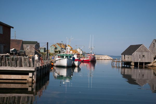
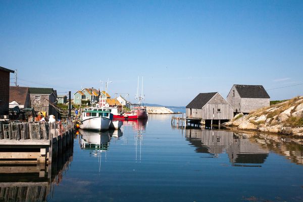
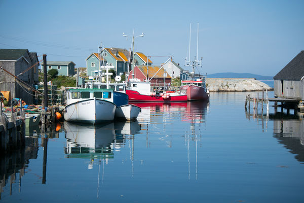
I'm trying to learn how to take better pics. I've been learning to use A mode and had some success. I would appreciate some critique of compositions - there are three pictures below taken at Peggy's Cove, Nova Scotia. The subject is the same. I know that my LR editing differs...I can work on that. For now, I'd appreciate understanding which composition is better and why.
Sep 2, 2017 16:23:25 #

In my opinion, Number 3. The houses and dock draw your eye from the boats in the other two. I presume the boats were what you wanted us to look at?
Sep 2, 2017 16:37:16 #

3. You can see the boats and reflections better. The others are 2 far away.
Sep 2, 2017 16:45:24 #

Sep 2, 2017 16:45:48 #

Yes, #3. The horizon in the other two split the frame in half, making that geometry rather boring. Also, because #1 and 2 are zoomed out, they include a lot of additional objects making it hard for the viewer to know what the subject (i.e. the "point") of the photograph is. And, as Crazy noted, the reflections in #3, which are an aesthetically pleasing element, are well defined, as opposed to those in 1 and 2. Also, I peer the line of the dock on the left leading out of the frame rather than the "box" created in 1 and 2. Also, all the stuff on the right of the channel is irrelevant to my eye.
Sep 2, 2017 16:53:44 #
tjpratt
Loc: Ballard
I will be the odd man out here. #2 for me. If the "boats" (were) the focus, your not in a good spot to shoot them. Maybe from the bank on the right.
For me the subject is the entire "cove", boats, piers and the cove. #2 yup
For me the subject is the entire "cove", boats, piers and the cove. #2 yup
Sep 2, 2017 16:57:30 #

Sep 2, 2017 17:03:44 #

Base_fiddle wrote:
I'm trying to learn how to take better pics. I've been learning to use A mode and had some success. I would appreciate some critique of compositions - there are three pictures below taken at Peggy's Cove, Nova Scotia. The subject is the same. I know that my LR editing differs...I can work on that. For now, I'd appreciate understanding which composition is better and why.
Photo #2 shows the entire harbor and it's components in equal proportions. The top and bottom photos try unsuccessfully to subject the boats. If the boats are your subject emphasize them, you don't. You finally try to highlight the boats in the bottom shot, but the buildings in the background interfere. All three are nice shots IMHO, but I do feel that Peggy gets better coverage in your second photo.
Sep 2, 2017 17:26:33 #

#3 gets the boats, but you're so far away that there is too much compression.
1 and 2 give a slightly better feel for the scene, but are divided in half both by the horizon and the space between the boats and the sheds. They also include far too much of the pier, which is very busy but has too little information.
Basically, you're too far away and standing too far to your right. Zooming in is not the same as getting closer-- elements become compressed and often appear unnatural. You might zoom in when you can't get closer, like with a bear and her cubs. Of course, too wide an angle also distorts the other way.
I think the reflections of the sheds and the boats complement each other. Moving over to the pier (if possible) and finding a viewpoint that includes both without the huge gap, and reduces the impact of the distracting pastel houses in the back, and places the horizon higher would be the way to go. Tall order, but nobody said it would be easy.
Sep 2, 2017 17:30:13 #

#2 is the better of the three #1 looks like it is tilted a little to the right and has an awkwardly cut building on the right. #3 is a closer look at #2 and whilst it shows more of the mooring lines and bouys it also loses the lobsterpots and cuts that right hand building again. I would straighten #2 and crop to remove the black gable end from the left. - this view gives the most context of the setting and the access to open water. ie an inate sense of movement.(will another boat arrive at the dock on the right?.
The problem you have in composition is that you don't move around enough. Had you physically moved to the right you could have got #3 without the chopped building in the frame at all. The far breakwater would have also been minimised and perhaps more of 'the dock' could have been included (or not). Moving to the left would have 'cut the black gable' out of the shot and included everything that made the 'interesting' in the first place.
Composition is not about 'what choices do I have with this view' It is 'where is the best viewpoint in order to understand this view'.'Where can I minimise the clutter & what is the main and secondary subjects' (which often changes as you explore different angles and viewpoints). Learn to walk around...The mess of ropes could have made a great 'foreground' or even 'an interesting shot' in its own right. The relections of the right hand building could have made another shot. etc etc.
'After the fact' never gives the 'right answere' as you have seen. Better to take lots of different shots at a location and then work out 'why' certain images 'feel better' than others. (then delete the others)
have fun
Sep 2, 2017 17:33:53 #
Thanks for the comments - they were very good.
Truth be known, when I got to the cove, I knew that there was a picture there. I liked the stillness, the shadows, the boats, the dock, the entire scene. I took a number of pictures with two different cameras (i.e, Canon 5D and Nikon 1 J5) and compared the shots when I got home. Generally I used aperture priority.
If I'm telling a story about a tranquil fishing village with a focus on the boats, then I was in the wrong spot to catch the boats...I probably should have been across from them. But trying to catch the scene with the lobster traps on the dock and the boats anchored...maybe the boats were out in the morning and fishing was over for the day...now it's just peaceful with a calm sea and beautiful sky. So, I didn't really intend to focus on anything, but clearly the boats caught my eye.
I clearly wanted feedback on how others saw the shots and what criteria you used. YOUR COMMENTS WERE REALLY GREAT!!! Thanks for thoughts!
BF
Sep 2, 2017 18:30:39 #
Visit 500px.com, guru shots.com, etc... and study shots from talented photographers. Good luck
Sep 2, 2017 18:34:29 #
tjpratt
Loc: Ballard
move around, good advice. If a shot is "worthy" its worthy of several different views. IMHO
G Brown wrote:
#2 is the better of the three #1 looks like it is ... (show quote)
Sep 2, 2017 18:40:05 #

#3, there is no question about what I should be looking at.
However, watch your horizons. The are not level.
However, watch your horizons. The are not level.
Sep 2, 2017 19:39:14 #

Base_fiddle wrote:
.../...
How about posting in the 'right place'???
For your consideration, C&C comes to mind. Do read this section instruction.
If you want to reply, then register here. Registration is free and your account is created instantly, so you can post right away.