Fallow deer
Aug 30, 2017 09:10:47 #
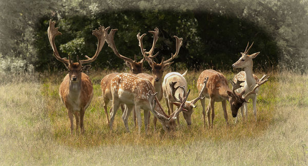
I put the second shot here originally in the Critique section and one of the respondents suggested I might get more feedback in this section so here goes.
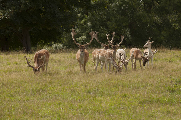
In some land near to me there is a herd of about 150 fallow deer which wander freely and don't get upset if one gets within about 10 yards of them.
The first shot shows a small group of them.
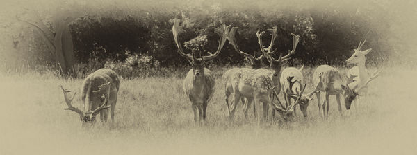
The second shot is the one I placed in the Critique section. One useful suggestion I received was that I should crop out the left hand deer which I thought was a good idea.
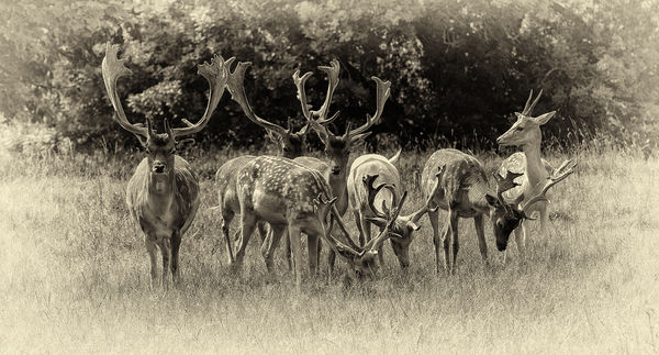
After cropping I used a slightly different method to produce the final shot.
Any suggestions as to any other way I could treat the original shot?
In some land near to me there is a herd of about 150 fallow deer which wander freely and don't get upset if one gets within about 10 yards of them.
The first shot shows a small group of them.
The second shot is the one I placed in the Critique section. One useful suggestion I received was that I should crop out the left hand deer which I thought was a good idea.
After cropping I used a slightly different method to produce the final shot.
Any suggestions as to any other way I could treat the original shot?
Aug 30, 2017 11:49:50 #

If you gave the original the same sort of cropping as the others, that would have worked also.
Aug 31, 2017 07:14:43 #
I like the crop in the third photo as well as the edge treatment, but the original color as in the first.
Aug 31, 2017 11:35:08 #

I really like the original. The group is nicely balanced in the frame with the inclusion of the one on the left. And I like ti better without the heavy vignette.
Aug 31, 2017 11:42:05 #
firtree wrote:
I like the crop in the third photo as well as the edge treatment, but the original color as in the first.
It's just about impossible for me to get the same edge effects in B&W. Attached is the nearest I can get it and I think it doees not have the same impact as the B&W version.
Aug 31, 2017 11:54:05 #
AzPicLady wrote:
I really like the original. The group is nicely balanced in the frame with the inclusion of the one on the left. And I like ti better without the heavy vignette.
I think the original is not balanced. If the deer on the left had been about a yard further to the right the balance would have been improved.
Aug 31, 2017 12:49:28 #
amersfoort wrote:
It's just about impossible for me to get the same edge effects in B&W. Attached is the nearest I can get it and I think it doees not have the same impact as the B&W version.
Yes I see what you are saying. Either take the edge effect further away of out all together. (Then print it out poster size and send it to me
 )
)Aug 31, 2017 21:41:33 #
amersfoort wrote:
I put the second shot here originally in the Criti... (show quote)
I'm a big fan of black and white. To me the third shot is the one I prefer. I like the crop you used and I like the vignette (although I might be a bit more subtle with the vignette). It gives me the feeling of an old photograph and I do like that look. I like how you worked several ideas for post processing before you landed on an idea that you liked. In my experience, that kind of experimentation usually pays off.
erich
Aug 31, 2017 22:50:24 #

I too love the last version, so nicely balanced and love the deer in the middle almost hiding. B&W is great, don't miss color at all on this!
Sep 1, 2017 04:41:11 #
Sep 7, 2017 15:49:52 #

I like the third one the best, by far. I would go a bit lighter on the vignette and the sharpening. I find the colours in the colour version are too muted for use with the vignette. The monochrome is definitely the way to go. The contrast of the antlers with the dark background is the anchor and best part of the picture. You have learned a key lesson: when in doubt about a picture, post it on FYC first. Then post the resulting image to the critique section once it is exactly the way you want it.
If you want to reply, then register here. Registration is free and your account is created instantly, so you can post right away.