Steampunk Peace Redub
Aug 9, 2017 17:00:40 #

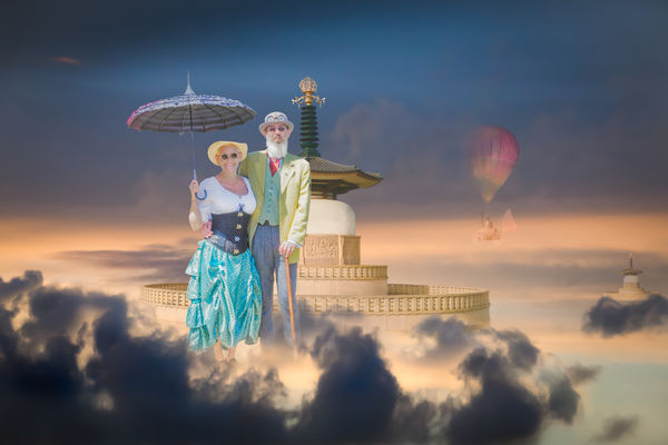
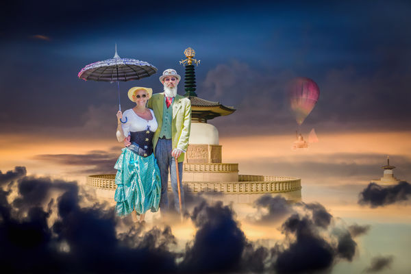
I've made this a new post as you may have got bored with the first one! Hope I can catch those who helped last time as I have incorporated suggestions from that post into a version that gets something like I envisaged, plus the improvements from FYC friends. So, I think this has got to be my final - else I will have to leave it for a while and come back to it in the future. The changes include getting the light in the same direction for all components, increasing foreground cloud depth, scaling-down the main temple and the addition of the balloon. All my own elements. Tried some filters but they seemed to take that 'fresh' look away, so dumped them. Please feel free to critique, it is appreciated.
Aug 9, 2017 17:47:28 #
You did a great job! I liked it before and now like it even more.
Wanted to try something. I took this version increased Clarity and increased Black quite a bit and really like this new version but that is me and know that is not your creative vision. I respect that and applaud your for a job well done.
Jim
Wanted to try something. I took this version increased Clarity and increased Black quite a bit and really like this new version but that is me and know that is not your creative vision. I respect that and applaud your for a job well done.
Jim
Aug 9, 2017 18:00:13 #
Jim-Pops wrote:
You did a great job! I liked it before and now like it even more.
Wanted to try something. I took this version increased Clarity and increased Black quite a bit and really like this new version but that is me and know that is not your creative vision. I respect that and applaud your for a job well done.
Jim
Wanted to try something. I took this version increased Clarity and increased Black quite a bit and really like this new version but that is me and know that is not your creative vision. I respect that and applaud your for a job well done.
Jim
Thanks Jim, your previous help appreciated too. If you'd like to share your new version, feel free to post it here.
Aug 9, 2017 18:30:38 #

Love it, Dave! Bright and fanciful, happy, engaging, wonderfully creative. The more substantial smoke/dark clouds in foreground really anchor the scene and the placement of the couple relative to the pagoda is much more appealing IMO. Super job!
Aug 9, 2017 20:04:25 #
magnetoman wrote:
Thanks Jim, your previous help appreciated too. If you'd like to share your new version, feel free to post it here.
Since you asked.
Aug 10, 2017 02:21:29 #
Linda From Maine wrote:
Love it, Dave! Bright and fanciful, happy, engaging, wonderfully creative. The more substantial smoke/dark clouds in foreground really anchor the scene and the placement of the couple relative to the pagoda is much more appealing IMO. Super job!
Thanks Linda. I'm happier with it than my first attempt - I got mislead by elements of the sky that I liked and didn't consider changing, and the scale was wrong but I just didn't see it. The critique received pointed me in the right direction. Can't beat a bit of FYC!
Aug 10, 2017 02:24:08 #
Jim-Pops wrote:
Since you asked.
I think your extra contrast adds a bit more depth Jim - I'll ponder a while before printing. Your assistance and continued interest has helped all the way. Many thanks.
Aug 10, 2017 07:21:04 #
magnetoman wrote:
I've made this a new post as you may have got bore... (show quote)
I really liked the first one. I also really like this one. I honestly can't decide which I like best. That does not matter a bit. This is very creative and imaginative. I love that hot air balloon drifting in the haze. That was done beautifully. Hats off. This is spectacular.
erich
Aug 10, 2017 07:55:05 #
ebrunner wrote:
I really liked the first one. I also really like this one. I honestly can't decide which I like best. That does not matter a bit. This is very creative and imaginative. I love that hot air balloon drifting in the haze. That was done beautifully. Hats off. This is spectacular.
erich
erich
Thanks Erich, I prefer the second version, but then Jim goes and adds a bit of contrast and now I may prefer it that way! It will get printed, one way or the other!
Aug 10, 2017 08:36:19 #
magnetoman wrote:
Thanks Erich, I prefer the second version, but then Jim goes and adds a bit of contrast and now I may prefer it that way! It will get printed, one way or the other!
You have a choice to make. I really like Jim's contrasty version; but I like the less "in your face" idea of your version as well.
erich
Aug 10, 2017 11:16:09 #

The shadows on the subjects are made from light coming from viewers left while the shadows on the air balloon are made of light coming from the viewers right.
I have a feeling that the dark clouds and the dark upper left sky are countering the pastel effects of the photo.
I have a feeling that the dark clouds and the dark upper left sky are countering the pastel effects of the photo.
Aug 10, 2017 11:39:58 #
SoHillGuy wrote:
The shadows on the subjects are made from light coming from viewers left while the shadows on the air balloon are made of light coming from the viewers right.
I have a feeling that the dark clouds and the dark upper left sky are countering the pastel effects of the photo.
I have a feeling that the dark clouds and the dark upper left sky are countering the pastel effects of the photo.
Don't think I'm going to get it looking any better really - the clouds negate the light area and adding shadow to the right emphasises the balloon too much. I sort of settled for a happy compromise. Not ideal but ?? Any ideas on tackling it short of moving out of the clouds? You're right on the dark areas affecting the general look but I decided to go that way. The whole thing ends up a balancing act. Think I'll stay with it as is unless anyone shows me something I prefer.
Aug 10, 2017 12:23:24 #
magnetoman wrote:
Don't think I'm going to get it looking any better really - the clouds negate the light area and adding shadow to the right emphasises the balloon too much. I sort of settled for a happy compromise. Not ideal but ?? Any ideas on tackling it short of moving out of the clouds? You're right on the dark areas affecting the general look but I decided to go that way. The whole thing ends up a balancing act. Think I'll stay with it as is unless anyone shows me something I prefer.
You can make some of the people happy some of the time, but not all the people all the time.
Aug 10, 2017 12:44:04 #
SoHillGuy wrote:
You can make some of the people happy some of the time, but not all the people all the time.
And thats OK

Aug 10, 2017 12:49:15 #
SoHillGuy wrote:
You can make some of the people happy some of the time, but not all the people all the time.
Yes, that's true, but one needs to keep an open mind, so any critique is always welcome on my posts, and I'm grateful for people taking the time to offer it. If we can see each other's point, thats good enough for me.
If you want to reply, then register here. Registration is free and your account is created instantly, so you can post right away.