Cornish Harbour Version 2
Jul 20, 2017 08:53:32 #

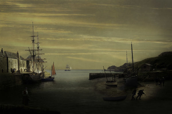
Quite a few, hopefully subtle, pp changes, plus a different sky to image post last week. Hope you're not bored with the scene by now - if not, how do you like this version?
Download essential to view colours correctly.
Download essential to view colours correctly.
Jul 20, 2017 09:10:15 #
Frank2013
Loc: San Antonio, TX. & Milwaukee, WI.
Like this version very much Dave...I would like to see the lower right brighter area blended in a broader way though...it's almost as if a spotlight were shinning.....
Jul 20, 2017 10:38:13 #
Frank2013 wrote:
Like this version very much Dave...I would like to see the lower right brighter area blended in a broader way though...it's almost as if a spotlight were shinning.....
Thanks Frank, I take the point and will adjust it.
Jul 20, 2017 12:09:34 #

I think the brightness or contrast on your monitor must be turned up too high. There are details that are barely visible even in the download and totally undiscernable in the thumbnail. But I can see why you like this scene. I suspect that you intended the atmosphere to be a bit on the heavy side, but it's so dark it's oppressive.
Jul 20, 2017 13:59:11 #
magnetoman wrote:
Quite a few, hopefully subtle, pp changes, plus a different sky to image post last week. Hope you're not bored with the scene by now - if not, how do you like this version?
Download essential to view colours correctly.
Download essential to view colours correctly.
I really love this version Dave !!! However, I do agree with Frank and R.G. The lower area needs lightened up some. I can't imagine I said that. You and I like our dark processing and for me to admit it you know it must be so to some degree. I like seeing the woman at the left lower of the image. There is something about her presence that adds to this image. The light that Frank speaks of is an attention getter. It looks as though someone has a flash light. If those areas are within your intention then forget my comments. I love the concept and your ever so close to perfection with this composite.
Dave
Jul 20, 2017 14:38:45 #
R.G. wrote:
I think the brightness or contrast on your monitor must be turned up too high. There are details that are barely visible even in the download and totally undiscernable in the thumbnail. But I can see why you like this scene. I suspect that you intended the atmosphere to be a bit on the heavy side, but it's so dark it's oppressive.
No, it's me not my monitor RG! Think I was getting a bit tired! I do want it quite dark but agree it may be overdone. I like that you need to look closely for details such as the figures, it's what attracts me to some oil paintings, but it ain't easy yer know!
As an aside, Ive been privately advised to post in sRGB in order to get the colours looking right in the thumbnails as well as downloads, would you agree with that?
Jul 20, 2017 14:43:00 #
Dave Chinn wrote:
I really love this version Dave !!! However, I do ... (show quote)
Yep, I've held my hand up to the darkness in responding to RG Dave, I know it's me.
I did rework that light area, got it looking ok, then messed it up again when darkening. Oh well, back to the drawing board!
Thanks for your comments, they all help persevere.
Jul 20, 2017 14:49:02 #
magnetoman wrote:
......Ive been privately advised to post in sRGB in order to get the colours looking right in the thumbnails as well as downloads, would you agree with that?
sRGB seems to be the safe option. Doing anything else seems to be fraught with the wrong kind of possibilities. I'm quite happy to do all of my editing in that colour space. Do you have a specific reason for using anything else for your editing?
Jul 20, 2017 15:59:14 #
R.G. wrote:
sRGB seems to be the safe option. Doing anything else seems to be fraught with the wrong kind of possibilities. I'm quite happy to do all of my editing in that colour space. Do you have a specific reason for using anything else for your editing?
As far as I'm aware I'm using RGB in Photoshop - can't double check at the moment as the whole caboodle has just locked-up! I recently watched a colourPrinting video advocating ProPhoto for its huge colour gamut, but haven't got far enough into printing to take advantage of it as yet but, in any case, that's not my problem with UHH. Just wondered if there was something about UHH that hugged sRGB rather than anything else.
Jul 20, 2017 19:21:11 #

magnetoman wrote:
... Just wondered if there was something about UHH that hugged sRGB rather than anything else.
Mr. Google has many dozens of articles about how sRGB is the standard for internet viewing, so no, it's not just UHH

One article in SmugMug help FAQ's said they automatically convert your image to sRGB before it uploads. Also, apparently many computer monitors can't see all the colors available in RGB; so it's not solely an internet issue either.
There's no reason to use RGB unless you see a major difference when you print.
Jul 21, 2017 01:43:07 #
Linda From Maine wrote:
Mr. Google has many dozens of articles about how s... (show quote)
Yes, I understand the print issue but wondered if UHH had an idiosyncrasy I didn't know about. Good to hear from you Linda, you've been avoiding me for a few days! Hope you're well.
Jul 21, 2017 07:44:59 #
magnetoman wrote:
Yes, I understand the print issue but wondered if UHH had an idiosyncrasy I didn't know about. Good to hear from you Linda, you've been avoiding me for a few days! Hope you're well.
Except for a nasty fall last Saturday (up at Tipsoo Lake...how appropriate), all is well. Taking a mental break from thinking about other people's photos as well as my own
Thank you, Dave!Jul 21, 2017 11:33:16 #
Retired fat guy with a camera
Loc: Colorado
Too my tired old eyes, it looks great the way it is. It is the way you see it.
Jul 21, 2017 11:51:33 #
Retired fat guy with a camera wrote:
Too my tired old eyes, it looks great the way it is. It is the way you see it.
Well that can't be a bad thing, glad you enjoyed it and thanks for the comment.
Jul 21, 2017 14:44:23 #

magnetoman wrote:
Quite a few, hopefully subtle, pp changes, plus a different sky to image post last week. Hope you're not bored with the scene by now - if not, how do you like this version?
Download essential to view colours correctly.
Download essential to view colours correctly.
Fantastic image, but the foreground is just a little too dark for my taste, but I do like the image very much.
If you want to reply, then register here. Registration is free and your account is created instantly, so you can post right away.