Evening Stroll
Jul 16, 2017 10:32:43 #

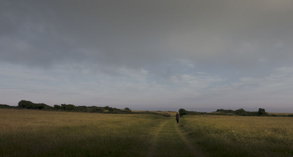
One of our regular dog walks - I'm ahead with them. What do you of the treatment please?
Jul 16, 2017 12:32:10 #

I know you're going for a soft look, but it looks just a bit on the flat side to my eye. If you infused a bit of a glow it would keep the evening light look but would be less flat.
Jul 16, 2017 12:45:46 #
R.G. wrote:
I know you're going for a soft look, but it looks just a bit on the flat side to my eye. If you infused a bit of a glow it would keep the evening light look but would be less flat.
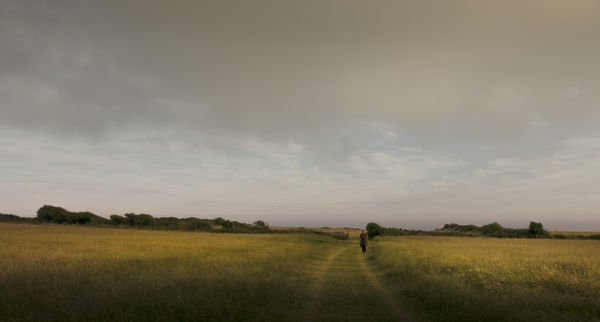
Yes, I've since done that and I do prefer it but not sure whether to leave it in the clouds - any thoughts? Thanks for the suggestion RG, its appreciated.
Jul 16, 2017 12:52:12 #
magnetoman wrote:
Yes, I've since done that and I do prefer it but not sure whether to leave it in the clouds - any thoughts? Thanks for the suggestion RG, its appreciated.
It's better, but the colouring in the sky was better in the first version. And overall it could do with just a touch of brightening.
Jul 16, 2017 13:03:30 #

You have some things to work with here. Good graduation, good leading lines. But the image is a little flat. I suggest you decide what you want the image to be. What is the subject, what is the story? IMHO this is a story about the expanse of the land and sky. I.e, a landscape, the figure (you?) provides scale for that vast expanse. It could be something different but that was my thought. Given that, then I might crop it a little off the r side, of course set the black and white levels, add some contrast, a tad of clarity. You would like to see the distant ocean a little bettter. You might try a dehazing step. Don't go overboard.
Most of all, have fun.
Most of all, have fun.
Jul 16, 2017 13:42:18 #
R.G. wrote:
It's better, but the colouring in the sky was better in the first version. And overall it could do with just a touch of brightening.
I think it's loading-up a bit darker on UHH than I'm seeing it, maybe my screen as it's often the case with my posts.
Agree on the sky and will amend. Thanks for your time RG.
Jul 16, 2017 13:50:39 #
JD750 wrote:
You have some things to work with here. Good grad... (show quote)
The story's in the title JD, but of course it is the wide landscape and the colours that I like. Not keen on more contrast, I did look at that but it takes the softness away. There is an underlying paint filter, just a touch, that helps with the softness.
Of course, being familiar with the landscape does bias ones view (pun intended), so you could well be right - I'll see if anyone else gives their opinion before upping the contrast.
My thanks for taking the time to make suggestions, its appreciated.
Jul 16, 2017 14:20:45 #
I find the foreground darkness just a hair heavy, perhaps brighten the path there to lead us into the image a little easier. Also, the ground may be sloped, but it looks like you aren't level, a small rotation counter clockwise might help. Much to like here, she needs a dog friend - and a dark tower behind the trees.
Jul 16, 2017 15:20:01 #
pfrancke wrote:
I find the foreground darkness just a hair heavy, perhaps brighten the path there to lead us into the image a little easier. Also, the ground may be sloped, but it looks like you aren't level, a small rotation counter clockwise might help. Much to like here, she needs a dog friend - and a dark tower behind the trees.
Must admit that I've been criticised before for my dark foregrounds in landscapes Piet. It is something to do with closing the bottom of the picture (for me), and I accept it doesn't suit everyone. I'll try your suggestion.
Yes, the ground slopes (the sea is straight) and I decided I'd leave it that way as I know the place so well it would otherwise feel wrong. Expected to be picked-up on it though and I may have to concede the point as others won't agree, I'm sure.
Yep, I could manage the tower and dog thing - but the lady in the shot doesn't go much on my composites. I do know when to leave things alone!
Many thanks for your suggestions and comments, they're appreciated.
Jul 16, 2017 18:14:00 #
Frank2013
Loc: San Antonio, TX. & Milwaukee, WI.
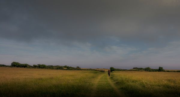
Scold me if I've done wrong, but I think you have told me it's ok to edit....tried to meet in between and get the light to bring out the subject. Lovely image by the way....
Jul 16, 2017 18:34:20 #

This is a very nice image, soothing and a pleasure to look at. it has an Old Masters' look to it. I like the second version best, but: Your first version may well be brighter than what we are seeing. The download is brighter than the thumbnail. That UHH funny business again, I guess. The placement of the subject at that particular point along the road is perfect both in terms of overall placement and location along furthest leftward point of the inner curve. But the colors and treatment are what makes it resonate. Bring this one large on canvas and keep it in your family room.
Jul 17, 2017 02:17:56 #
Frank2013 wrote:
Scold me if I've done wrong, but I think you have told me it's ok to edit....tried to meet in between and get the light to bring out the subject. Lovely image by the way....
Thanks for your effort Frank. I like the result, although it's a touch warmer than I'd choose, it's a pleasing look.
Jul 17, 2017 02:24:57 #
minniev wrote:
This is a very nice image, soothing and a pleasure... (show quote)
Thank you Min, you seem to have got onto my wavelength with this one. I did use an underpaint filter, very slight, but it's there. I too think UHH is darkening things a bit. Having had two people mention the tilt of the land (one privately), I'm now wondering whether to give it a false 'straightness' before printing - something I have advocated at times for others but decided against initially. I'll consult the boss, she'll know!
Jul 17, 2017 11:26:01 #
Jul 17, 2017 12:28:48 #
magnetoman wrote:
......I'm now wondering whether to give it a false 'straightness' before printing.....
One problem that I can predict is that if you tilt it to "straighten" it, the person will look like they're noticeably leaning. As it is her head is already well to the left of a vertical line that goes through her feet. If you can find some way to keep her straight while the rest of the image gets tilted......
Another problem is that the sea is barely visible and doesn't provide a clear horizon. The up side to that is that you can tilt and you won't end up with a wonky horizon.
If you want to reply, then register here. Registration is free and your account is created instantly, so you can post right away.