Are these photos good enough to put in a display book for showing potential customers
Jun 20, 2012 06:48:50 #
magicunicorn
Loc: Melbourne Australia
HI everyone, a couple of days ago i put up a topic asking 'What is a reasonable rate to charge'. Many forum members gave me some very kind and helpful feedback which made me feel very blessed that may be i am good enough.
Anyway i have decided to put together a displaybook to show pople some of the work i have done and would love feedback on theses photos to see if they are up to standard. The two ridden shots i took at an adult riders meeting last weekend and they offered to pay me but silly me refused at that point.
Any help greatly apreciated


Jun 20, 2012 06:49:46 #

Jun 20, 2012 07:00:17 #
Jun 20, 2012 07:06:12 #
magicunicorn
Loc: Melbourne Australia
Thankyou Blueduck and chelesphotography for yoru comments. I am definatly no professional but love to take pitcures. I do apreciate your comments it all helps and pushes my to read and learn more to try and improve.... all comments greatly apreciated.
Where can i improve in your oponion please
Where can i improve in your oponion please
Jun 20, 2012 07:16:59 #
donrent
Loc: Punta Gorda , Fl
"pro level for selling."
=========================================================
Now,pray tell me, Exactly what in the hell is "pro level" ???
The first four pictures are as "pro" as they can be and would be totally acceptal in a brochure.... The last two are OK, but lacking the 'wow' factor... Too plain...
=========================================================
Now,pray tell me, Exactly what in the hell is "pro level" ???
The first four pictures are as "pro" as they can be and would be totally acceptal in a brochure.... The last two are OK, but lacking the 'wow' factor... Too plain...
Jun 20, 2012 07:28:21 #
magicunicorn wrote:
HI everyone, a couple of days ago i put up a topi... (show quote)
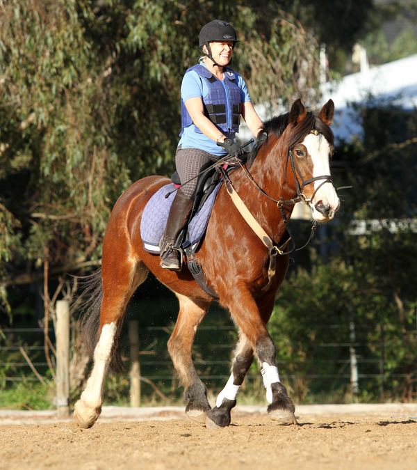
Since you asked
#1 the woman's face is badly overexposed
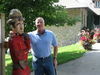
#2 is a cute shot
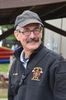
#3 is a nice shot
#4 I don't know horses, but that one looks sad
#5 is a nice shot
#6 is a snapshot
So, all in all, they're nice, but entirely average.
Jun 20, 2012 07:47:18 #
magicunicorn
Loc: Melbourne Australia
I have tried to fix Number 1 on the womans face being overexsposed. Is that better. It was nagging at me how i could make this photo a little better -
Thanks everyone for the feedback. This was only my second go using full M mode on my own. Please keep it coming positive and negative
Thanks everyone for the feedback. This was only my second go using full M mode on my own. Please keep it coming positive and negative

Jun 20, 2012 08:11:50 #
Jun 20, 2012 09:15:21 #

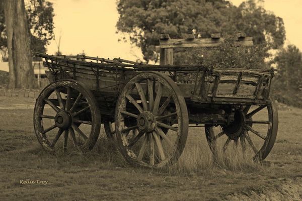
I like them, but the one with the wagon would be better if you cloned out the power lines. Then could be done in an old B&W or Sepia effect also. Usually I don't like this because people try to make new things look old. In this case you are working with an old wagon, with real characture.
Removed powerlines, and converted to Sepia.
Jun 20, 2012 22:47:40 #
magicunicorn
Loc: Melbourne Australia
Thank you mad mike .. I agree with you. I agree with you completely... I have converted to black and white before with porterates. The power lines gone are great and your changes you made look great. Thank you again .
Jun 21, 2012 07:37:27 #
konica135
Loc: Ormond Beach, FL
Check your spelling - it reflects on your "photographer" credibility, especially PP.
Jun 21, 2012 08:30:34 #

Jun 21, 2012 12:13:34 #
Hey Mike....what PP program do you use? I can't find one with a cloning tool to remove things like power lines.
Jun 21, 2012 14:51:15 #
magicunicorn wrote:
HI everyone, a couple of days ago i put up a topi... (show quote)
I would agree in the first shot the rider's face is over exposed but so what? It's a fine shot and any amateur rider would probably like it.
Number 2 is a very pretty shot. It could use some sharpening I think but it's nicely composed and really pretty.
3 and 4 are nice.
5, the wagon, could perhaps be a little sharper and a little brighter - not much, just a little to make it pop.
6, could be framed slightly to the right to center up the horse in the shot.
Nice work overall - just a few tweaks and you'll have a nice book. Keep shooting, good luck
Jun 21, 2012 19:57:41 #
magicunicorn
Loc: Melbourne Australia
Thanks everyone all comments help. Sometimes you need someone else to help point things out . You are right Jimmya I agree with you completly I will try to fix and enhance as suggested.
Photoshop has a clone tool CS5 is a good one
Thank you everyone
Photoshop has a clone tool CS5 is a good one
Thank you everyone
If you want to reply, then register here. Registration is free and your account is created instantly, so you can post right away.