Check out Drone Video and Photography Forum section of our forum.
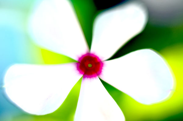
Processed Geraniums
Mar 7, 2017 17:37:44 #

Tweaked the gamma/exposure, saturation/tint, and brightness in Photoshop. I think it looks a bit like a painting or a piece of floral design fabric.

Mar 8, 2017 02:53:49 #

Not quite a painting more like bathroom curtains circa 1955,as you suggested a fabric design. Have to say my man its not the best bit of PP I have seen applied to flowers but that's just ones mans opinion and if you think its cool then that's all that matters.
Mar 8, 2017 07:59:41 #

I don't care for it at all; it looks garish to me. But, as Billy indicated, if it suits you . . . .
Check out Software and Computer Support for Photographers section of our forum.
Mar 8, 2017 09:53:54 #

Mar 8, 2017 11:08:32 #

The way it is just now it looks like it could be an interesting starting point for an impressionist or surreal look. In any case, if you have colour denoise at your disposal you might find that it cleans things up a bit.
Mar 8, 2017 11:20:37 #

Bobspez wrote:
Tweaked the gamma/exposure, saturation/tint, and brightness in Photoshop. I think it looks a bit like a painting or a piece of floral design fabric.
My first thoughts were that there was too much contrast and too much in the way of blacks.
My second thought was that this might be what you wanted, and if so you succeeded.
My third thought was that I was glad to see bold experimentation.
Then, finally, I wanted to know what you were starting from and what you were seeking. I should have started with this part!
As an afterthought, I wanted to slap textures on it, as I always do, and possibly overlay it onto a background texture/pain layer and use a clipping mask to give it the floral layer some ragged edges.
Keep on playing and sharing!
Mar 8, 2017 11:30:36 #
Thanks for looking and for the comments. I expect most people won't like it, but for some reason I find the image appealing. I do like it a lot.
Check out Infrared Photography section of our forum.
Mar 8, 2017 11:45:19 #
Thanks minnie. Attached was my starting point. I was looking to duplicate the process I used with my flower pic posted on the Georgia O'Keefe thread, also attached.
I did get pretty much what I was looking to get on the processed pics. I wanted it to be extra colorful, but based on the original. Sort of abstract and maybe a bit like a vibrant water color.
Bob
I did get pretty much what I was looking to get on the processed pics. I wanted it to be extra colorful, but based on the original. Sort of abstract and maybe a bit like a vibrant water color.
Bob
minniev wrote:
My first thoughts were that there was too much con... (show quote)

Mar 8, 2017 13:44:20 #

Bobspez wrote:
I was looking to duplicate the process I used with my flower pic posted on the Georgia O'Keefe thread, also attached... Sort of abstract and maybe a bit like a vibrant water color.
I see the "vibrant watercolor" in #2, though it's really a bit too bright for my tastes.
I appreciate your willingness to share both, Bob, and that you understand your results may not find a large audience.
I enjoyed your mention of hoping to repeat an effect on another image. I don't know if I've ever been successful doing that - because of size of subject, the light, whatever - they always seem to turn out differently

Mar 8, 2017 13:54:49 #
Thanks Linda,
I've seen others use basically the same effect on many of their flower photos, but I also find it difficult to do the same effects twice. I also find it very hard to copy someone else's style that I like, especially if their work is very good and very unique. I guess the starting points are different, and our own individuality comes through for better or for worse.
Bob
Linda From Maine wrote:
I see the "vibrant watercolor" in #2, th... (show quote)
Mar 8, 2017 14:31:23 #
Bobspez wrote:
Thanks Linda,
I've seen others use basically the same effect on many of their flower photos, but I also find it difficult to do the same effects twice. I also find it very hard to copy someone else's style that I like, especially if their work is very good and very unique. I guess the starting points are different, and our own individuality comes through for better or for worse.
Bob
I've seen others use basically the same effect on many of their flower photos, but I also find it difficult to do the same effects twice. I also find it very hard to copy someone else's style that I like, especially if their work is very good and very unique. I guess the starting points are different, and our own individuality comes through for better or for worse.
Bob
And our styles and interests may change, along with our proficiency. I like looking back on my first days with Topaz Simplify (a couple of years ago). Some make me cringe and some I still like a lot

Mar 9, 2017 19:46:09 #
Bobspez wrote:
Tweaked the gamma/exposure, saturation/tint, and brightness in Photoshop. I think it looks a bit like a painting or a piece of floral design fabric.
I'm in agreement with Min. I do like that you are venturing into new areas can be rewarding. It can also be frustrating if things don't turn out the way you want. Only you know where you wanted this photo to be.
Erich
Mar 9, 2017 20:46:09 #
Thanks EB. It did come out pretty much as I thought it would, and I do like it. That is to say it was completely intentional and I was completely satisfied with the results. I like the colors and I like the fact it came out somewhat like a water color.
There was one member on UHH that posted super saturated pics with mostly primary colors a few years ago. I thought they were brilliant but no one else liked them and he got into squabbles with critics and stopped posting pics. He mostly hangs out in the Attic now.
I wouldn't argue with anyone else's criticism of my stuff because I invited it by posting. I recognize my tastes are different than most when it comes to this type of processing.
ebrunner wrote:
I'm in agreement with Min. I do like that you are venturing into new areas can be rewarding. It can also be frustrating if things don't turn out the way you want. Only you know where you wanted this photo to be.
Erich
Erich
If you want to reply, then register here. Registration is free and your account is created instantly, so you can post right away.
Check out AI Artistry and Creation section of our forum.