Split Toning
Feb 25, 2017 09:30:43 #

I'm curious how many use split toning techniques. I've been doing some research/study on the process, and although it's something that won't benefit every photo, it brings some images to life.
I'd like to hear your experiences.
I'd like to hear your experiences.
Feb 25, 2017 11:31:58 #
Feb 25, 2017 12:20:05 #

I have played with split toning but don't really know what I am doing. I feel that I don't yet understand the impact of color and tone. So, watching this thread for some good references. Actually, my avatar is a result of playing with split toning but not sure if I could repeat it.
Feb 25, 2017 12:20:12 #
rgrenaderphoto wrote:
Don't overdo it.
I know you are exactly right. :-) Thanks.
Feb 25, 2017 12:23:06 #
jaysnave wrote:
I have played with split toning but don't really know what I am doing. I feel that I don't yet understand the impact of color and tone. So, watching this thread for some good references.
You aren't alone! I've been doing Google searches on the subject and reading some nicely composed articles. I've been 'playing' with some images, and a couple of them were visibly more appealing.
Feb 25, 2017 14:59:50 #
Racmanaz
Loc: Sunny Tucson!
brucewells wrote:
I'm curious how many use split toning techniques. I've been doing some research/study on the process, and although it's something that won't benefit every photo, it brings some images to life.
I'd like to hear your experiences.
I'd like to hear your experiences.
I have utilized split toning in a few of my photo's but not with regularity. I do like the option of adding color to highlights while adding a different color tone in the shadows....it's all about control of color tones. :)
Feb 25, 2017 15:04:17 #

I've found it's a good way to add colour to grey images when bumping up the saturation doesn't produce good results.
A popular use of split toning is to add orange and teal - orange for the highlights and teal for the shadows. The world of cinematography uses that technique quite a bit. I do it the other way around for a lot of my grey landscape shots - blue for the highlights and amber/orange for the darks (many of my landscape shots have orange/brown heather as the main ground covering). The blue enhances grey skies and adds a natural-looking blue tint to mountains and hills. As rgrenader points out, restraint is a must. I usually back well away from the point where it starts to look too much.
Monochromatic tints like sepia and cyan can be interesting, but split toning allows you to add tints while avoiding the flatness of monochrome. Even adding just a slight difference between the shadows and highlights is usually lots better than just flat monochrome.
-
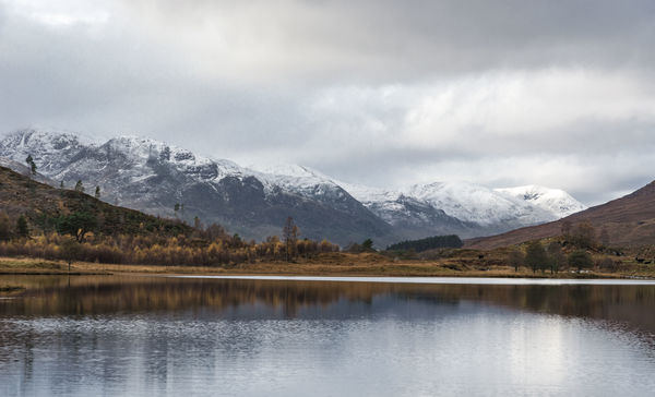
No split toning.
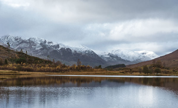
With split toning.
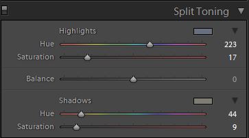
Split toning settings.
Feb 25, 2017 15:12:02 #
R.G. wrote:
I've found it's a good way to add colour to grey i... (show quote)
Nice! Thanks for your input.
Feb 25, 2017 15:17:18 #
brucewells wrote:
Nice! Thanks for your input.
Thanks. And thanks for raising an interesting subject.
Feb 25, 2017 15:50:39 #

Feb 26, 2017 06:28:14 #

If you include "gradient mapping" in the split tone camp- and I think it should be- then, I use it quite a bit. Admittedly, it's a new phenomena for me but find the technique pulls together the image's entire color palette and makes a more unified and cohesive presentation. It also adds a certain tonal quality that simply isn't available by other means. No, it's not a "trick" trotted out to save a less than stellar image from the dust bin, but it certainly can cause a viewer to spend an extra moment viewing the image just because of that certain quality.
Feb 26, 2017 08:16:25 #
I've also used split toning to reverse the effects of harsh sunlight. If you add blue to the highlights (stuff lit by direct sunlight) and yellow to the shadows (stuff lit by the ambient blue sky light) it can even out pronounced colour differences between the bright parts and shadowed parts, making the lighting appear less contrasty without having to lose luminosity contrast. You need to watch out for shadows that are so recessed that they aren't lit by skylight (and therefore not blue). They would need to be selected and neutralised using something like the adjustments brush.
Another possibility is to add yellow to just the shadows if they're excessively blue, even if the direct sunlight isn't particularly harsh or tinted. You want to add just enough to weaken the blue. Too much and you'll end up with green or yellow/green shadows.
Another possibility is to add yellow to just the shadows if they're excessively blue, even if the direct sunlight isn't particularly harsh or tinted. You want to add just enough to weaken the blue. Too much and you'll end up with green or yellow/green shadows.
Feb 26, 2017 08:47:09 #
Feb 26, 2017 08:49:05 #
R.G. wrote:
I've also used split toning to reverse the effects... (show quote)
I know, from the little bit I've worked with it, that what you say is correct. Thanks!!
Feb 26, 2017 09:07:17 #

R.G. wrote:
I've also used split toning to reverse the effects... (show quote)
How does this differ from changing the luminosity in the HSL\Color\B&W panel? What do the color pickers and balance do?
If you want to reply, then register here. Registration is free and your account is created instantly, so you can post right away.