Color or Black and white
Feb 25, 2017 01:59:34 #
PGHphoto
Loc: Pittsburgh, PA
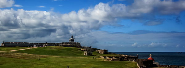
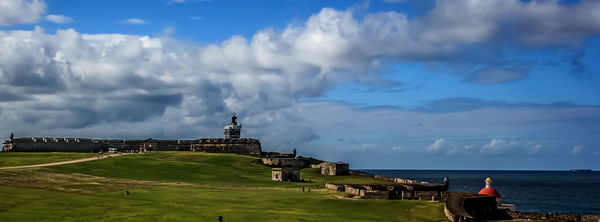
Wanted to get some comment on using B&W or color. I think the B&W gives more of a moody tension that I was trying to capture while the color actually has more drama. Not thrilled with the composition but had to crop to eliminate distractions just out of frame. Comments/suggestions welcome on crop and which is more 'impactful'.

Feb 25, 2017 03:11:39 #
Difficult to judge now the image has been cropped and what was cropped out.
The Black and White photograph works better for me than the colour.
The Black and White photograph works better for me than the colour.
Feb 25, 2017 05:54:33 #
Tom G
Loc: Atlanta, GA
Leicaflex wrote:
Difficult to judge now the image has been cropped and what was cropped out.
The Black and White photograph works better for me than the colour.
The Black and White photograph works better for me than the colour.
PGH should not have mentioned cropping, 'cause whatever was or wasn't there is irrelevant. And, the composition is not exceptional as PGH suggested. In this case, color adds something - maybe not much, something.
Feb 25, 2017 07:08:34 #

Feb 25, 2017 07:35:32 #
Feb 25, 2017 09:09:53 #

Neither works for me because the elements are so tiny and distant. Very difficult to see any details.
Regarding b&w, you can often sculpt the light (and shadows) in your pp to direct one's eye around and to enhance mood. Hope you will do more comparison projects and work on refining your b&w processing. It's a rewarding journey!
Regarding b&w, you can often sculpt the light (and shadows) in your pp to direct one's eye around and to enhance mood. Hope you will do more comparison projects and work on refining your b&w processing. It's a rewarding journey!
Feb 25, 2017 11:04:31 #

Not enough detail in either case to make a judgment. Also, for opinions, you should use "store original".
Feb 25, 2017 13:39:26 #
PGHphoto
Loc: Pittsburgh, PA
Thanks for the responses. I did check the store original but it seems that because I altered the size according to the instructions (800x600), the JPG's were added in the same size as uploaded. Is the 800x600 just a guideline ? Still new to UHH and not sure of what file sizes are usable. The detail is much more obvious at the original size. Can you give me an idea on the appropriate size for upload ?
The horizontal in-camera crop was to eliminate telephone pole and street sign. vertical crop in PP was to remove boring plain sky above clouds.
The horizontal in-camera crop was to eliminate telephone pole and street sign. vertical crop in PP was to remove boring plain sky above clouds.
Feb 26, 2017 08:21:39 #

Feb 26, 2017 12:39:20 #
Both are good pictures but overall my eye goes to the color, however the way you have cropped them they are actually two different pictures. The color shows more sky and land in front of the fort than the B&W. The B&W has a more dramatic feel but I think that too much detail is lost in the shadows. To me, both would be better if larger. Keep in mind that in the final analysis your opinion is the one that matters (it is your picture) and that we all are still learning.
Feb 26, 2017 17:00:39 #

Feb 26, 2017 20:24:57 #

Feb 28, 2017 00:27:56 #

Feb 28, 2017 00:31:40 #
Feb 28, 2017 08:21:45 #
PGHphoto wrote:
Thanks for the comments. I was able to upload the larger files
I sent you a b&w to compare. I was able to pull a few more details and also selectively darken/lighten specific areas. I used Nik Silver Efex for the conversion, which is part of Nik Collection - now free from Google.
You will need a "host" program such as Photoshop, Lightroom or PS Elements in order to use most of the Nik Collection.
Prior to opening in Silver Efex, I also did a few adjustments in the "camera raw" part of Elements in order to smooth out the exposure (lighten the blacks, for one thing). I thought it would be easier to work with the details if there wasn't as much contrast with the color shot.
After the conversion is when I used layers in PS Elements to dodge (a b&w film term meaning to brighten/lighten) areas such as a few of the clouds and sunny parts of the buildings, and burn (darken) some of the sky and a bit of cloud. In Silver Efex you can also play with filters that darken or lighten certain colors: red, blue, green, yellow.
All this is to give a feeling of depth and structure to the photo, to help direct your eye, to enhance the existing light. One-click conversion for black and white are rarely satisfying.
If you want to reply, then register here. Registration is free and your account is created instantly, so you can post right away.