Check out The Pampered Pets Corner section of our forum.
OK>>>> I need your thoughts on this Color Shift from Lightroom
Feb 4, 2017 18:06:34 #
Here is an image that I would like to post, but I need some input first. I know this section may not be the best place for "opinion and technical comment" but the other sections would frown on this image..... And speaking of the image, I value your opinions, but please hold them until I actually post the image in it's final state.
>>>>>>>>>>>>>>>> This is a Lightroom vs Other Photo Viewers issue.
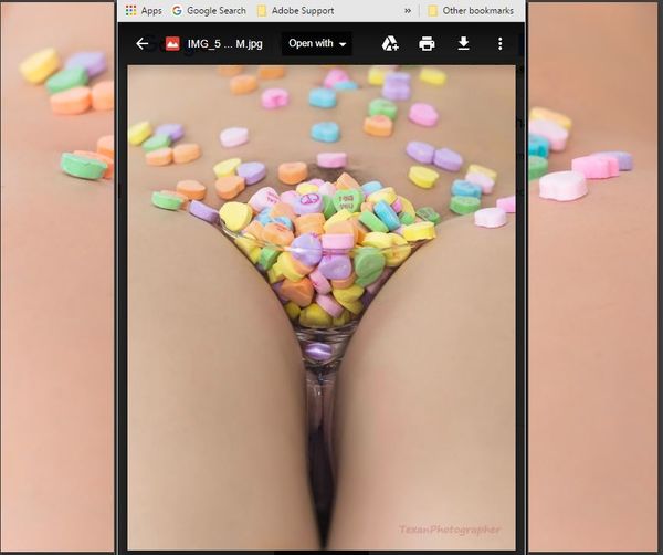
I prefer the color shown in the background photo .... this is my Lightroom edit and this is what I exported. The Foreground photo is the color I get when I view the photo in Windows 10 Photos and also in Photoscape. Photoscape is a pretty good online free editing software product that I cut my teeth on years ago. It's still a valid program if you are not editing RAW.
So, with that said, I am getting a color shift.
The folks at X-Rite.com tell me that my monitor is calibrated correctly and that "they are right and Lightroom is right and "EVERYONE" else is wrong. That maybe true, but my clients and very view of my models have Lightroom to view my work with. And if the client is not happy - no one is happy....
So.... does anyone else experience this color shift??
John
>>>>>>>>>>>>>>>> This is a Lightroom vs Other Photo Viewers issue.
I prefer the color shown in the background photo .... this is my Lightroom edit and this is what I exported. The Foreground photo is the color I get when I view the photo in Windows 10 Photos and also in Photoscape. Photoscape is a pretty good online free editing software product that I cut my teeth on years ago. It's still a valid program if you are not editing RAW.
So, with that said, I am getting a color shift.
The folks at X-Rite.com tell me that my monitor is calibrated correctly and that "they are right and Lightroom is right and "EVERYONE" else is wrong. That maybe true, but my clients and very view of my models have Lightroom to view my work with. And if the client is not happy - no one is happy....
So.... does anyone else experience this color shift??
John
Feb 4, 2017 20:51:57 #
So the borders of your truly engaging image is the skin tone you want for your client, yes? But the center image is what you view in Lightroom? What happens when you do an image reset in Lightroom? Do the skin tone colors go back where you want them? You could also use Topaz Simplify's Portrait skin tone filter.
Feb 4, 2017 20:55:56 #
rgrenaderphoto wrote:
So the borders of your truly engaging image is the skin tone you want for your client, yes? But the center image is what you view in Lightroom? What happens when you do an image reset in Lightroom? Do the skin tone colors go back where you want them? You could also use Topaz Simplify's Portrait skin tone filter.
The background is the Lightroom view & the image tone I want.
The foreground is what the Lightroom exported image looks like when opened up in different photo viewers.
Check out Bridge Camera Show Case section of our forum.
Feb 5, 2017 10:53:02 #
MichaelH
Loc: NorCal via Lansing, MI
I, too, noticed this effect using Windows 7 Pro "Windows Photo Viewer". I recently purchased the i1 Photographer kit with the i1Display Pro. My monitor defaults (a Dell U2711 - good in its day) to 50% Brightness and 50% Contrast. After using the i1Display a few times and seeing what it could do, I settled into a setting that seemed "right". [These were the settings: Used Advanced Mode, No Ambient Light Control, No ADC{Set Bright and Contrast interacting with software with result 31% Bright and 50% Contrast}, No Flare Control, Gamma 2.20, White point D65, Luminescence=120cd/m2 - yes I know, too much info.]
The result was a dimmer monitor (bright moved from 50% to 31%) but also I noticed my default picture viewer, "Windows Photo Viewer", was showing a version of the image that was obviously much darker. Googled and found that some software uses the applied x-Rite (or other non-default) Color Management Profile and some don't (or can only use the Windows standard default .icc profile - I did not follow up).
FastStone Viewer does use the applied profile and the images look the same as in Lightroom. Google {"Windows Photo Viewer" images appear dark} for other info.
Feb 5, 2017 11:01:24 #
MichaelH
Loc: NorCal via Lansing, MI
And I am only here for the articles!
By the way, FastStone can be easily set up as the default image viewer and configured as mainly a viewer while not showing the editing tools. Try dragging your .jpg into a browser window and it will probably look very similar to the Lightroom rendition (at least that is what I saw).
By the way, FastStone can be easily set up as the default image viewer and configured as mainly a viewer while not showing the editing tools. Try dragging your .jpg into a browser window and it will probably look very similar to the Lightroom rendition (at least that is what I saw).
Feb 5, 2017 12:41:03 #

Feb 5, 2017 13:29:06 #
I'm assuming if you have access to lightroom, you also have access to photoshop... The version doesn't matter.
You can do a selection and apply your effect only to the selection. Don't select the background and it will stay the same as the original.
Then combine the layers (Control/shift/Alt/E)
WALA Good Luck
You can do a selection and apply your effect only to the selection. Don't select the background and it will stay the same as the original.
Then combine the layers (Control/shift/Alt/E)
WALA Good Luck
Check out Landscape Photography section of our forum.
Feb 5, 2017 14:52:00 #
romanticf16
Loc: Commerce Twp, MI
I'd guess that you are viewing in the RGB color space,but exporting as sRGB, which displays a smaller range of color tones?
Feb 5, 2017 17:22:01 #
MichaelH
Loc: NorCal via Lansing, MI
Here is a link from some competing blog: https://www.dpreview.com/forums/thread/3901921
Maybe the same issue. Try opening the image in a Firefox or Chrome browser window. I think both are Color Management aware and so should closely match Lightroom.
My understanding was you were concerned with the color being different in different contexts, not on how to correct it in Lightroom. There was a small "trick" to using the x-Rite produced calibration instead of the original profile. One way to check if the x-Rite color calibration is installed is to fire up Photoshop and go Edit - Color Settings (click). In the resulting window you will see Working Spaces with "something" RGB picked. Lightroom by default uses PhotoRGB which retains the most information in raw files - but whether to change the default is .... But in this DropDown list of choices should be your named calibration profile that you created with the gadget. [Do not pick it - it should just be in the list.] Then hit Cancel to close the Color Manage window without making any changes. I do not know if is the same in Win10, but on Windows 7 finding the profile in use is as easy as Start|Control Panel and click on Color Management. The one in use is labeled default in the devices tab.
Feb 5, 2017 17:36:21 #

I have long noticed that colors in Windows Photos do not look as good as they did in ACR and Photoshop. There are lots of discussions about color management and what color space you should use for better printing results, but I have not seen a discussion of how to make Windows Photos show the same thing as PS or LR. I wonder if its possible.
Feb 5, 2017 18:09:45 #
MichaelH wrote:
Here is a link from some competing blog: https://www.dpreview.com/forums/thread/3901921
Maybe the same issue. Try opening the image in a Firefox or Chrome browser window. I think both are Color Management aware and so should closely match Lightroom.
My understanding was you were concerned with the color being different in different contexts, not on how to correct it in Lightroom.
Maybe the same issue. Try opening the image in a Firefox or Chrome browser window. I think both are Color Management aware and so should closely match Lightroom.
My understanding was you were concerned with the color being different in different contexts, not on how to correct it in Lightroom.
MichaelH ..... your links are going to require some studying.... but there may be something there....
Yes.... my concern is the difference between the Windows 10 default "Photo" ap .... and what is viewed/developed through Lightroom...
Here are a couple extra bits of information and possibilities...
This bit of info... is not necessarily part of my issue in this post, but may be informative to others..... _-_-_-_-_ The old DEFAULT Windows photo viewer, the one that most of us loved - so quick, so fast, so simple, was replaced 1st, I think in Windows 8 (which I never had) and then again in Window's 10. I am told by X-Rite Customer service that the OLD viewer is not being updated by Microsoft to remain compatible with some of the latest technology, such as X-Rite's i1-Display Pro calibration. So, the Old viewer, which I still tried to use after my conversion to Window's 10 - failed miserably. The images were extremely dark and almost unrecognizable. The new Photo viewer was much better.
This is a Light Bulb idea, that I think was suggested to me a month or so ago and my forgetfulness could be a factor here, but consider this...
_-_-_-_ I work with two monitors. The big monitor is calibrated by my X-Rite i1Display Pro. The big monitor is secondary and is not the "primary" monitor. My Laptop screen is primary. Right now, the laptop monitor is not calibrated. (I recently had a computer issue and Windows 10 was re-installed, which would have negated any calibration I had set in place) Soooo, if my Laptop monitor is "Primary", would not the Window's Photo generate an image based on the color settings of the primary monitor? And in this case, when I slide the image over to the secondary "and calibrated' monitor, would not the color appear different?
A quick test of this theory will be a re-calibration of both monitors ..... which I may have time to do tonight....
Thanks.... for everyone's input..... I will update this post with my findings when I can ....
John
Check out Astronomical Photography Forum section of our forum.
Feb 5, 2017 21:52:45 #
romanticf16
Loc: Commerce Twp, MI
It sounds like you are on the right track! You should make your isp monitor the Primary, as it will calibrate more accurately than a laptop will.
Feb 6, 2017 23:10:23 #
romanticf16
Loc: Commerce Twp, MI
It sounds like you are on the right track! You should make your isp monitor the Primary, as it will calibrate more accurately than a laptop will.
If you want to reply, then register here. Registration is free and your account is created instantly, so you can post right away.
Check out Photo Critique Section section of our forum.