Harbor shot from Maine Heavy HDR
Jun 1, 2012 15:06:16 #
Rhodge
Loc: Connecticut
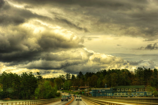
Worked on this for awhile now, What do you think? Is it to over the top on the HDR? Double tone mapped, a lot of PP. I am calling it "Storm over the Harbor"

Jun 1, 2012 15:15:31 #

Jun 1, 2012 15:27:57 #
Rhodge
Loc: Connecticut
Frighteners Entertainment wrote:
interesting, almost look like a painting.
Nice shot.
Nice shot.
Thanks, I was trying to get it to look as 3D as possible with my limited photoshop skills. I am happy with the results.
Jun 1, 2012 17:26:25 #

If you're happy with it - it's a great shot.
I think it looks like a painting also
Sarge
I think it looks like a painting also
Sarge
Jun 1, 2012 17:28:41 #
Rhodge
Loc: Connecticut
sarge69 wrote:
If you're happy with it - it's a great shot.
I think it looks like a painting also
Sarge
I think it looks like a painting also
Sarge
Thanks Sarge :-)
Jun 1, 2012 18:20:20 #

Jun 1, 2012 18:28:16 #

Jun 1, 2012 18:41:32 #
I also like it, yes the colors are a little over the top, but I like over the top. vibrant, thestorm clouds look spooky. I would hang this one up in your living room.
Jun 1, 2012 18:59:38 #
Jun 1, 2012 19:08:00 #
Firstly I love it, well done.
Before you print it you might want to remove the two dust spots first. Both on the let side, one between the trees and the other above and to the right a bit.
Before you print it you might want to remove the two dust spots first. Both on the let side, one between the trees and the other above and to the right a bit.
Jun 1, 2012 19:12:01 #

I like it and I HATE HDR....this, however looks very good.
One thing; it appears that the horizon is slightly tilted to the left...otherwise, I really think this was a good job.
One thing; it appears that the horizon is slightly tilted to the left...otherwise, I really think this was a good job.
Jun 1, 2012 19:12:56 #
Rhodge
Loc: Connecticut
Izza1967 wrote:
Firstly I love it, well done.
Before you print it you might want to remove the two dust spots first. Both on the let side, one between the trees and the other above and to the right a bit.
Before you print it you might want to remove the two dust spots first. Both on the let side, one between the trees and the other above and to the right a bit.
Thank you very much, I cleaned so many spot so far and missed those two, nice to have a fresh pair of eyes give a once over. Glad you enjoyed it!
Jun 1, 2012 19:15:36 #
Rhodge
Loc: Connecticut
rpavich wrote:
I like it and I HATE HDR....this, however looks very good.
One thing; it appears that the horizon is slightly tilted to the left...otherwise, I really think this was a good job.
One thing; it appears that the horizon is slightly tilted to the left...otherwise, I really think this was a good job.
Thanks rpavich, I will work on the horizon. I guess you just hate bad HDR ;-)
Jun 1, 2012 19:26:49 #
Rhodge wrote:
Thanks rpavich, I will work on the horizon. I guess you just hate bad HDR ;-)
rpavich wrote:
I like it and I HATE HDR....this, however looks very good.
One thing; it appears that the horizon is slightly tilted to the left...otherwise, I really think this was a good job.
One thing; it appears that the horizon is slightly tilted to the left...otherwise, I really think this was a good job.
Thanks rpavich, I will work on the horizon. I guess you just hate bad HDR ;-)
Yep... :)
Jun 1, 2012 19:50:48 #
Rhodge
Loc: Connecticut
Rhodge wrote:
Worked on this for awhile now, What do you think? Is it to over the top on the HDR? Double tone mapped, a lot of PP. I am calling it "Storm over the Harbor"
figure i would add a few more over the top


If you want to reply, then register here. Registration is free and your account is created instantly, so you can post right away.