Composition Class Assignment Assistance.
Jan 15, 2017 12:43:34 #
I've just started a short Adult Ed course on Composition. Our first assignment is to shoot some pictures on our cell phones. No other criteria - just use a cell phone. I took these at lunchtime within 5 minutes of my office. I have PP'd some of them - either PS on the computer or Lightroom on the phone. I've tried to explore beyond my usual 'Thirds' composition. I'm quite pleased with these for cell phone pics, but would welcome any comments or suggestions re composition.
The class is just for fun - no pressure, but I want to get as much as I can out of it.
Thanks
The class is just for fun - no pressure, but I want to get as much as I can out of it.
Thanks
Jan 15, 2017 12:56:13 #
I thnk you've nailed them all quite well, especially the framed shots.
Jan 15, 2017 12:56:39 #
Jan 15, 2017 13:14:23 #
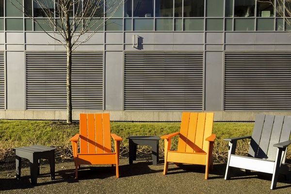
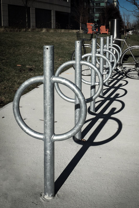
FWIW, my comments. Does the assignment require the full frame, or are you allowed to crop, etc? #1 & 3 are quite good. The contrast of curved and straight lines works, and the people bring them alive. Experiment with lightening or darkening the shadows. I like the brilliant sky. #2- the building entrance in the background is a bit busy and distracting, and I particularly don’t like the green colored panels (but that’s just my opinion). Maybe this area could be slightly blurred to reduce the busyness. Also try softening the color, or maybe even intensifying to make it stand out more. #4 is nice for the colored chairs, but the building windows are distracting. Crop the upper section out, again maybe blur the building wall a bit. Draw all attention to the chairs. Same with #5—the background stuff is distracting, and there are some strong highlights (white vehicles and walls) in the background that I find distracting. Cropping closely to the wood bench, maybe even taking out the pedestrians on the right, might help. #6 could also be cr I opped to eliminate the building and background. I’m not sure what to do with the bicycle. It complements the forms of the racks, but the handlebars and seat get lost in the background. I’d try this one again with the same sun angle but without the bike. The orange chairs are also distracting, the color draws the eye away from the foreground. Tone these down a bit.
Jan 15, 2017 17:21:06 #
For me, #1 is the strongest composition, including your use of light and shadows. We're drawn to the person via the light, the curves of the artwork, and the walkway. The two bright openings on the left add interest and balance. (I think you've posted this sculpture before, right? In b&w?)
I see #3 as unbalanced, with no clear subject and our eye drawn right up the bright building and out of the frame.
Love the curve of the long bench in #5, its color and clarity. I don't mind the bright background because it's evenly distributed, including a bit with the snow on left. I personally would edit the shiny wet area on the ground to a more subdued state

Jan 16, 2017 00:08:20 #
Jan 16, 2017 00:26:31 #
thearborist wrote:
FWIW, my comments. Does the assignment require the... (show quote)
Thanks for the suggestions thearborist. I tried a different shot for #2 which shows more of the entrance and gives it more reason for being there. I also intensified the blue and green. I like the reflection of the blue on the stone.
On the chairs, I had already tried this tighter crop, but was undecided between the two. I think I do like this version better. I want to keep the louvers fairly strong as I like the contrast between the horizontals and the vertical slats of the chairs. The tree stem is unfortunate. I might try to reshoot this tomorrow.
I took a wider crop on the bike rack to include the whole bike. I like that it terminates the vanishing point of the rack but it does introduce more extraneous background which I have tried to fade out.
Thanks again for your suggestions.
Jan 16, 2017 00:38:42 #
Linda From Maine wrote:
For me, #1 is the strongest composition, including... (show quote)
Thanks Linda. #1 is my favorite too. I did post B&W shots of this structure last summer. Those were taken in strong sun with great shadows curling through the frames. This has become my 'place' for shooting under different conditions. Every time I go there its a different scene.
I'll experiment with the ground on #5 and see what I can do.
Thanks again for looking and for your suggestions.
Jan 16, 2017 00:39:46 #
Jan 16, 2017 00:42:33 #
ggttc wrote:
You're doing just fine. The first one is very well done.
Thanks for looking and the feedback ggttc.
Jan 16, 2017 00:48:28 #
jaymatt wrote:
Nice work, especially with a cell phone.
Thanks John. I was pleasantly surprised with the results from the cell phone. The only problem is they are very hard to handle if you are trying to any more than just take a snap. Plus you feel like an idiot trying to take a 'serious' picture with a phone. I took a couple of them on my knees. I was terrified somebody was going to accuse me of 'upskirting'.
Jan 16, 2017 02:06:38 #
I really like what you’ve done with #2. This view is powerful. Brightening the roof colors helped a lot, and I agree about the reflection of blue (sky?) on the polished stone. The splash of orange of the tree on the left actually adds to the picture. The chairs are great. Might try cropping just a bit more off the top to see if you like it. The bike rack is a tough one, but you’ve got a good image now. Will be interesting to see what your instructor thinks.
As to using the cell phones, there are pros who have shot whole assignments with them, some have published books to show what is possible. When I was taking photography courses in high school (late 1960s, but don’t tell anyone) a girl in the class shot with an old Instamatic using 126 format cartridges. She could not afford the SLRs most of us used. She had no focus or exposure control. She learned how to use the available light and composition better than most of the class, and consistently got some of the highest grades. The point is, it is not the camera that takes good pictures, but a photographer that knows how to use the equipment he has. I suspect that’s what your assignment is really about.
As to using the cell phones, there are pros who have shot whole assignments with them, some have published books to show what is possible. When I was taking photography courses in high school (late 1960s, but don’t tell anyone) a girl in the class shot with an old Instamatic using 126 format cartridges. She could not afford the SLRs most of us used. She had no focus or exposure control. She learned how to use the available light and composition better than most of the class, and consistently got some of the highest grades. The point is, it is not the camera that takes good pictures, but a photographer that knows how to use the equipment he has. I suspect that’s what your assignment is really about.
Jan 16, 2017 02:14:28 #
One last suggestion on #2. It looks like it might be a bit off vertical. Check it out, and maybe straighten it just a bit.
Jan 16, 2017 09:10:41 #
repleo wrote:
Thanks John. I was pleasantly surprised with the results from the cell phone. The only problem is they are very hard to handle if you are trying to any more than just take a snap. Plus you feel like an idiot trying to take a 'serious' picture with a phone. I took a couple of them on my knees. I was terrified somebody was going to accuse me of 'upskirting'.

 I know what you mean; I've gotten some strange looks, too, when I did more with mine than just hold it out and shoot.
Jan 16, 2017 15:27:12 #
Taking the group as a whole, it's a lovely study in curvology. I really like the group. I think the chairs are perhaps the weakest image in the group. And the one you added is perhaps the strongest.
If you want to reply, then register here. Registration is free and your account is created instantly, so you can post right away.


