Sense of Place - International Walkway of Lights
Dec 31, 2016 13:01:03 #

A few years after we were married, in 1982 Vickie and I moved to Marion, Indiana, a small "city" of 30K. Twenty-one years later we moved from there to Kansas, having added two now-teenaged daughters and a kitten {recompense to the daughters for moving them} to the family. Marion had also changed a lot during that time; for example, a business in town is a major producer of lighted displays, so they had started an annual Thanksgiving to New Years display in the large park on the edge of town.
As of a few months ago, all members of our family now live within 2-1/2 hours of Marion for the first time since we moved away, so the social committee consisting of the three ladies in the family decided we should revisit the Marion display. Of course much has changed - for example, this time the two parents sat in the back seat and the daughter who first saw the display from a child's safety seat drove.
I tried to pare down the number of images in this post, but... On several cases I couldn't decide between two images of the same scene, so I included both in the hope of getting artistic input here.
.....................................................................................................................................
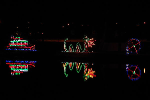
#1A: display on riverbank approaching actual entrance
(Download)
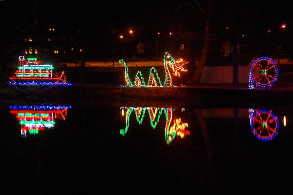
#1B: same as #1A, but shot using my camera's "Night HDR" scene, which goes to higher ISO then uses multiple identical exposures to reduce noise
(Download)
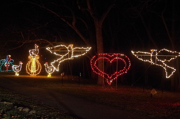
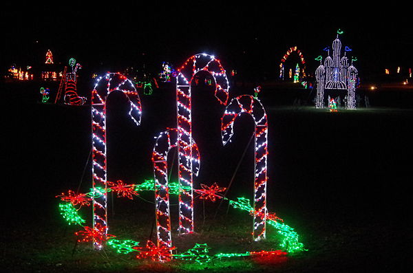
#2: early part of "Twelve Days of Christmas"; far left is one of the "Four Calling Birds" {each is a parrot standing on a telephone}
(Download)
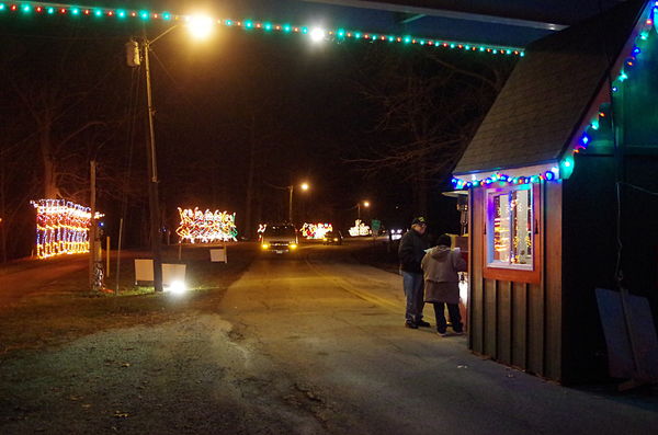
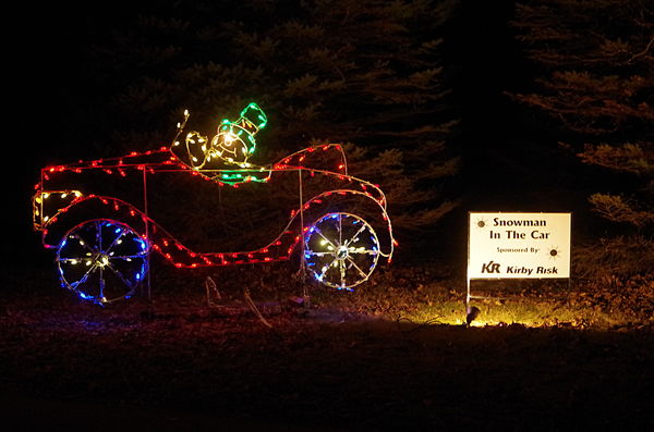
#3: "toll booth", where my daughter paid $5 for "3 in car plus one walker"; after trying various angles I decided this one worked best {end of "Twelve Days of Christmas" is in the background}
(Download)
#4A: display on the right is new this year - it honors 200th anniversary of Indiana statehood
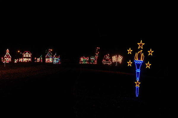
(Download)
#4B: again using "Night HDR"
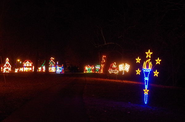
(Download)
#5A: "Ice Castle" on right was star of original displays, and was central feature on commemorative sweatshirts. Now it has been moved to a field with more lowly displays
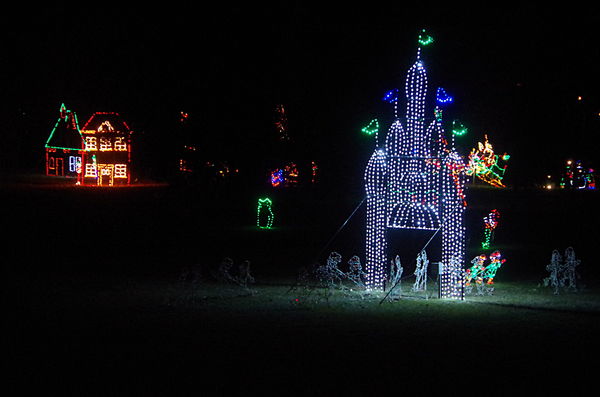
(Download)
#5B: I thought this shot from the road did a better job of showing the "Ice Castle"'s new isolation
(Download)
#6: most displays are sponsored, but this is the only time I got the sign in the picture
(Download)
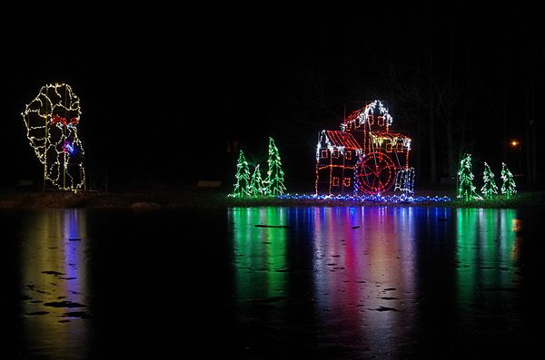
#7A: Grand Finale: mill between trees on right is where the Ice Castle reigned for so many years

(Download)
Dec 31, 2016 13:23:43 #

I very much enjoyed the tour as well as your story of the meaning and memories of the event.
Regarding interest in the compositions and subjects:
The last image is my favorite for the reflections on the ice. Very festive and pretty. Appears to need straightening + maybe remove the bright light on right side.
1B - not an improvement over 1A IMO because the background details don't add anything. Are these hand-held? I like the reflections, but the displays seem a bit blurry.
5B - I like this for the appealing foreground display and sense of how large the event is, with the smaller elements in the background.
Since you've previously talked about the pro's and con's of including people in your shots, and with your info on the meaning of this event to your family, I wonder if you have any shots of visitors, other than the one you posted here? While the lights and details of the displays are pretty, I'm thinking a full sense of place (and the holiday) would be better represented with a couple of excited children, frazzled parents
Dec 31, 2016 13:45:01 #
Linda From Maine wrote:
Thank you for your comments - they give me things to think about. I tried to straighten the first two, but was having trouble figuring out what "straight" means in this context. I guess I need to look at them again.I very much enjoyed the tour as well as your story of the meaning and memories of the event.
Regarding interest in the compositions and subjects:
The last image is my favorite for the reflections on the ice. Very festive and pretty. Appears to need straightening + maybe remove the bright light on right side.
Regarding interest in the compositions and subjects:
The last image is my favorite for the reflections on the ice. Very festive and pretty. Appears to need straightening + maybe remove the bright light on right side.
Linda From Maine wrote:
Yes, everything was hand-held; a tripod wasn't happening {I got enough complaints from the front seat about slowing down the party as it was - and standing in the road using a tripod seemed to be good working definition of dumb}1B - not an improvement over 1A IMO because the background details don't add anything. Are these hand-held? I like the reflections, but the displays seem a bit blurry.
Linda From Maine wrote:
Most people look at the displays from the warmth of their cars. I asked my daughter to turn off her headlights every time I became a pedestrian, but dealing with random headlights was one of my main issues. The only place I saw any real people was in/at the gift store, and I wasn't very happy with my results there.5B - I like this for the appealing foreground disp... (show quote)
Dec 31, 2016 14:25:35 #
It was only the last one that seemed tilted to me; per some of our previous conversations in FYC about perception vs. reality, here is a comparison:
(thanks for info on viewing from the car. Now I understand how large this place must be!)
(thanks for info on viewing from the car. Now I understand how large this place must be!)
Dec 31, 2016 15:55:39 #

The Night HDR shots look better to my eye. The others look like lights floating in the air.
Dec 31, 2016 15:59:28 #

On download, I prefer 4A over 4B. 4B is more distinguishing before viewing as a download, but on download, the lights are too bright especially the white ones.
Dec 31, 2016 18:50:54 #
R.G. wrote:
Yeah, I've always had that "problem" with light displays - their light seems to be mostly cast away from the supporting structure, which takes attention away from the structure and toward the design - good from an artistic point-of-view, but not very satisfying in many other aspects.The Night HDR shots look better to my eye. The others look like lights floating in the air.
SoHillGuy wrote:
From my perspective, another side of what R.G. said. I took a series of pictures at the first site, and used the following drive minutes to settle on a smaller number of alternatives to use at future stops {another benefit of no longer being the driver}. I guess I need to think about the differences between those two sets of settings and find opportunities at other times of year to experiment more - but my own ambivalence between those two settings is why I posted both setsOn download, I prefer 4A over 4B. 4B is more distinguishing before viewing as a download, but on download, the lights are too bright especially the white ones.
If you want to reply, then register here. Registration is free and your account is created instantly, so you can post right away.