B&W or color, among other things
Dec 31, 2016 12:59:39 #
manofhg
Loc: Knoxville, TN
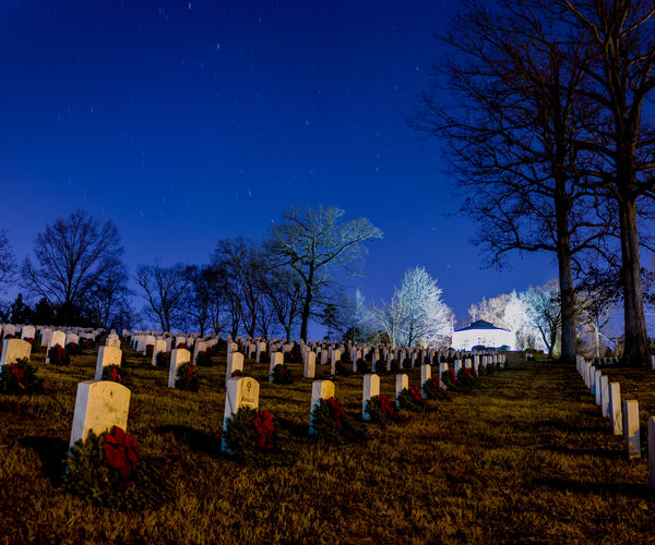
Shot this image last night. I will follow with posting the B&W version. I rarely work with B&W, so I don't know when I've done it correctly or made the right choice to shoot in B&W. I know that I should have shot two images so that the building in the background would not have been blown out. Would appreciate your opinions regarding all aspects of the shot, not just B&W vs color.
Dec 31, 2016 15:19:19 #

The color of the sky contrasted with the white trees/building is beautiful! The B&W one highlights the tombstones more, a tad more creepy, but still great in a different way!
Dec 31, 2016 15:40:47 #
manofhg
Loc: Knoxville, TN
drainbamage wrote:
The color of the sky contrasted with the white trees/building is beautiful! The B&W one highlights the tombstones more, a tad more creepy, but still great in a different way!
Thanks for the comments. This is a veteran's cemetery with wreaths placed at each headstone, part of Wreaths Across America.
Jan 1, 2017 09:28:13 #
katcost
Loc: Covington, LA
I particularly like the Black and White. The white balance seems a little off in the color version - maybe cool it down a little bit. The leading lines of the tombstones draw you back into the photo and make you wander around between them. The only real problem for me is the brightness of the building in the back. It's washed out in both versions and because it's so bright, I spend more time looking at the building than I do the rest of the photograph and I am sure this is not your intent.
Jan 1, 2017 09:38:26 #
manofhg
Loc: Knoxville, TN
katcost wrote:
I particularly like the Black and White. The white balance seems a little off in the color version - maybe cool it down a little bit. The leading lines of the tombstones draw you back into the photo and make you wander around between them. The only real problem for me is the brightness of the building in the back. It's washed out in both versions and because it's so bright, I spend more time looking at the building than I do the rest of the photograph and I am sure this is not your intent.
Thanks for commenting. Yes, at the time, I didn't realize that I had overexposed the building so much. The color version had been "cooled" considerably. The light on the stones were from mercury vapor street lights, very orange. If I brought it down much more, the building would start looking blue, but I could have masked off the building and controlled the color separately. I also shot many other shots that did not contain the building and therefore, the light could be cooled more to make the stones whiter.
Jan 1, 2017 12:06:43 #
StevenG
Loc: Long Island, NY
manofhg wrote:
Shot this image last night. I will follow with posting the B&W version. I rarely work with B&W, so I don't know when I've done it correctly or made the right choice to shoot in B&W. I know that I should have shot two images so that the building in the background would not have been blown out. Would appreciate your opinions regarding all aspects of the shot, not just B&W vs color.
I prefer the color version. I like the contrast of the sky with the white trees, and I like the red ribbons on the wreaths. I really like the composition with the leading lines pointing the viewer toward the building. The b & w looks a little washed out to me.
Jan 1, 2017 12:24:02 #
If the saturation is brought down some in the color version, I would prefer that one. Maybe also bring down the luminosity as well, which would give it the darker feeling that the BW image provides. I wish the building wasn't quite so strongly lit.
Regardless of the choice, the photo is a nice long exposure capture.
Jerry
Regardless of the choice, the photo is a nice long exposure capture.
Jerry
Jan 1, 2017 12:50:14 #
manofhg
Loc: Knoxville, TN
StevenG wrote:
I prefer the color version. I like the contrast of the sky with the white trees, and I like the red ribbons on the wreaths. I really like the composition with the leading lines pointing the viewer toward the building. The b & w looks a little washed out to me.
Thanks for commenting. Yes, the building was really washed out.
Jan 1, 2017 13:02:16 #
manofhg
Loc: Knoxville, TN
Erdos2 wrote:
If the saturation is brought down some in the color version, I would prefer that one. Maybe also bring down the luminosity as well, which would give it the darker feeling that the BW image provides. I wish the building wasn't quite so strongly lit.
Regardless of the choice, the photo is a nice long exposure capture.
Jerry
Regardless of the choice, the photo is a nice long exposure capture.
Jerry
Yes, I too wish I had done a shorter exposure or a second shot (short) and combine the two so that the building would not look as it does. Bringing down the brightness doesn't help on this image for the building anyway, it is too far gone.
Originally, thinking about going down there to make the shot, I didn't consider that the building could already be illuminated. I took a flash with me that I could set to gently illuminate the interior (glass windows all the way around) from the opposite side of the building from the side I was shooting from. The exposure I used was 4 minutes, but wish I had have shot a 2 minute one as well.
Thanks for taking the time to critique.
eric
Jan 2, 2017 12:09:16 #
It's a great composition. I have the same answer most every time. They are equal in greatness. Unless you can only enter one in a contest. The color seems a bit pushed. The white building in the back is a bite bright. I would highlight it in Photoshop Elements and darken it a bit. I do not like too much contrast.
Jan 2, 2017 12:54:11 #
manofhg
Loc: Knoxville, TN
Meives wrote:
It's a great composition. I have the same answer most every time. They are equal in greatness. Unless you can only enter one in a contest. The color seems a bit pushed. The white building in the back is a bite bright. I would highlight it in Photoshop Elements and darken it a bit. I do not like too much contrast.
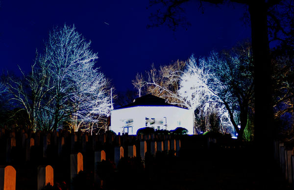
Thanks for commenting. The problem with darkening it in Elements is it will still look blown our, just darker. The difference will look bad that way too. I've attached an example of where I have darkened the building in excess, but it just can't help since the features were lost when shooting.
If you want to reply, then register here. Registration is free and your account is created instantly, so you can post right away.