Abandoned
Dec 21, 2016 14:06:24 #

Dec 22, 2016 06:29:05 #

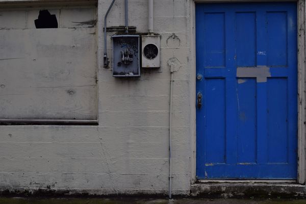
Who was the guy that used to put images of cables and walls up regularly? CM might remember. Anyway, it reminds me of those, which were well received although, personally, I'm not really a fan. I know the wall is grey, but the whole thing looks rather drab to me. Perhaps I'm a bit miserable today!
Dec 22, 2016 07:01:52 #

Personally, I am a big fan of these types of images. What is it that you are trying to convey with this shot? In my opinion, there are too many things going on that make it a tad bit distracting. The black looking thing in the upper right-hand corner is distracting to the rest of the image, BUT if shot by itself or Cropped Square just outlining the inset might make an interesting minimalist looking image. The utility boxes could be done in the same fashion. I would probably try to bring out more of the brick detail in post editing and add more grunge. Thank you for sharing your image.
Dec 22, 2016 07:12:38 #

Pilot 6:
I am not sure what you saw, and what you want us to "see".
The framing looks a bit tight in that the door edge is on the photo edge, and the window is missing an edge. A bit more space above the door and window (maybe equal to the space below the door?) and I think the composition might be a bit more interesting?
Dec 22, 2016 08:22:34 #

magnetoman wrote:
Who was the guy that used to put images of cables and walls up regularly? CM might remember. Anyway, it reminds me of those, which were well received although, personally, I'm not really a fan. I know the wall is grey, but the whole thing looks rather drab to me. Perhaps I'm a bit miserable today!
Jim Hill
Dec 22, 2016 08:24:51 #
This does remind me of Jim Hill's work. I agree though that it needs to be brightened. I also think that either all the trim should show around the door or none of it. With just the right side trim showing and not the top it gives it a chopped off look.
Dec 22, 2016 08:41:55 #

Dec 22, 2016 12:22:38 #

Dec 22, 2016 13:02:14 #

Jim would probably have cropped to put more attention on the functionality of the electrical stuff. Definitely needs brightening, regardless of how true to life that level of brightness is.
Dec 27, 2016 14:55:04 #

DwsPV wrote:
Pilot 6:
I am not sure what you saw, and what you want us to "see".
The framing looks a bit tight in that the door edge is on the photo edge, and the window is missing an edge. A bit more space above the door and window (maybe equal to the space below the door?) and I think the composition might be a bit more interesting?
I am not sure what you saw, and what you want us to "see".
The framing looks a bit tight in that the door edge is on the photo edge, and the window is missing an edge. A bit more space above the door and window (maybe equal to the space below the door?) and I think the composition might be a bit more interesting?
I agree that it should be a bit wider in the coverage. Plus if you're trying to give an "abandoned" feeling, I would fade the overall color of the photo. That bright blue makes me think more "disrepair" than abandoned.
If you want to reply, then register here. Registration is free and your account is created instantly, so you can post right away.