Pretty and Pink
Dec 11, 2016 20:26:27 #

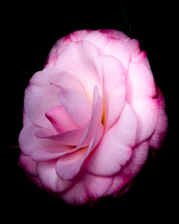
Since I want to participate in this section I feel I should contribute photos when I can and since I had a little time on my hands last night to play in Lightroom I worked on this photo. Please feel free to C&C.
Dec 11, 2016 21:28:14 #

Very nice detail in the petals with no blown out areas. It is a very pretty flower. I'd be interested in the processing. Was the background darkened significantly from the original?
Walt
Walt
Dec 11, 2016 21:46:36 #
Whuff wrote:
Very nice detail in the petals with no blown out areas. It is a very pretty flower. I'd be interested in the processing. Was the background darkened significantly from the original?
Walt
Walt
The background in the original was already very dark so I moved the Blacks slider (in Lightroom) to the left until if blacked out the back ground then worked the colors in the flower to bring them up.
Dec 11, 2016 22:41:37 #
Frank2013
Loc: San Antonio, TX. & Milwaukee, WI.
luvmypets wrote:
I'm not qualified to critique but these are my comments.......Part of your background is showing upper right and lower left. For future posts it would help us if you would check store original. There is quite a bit of highlight clipping although it’s not a big issue. The composition is fine but might gain by a bit more square of a crop. Not a lot of impact for me here……look forward to more of your images.Please feel free to C&C.
Dec 11, 2016 22:51:48 #
Frank2013 wrote:
I'm not qualified to critique but these are my comments.......Part of your background is showing upper right and lower left. For future posts it would help us if you would check store original. There is quite a bit of highlight clipping although it’s not a big issue. The composition is fine but might gain by a bit more square of a crop. Not a lot of impact for me here……look forward to more of your images.
Hello Frank,
Thank you for your comments and insight. I will have to play with it a bit more and try your suggestions when I next have a chance. I, too, like a photo with impact but decided to go a little softer on this one. Your input is greatly appreciated.
Dec 12, 2016 09:09:16 #

Good to see you, Dodie! The following is strictly personal opinion:
I don't usually care for a "cut out" flower, especially one that doesn't show a stem; for me it feels like it's floating. The vertical orientation was a bit uncomfortable, too. I tried rotating 90 degrees to right which makes me feel more relaxed and able to admire the delicate beauty of the petals and colors.
The softer look is certainly appropriate for the subject and is appealing here; it would be easier to view in download mode, though the black background helps separate from the mustard yellow at least
With single blossoms, I often enjoy the square format, but don't see that it would work here since the flower itself is more rectangular. The black sets off the colors and shapes beautifully!
Dec 12, 2016 17:51:21 #

luvmypets wrote:
Since I want to participate in this section I feel I should contribute photos when I can and since I had a little time on my hands last night to play in Lightroom I worked on this photo. Please feel free to C&C.
I'm so glad you have decided to hang out with us here! Share your images and your ideas, we are glad to have you.
Very nice color and detail from a good angle. The blacks in the background work well, I didn't even notice what Frank was seeing but he is our sharpest eyed critic and I always appreciate the detail he brings to his responses. I agree about the whites perhaps being a little bit bright, and you may have more detail by subduing them a bit, and also help focus attention on the center of the flower, where all the best drama is. I don't mind the "float" look of a suspended flower in a black background.
Someone on here a while back taught me this in LR - to paint the background dark/black with a brush with auto mask turned on. I have found it works very well.
Dec 12, 2016 21:37:00 #
Linda From Maine wrote:
Good to see you, Dodie! The following is strictly ... (show quote)
Hi Linda,
Thank you for stopping to look and for your perspective. It is always nice to see something from a different point of view. I will rotate it and see if it improves the look I was going for.
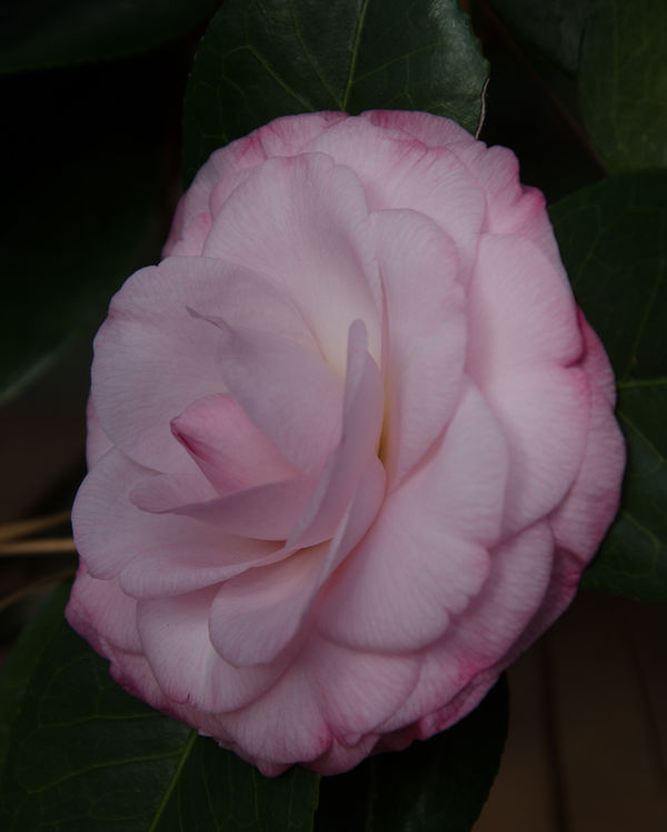
This flower isn't a "cut out". I just lowered the black slider to eliminate the already dark and unattractive back ground then brought out the flower colors. I will add the original to the thread in a few minutes and you will see there is no immediate stem as a set of leaves is directly below it. Also, I haven't changed the position of the flower it is as it was photographed on the shrub.
Years ago when I was doing film I did a lot of photos of flowers on black back grounds. I was considering doing a cut out with this but the black slider did most of the work. I will take it into Photoshop and fix the little problems that Frank found.
Thanks again for your input.
Dec 12, 2016 21:38:56 #

Dec 12, 2016 21:44:36 #
minniev wrote:
I'm so glad you have decided to hang out with us h... (show quote)
Hi Minnie,
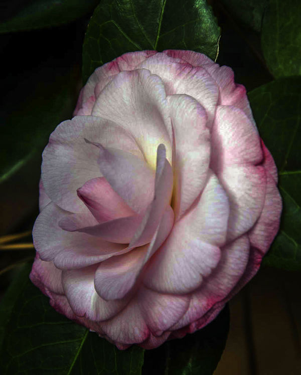
Thank you for stopping to look and to add your perspective. This was not done in Photoshop or Lightroom with a brush. It was done in Lightroom with the black slider. I have added the original and the pp'd (with the store original checked this time)so everyone can see where I started and ended.
When I have the chance I will go back and try to reduce the whites and highlights and see if that helps. I may have to get a brush and do a little burning to bring it in.
Thank you again!!!
Dec 13, 2016 02:59:25 #

I think the original is a nice shot and could make a nice fota. Your PP has left a flower floating in mid air. What was wrong with the leaves. The highlights are clipped and its over saturated. Basically its looking like a great shot of a flower that's had too much PP thrown at it with maybe a view to make it artistic.
As a man who loves flowers I would say let the flower do the talking it is beautiful. Heavy hands on the sliders make em into garish messes.
The softness you introduced is nice and will work well with a natural look. Is yours worth working on further? In my humble opinion no but start again and you will find a very beautiful image in there.
Dec 13, 2016 21:02:22 #
Billyspad wrote:
I think the original is a nice shot and could make... (show quote)
Thank you for your input. I will make a copy of the original and try it a different way.
Dec 13, 2016 23:56:28 #
Further to editing this rather excellent image and posting it via PM Dodie suggested I also post on back on the thread.
Dec 14, 2016 09:01:59 #
Billyspad wrote:
Further to editing this rather excellent image and posting it via PM Dodie suggested I also post on back on the thread.
This is a good example of the "my image/your look" challenges as you've completely changed the mood of the original. So now it's Billy's story, not Dodie's

For me the greens are too neon-colored and the flower itself a bit too dark. I do like the hint of leaves and stems (surroundings), but I prefer the soft glow of the first image posted.
What say Dodie?
Dec 14, 2016 09:21:20 #
Billyspad wrote:
Further to editing this rather excellent image and posting it via PM Dodie suggested I also post on back on the thread.
Billy brought out some nice additional detail in the petals and leaves, but at the cost of some rather dreadful posterization effects. I also find the stem or stick of whatever on the left distracting. This looks like a Topaz version without layers or masks, having some benefits but at the cost of detriments. Of course that may be from pushing hard on a small jpeg, which is why it's pretty useless to critique an edit of an image posted here.
I think some balance could be found that could reveal a little of the leaf structure on the right, bring back the detail in the highlights, and wouldn't create that horrible splotchy effect. Usually when I'm trying to get a balance, I do an edit that brings out detail, then stack it over the softer, richer version, hide all with a layer mask, and gently paint in some detail using a low opacity brush in the areas I want the detail to show.
Billy, you really need to check your export color space, there is something going on there that hasn't always been the case with your images.
If you want to reply, then register here. Registration is free and your account is created instantly, so you can post right away.