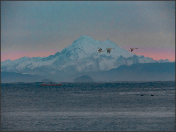
Mount Baker in the pre-dawn
Nov 21, 2016 19:11:07 #

Mt. Baker is 87 miles (re: Google Earth), from the camera. I'm assuming that distance, plus the low light and high ISO account for the mottling present in this image. I was first introduced to the pre-dawn and Mt. Baker around six years ago. At that time Iceland had produced an immense volcanic eruption and the particulates had found their way around the globe giving us some fantastic sunrises/sunsets. This image is lacking the "OMG, Look At That" factor, but I still find the gentle red glow quite pleasant.
ISO: 1600
Shutter: 1/400
FL: 532mm, 35mm equiv.
FYC
ISO: 1600
Shutter: 1/400
FL: 532mm, 35mm equiv.
FYC
Nov 21, 2016 22:18:29 #
Frank2013
Loc: San Antonio, TX. & Milwaukee, WI.
Have to start calling you the birdman.......ship ain't working but a pleasant scene neilds.
Nov 21, 2016 22:48:03 #
Frank2013 wrote:
Have to start calling you the birdman.......ship ain't working but a pleasant scene neilds.
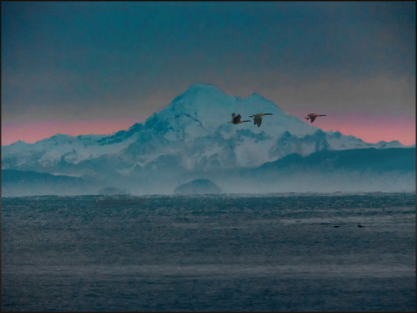
Thanks Frank2013. I threw the ship in as a test...

Nov 22, 2016 07:53:04 #

I like the soft dawn colors.
Regarding IQ, there is probably a lot of moisture between you and the mountain too. I'm lucky for my mostly dry-side views of Mt Adams. If it's wet when I go to the Cascades, Mt Rainier isn't visible, period
Regarding IQ, there is probably a lot of moisture between you and the mountain too. I'm lucky for my mostly dry-side views of Mt Adams. If it's wet when I go to the Cascades, Mt Rainier isn't visible, period
Nov 22, 2016 08:13:46 #
Linda From Maine wrote:
I like the soft dawn colors.
Regarding IQ, there is probably a lot of moisture between you and the mountain too. I'm lucky for my mostly dry-side views of Mt Adams. If it's wet when I go to the Cascades, Mt Rainier isn't visible, period
Regarding IQ, there is probably a lot of moisture between you and the mountain too. I'm lucky for my mostly dry-side views of Mt Adams. If it's wet when I go to the Cascades, Mt Rainier isn't visible, period
Air quality is certainly a factor. In the '50's coming from the east we caught our first view of Rainier from Moses Lake. Then in the '60's and '70's you couldn't see it from Seattle. Then when automobile emission standards came in the view extended again. At least now all we have to worry about is Mother Nature.
Nov 22, 2016 09:42:36 #

Are you sure the ship's level Neil? I jest and, apart from the rather 'planted' ship, think this is a lovely scene. The mottling looks rather like an over-zealous luminance slider -certainly in the sky area. You could try balancing saturation to luminance, or vice versa. Love the colours.
Nov 22, 2016 10:01:00 #
magnetoman wrote:
Are you sure the ship's level Neil? I jest and, apart from the rather 'planted' ship, think this is a lovely scene. The mottling looks rather like an over-zealous luminance slider -certainly in the sky area. You could try balancing saturation to luminance, or vice versa. Love the colours.
Thank you for the assessment, but the only slider I played with was "brightness/contrast", (which is still prone to "over-zealous"). Anyway, I get your point. Looking at the paper print I go back and forth as to "too much", and "too little", and end up leaving it as-is.
Nov 22, 2016 12:15:47 #
birds and ship are too warm. Try cooling them down with blue, over paint them using blues, see if that helps. Love that mountain and waters!
Edit - ship in particular since It is surrounded by that blue water and sky
Edit - ship in particular since It is surrounded by that blue water and sky
Nov 22, 2016 12:21:33 #

To my eye this shot's crying out for a softer, less grainy sky, but there'll probably be some film fans that'll tell me it's an acceptable aspect of the genre .
.Nov 22, 2016 12:55:12 #
pfrancke wrote:
birds and ship are too warm. Try cooling them down with blue, over paint them using blues, see if that helps. Love that mountain and waters!
Edit - ship in particular since It is surrounded by that blue water and sky
Edit - ship in particular since It is surrounded by that blue water and sky
Ah, Piet! I have made four 8x10 prints of this with increasing desaturation of the overall blue cast in an attempt to minimize the overall blue cast. Even the Missus, who would paint everything blue given a choice, thought it would be more natural with the blue toned down. Since my color vision is rather iffy, she's my color guide. As for the mountain and waters, we are blessed with the open 87 mile shot through the Strait and islands.
Nov 22, 2016 13:00:01 #
R.G. wrote:
To my eye this shot's crying out for a softer, less grainy sky, but there'll probably be some film fans that'll tell me it's an acceptable aspect of the genre .
.I think you are correct, R.G. If I were going to print anything over an 8 x 10 that would have to be done (as well as removing the ship and the nondescript black objects in the water on the right side)
Nov 22, 2016 13:07:25 #
neilds37 wrote:
Ah, Piet! I have made four 8x10 prints of this with increasing desaturation of the overall blue cast in an attempt to minimize the overall blue cast. Even the Missus, who would paint everything blue given a choice, thought it would be more natural with the blue toned down. Since my color vision is rather iffy, she's my color guide. As for the mountain and waters, we are blessed with the open 87 mile shot through the Strait and islands.
LOL - just to be clear, I mean only the boat and birds get an extra touch of blue. Overall, you can fool with blue cast, but just saying that your inserted objects will read better if they have the same cast as their environment. Grab some color from their surrounding areas and paint birds and ship (in color mode) the same blue. (when I get home this evening, I'm going to give it a shot to see if I am right, or just making silly noise - the color on the ship in particular needs blue)
Nov 22, 2016 13:16:15 #
pfrancke wrote:
LOL - just to be clear, I mean only the boat and birds get an extra touch of blue. Overall, you can fool with blue cast, but just saying that your inserted objects will read better if they have the same cast as their environment. Grab some color from their surrounding areas and paint birds and ship (in color mode) the same blue. (when I get home this evening, I'm going to give it a shot to see if I am right, or just making silly noise - the color on the ship in particular needs blue)
Not sure I can follow your instructions, but I'll give it a shot with my limited experience on this particular aspect of PP. Looking forward to seeing what you come up with.
Nov 22, 2016 19:36:37 #
neilds37 wrote:
Not sure I can follow your instructions, but I'll give it a shot with my limited experience on this particular aspect of PP. Looking forward to seeing what you come up with.
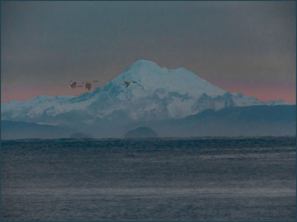
here is what I came up with, not everyone will agree. Horizon and fog got less saturation, and got lighter. Near sky and near sea got darker and greater saturation. Birds are darker and a little bluer (cooled). Ship I failed on, but you still see it on download. But regardless, it got water color (cooler) and blended in more - harder to see in the distance.
I really enjoyed playing with your very nice colors. thank you for being up in the pre-dawn to do this.
edit - I think the fog bank and birds are nicer, but probably made the upper sky too dark, making the whole image too contrasty.
2nd edit - I like your version better, other than the darker birds.
Nov 22, 2016 19:50:19 #
pfrancke wrote:
here is what I came up with, not everyone will agr... (show quote)
So many ways to do this. This what I have now after trying to "correct" some issues I wasn't pleased with. Win some, lose some...
If you want to reply, then register here. Registration is free and your account is created instantly, so you can post right away.