Leaves
Nov 18, 2016 17:40:48 #

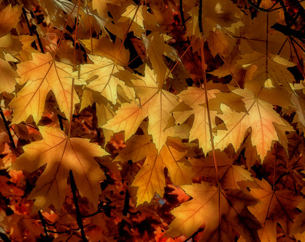
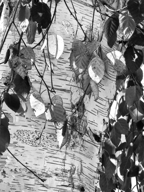
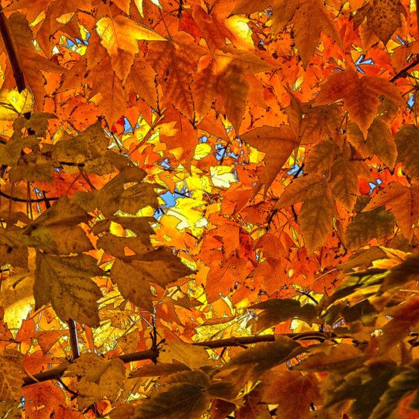
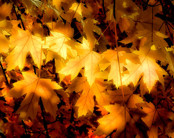
Going for:
1. warm, golden glow
2. rough textures
3. being enveloped by the forest, finding my way to the light
Suggestions and edits are welcomed! Thanks so much.
1. warm, golden glow
2. rough textures
3. being enveloped by the forest, finding my way to the light
Suggestions and edits are welcomed! Thanks so much.
Nov 18, 2016 18:19:08 #

Nov 18, 2016 20:10:35 #

#1 is a quite beautiful study of Autumn colours in all its glory. Simple and majestic love the light center which leads the eye in.
2 and 3 have no appeal to me simply because Im not sure heavy use use of filters can improve nature. Yes it shows it in a different way and whether that enhances what Mother Nature gave us is a matter of individual taste.
I think most would be proud of shot #1 as you should be.
2 and 3 have no appeal to me simply because Im not sure heavy use use of filters can improve nature. Yes it shows it in a different way and whether that enhances what Mother Nature gave us is a matter of individual taste.
I think most would be proud of shot #1 as you should be.
Nov 19, 2016 06:32:12 #
Nov 19, 2016 07:02:13 #

Number one is hugely appealing, warm, the use of light in it perfectly done. One of the best fall leaf shots I've seen this year.
Number two I also like very much, and not just the textures, but also in the monochrome, a great choice here, especially with the birch or aspen background.
Third one to me is a number one wannabe. It's pretty, but doesn't have quite the warmth or appeal of the first. But that one would be hard to beat.
Nov 19, 2016 07:03:12 #

Linda From Maine wrote:
Going for:
1. warm, golden glow.......
1. warm, golden glow.......
With your stated intention I thought the shot had unexplored potential.
-
Nov 19, 2016 07:13:02 #

Looks like you met your goals...#1...warm and cuddly feeling to me!! #2..I love B&W...I might have pulled back a little...#3...I can feel myself swimming up through an ocean of leaves reaching for the sky!!...a great set!!
Nov 19, 2016 08:48:02 #
Thank you all so much for taking the time to offer your opinions and suggestions! Greatly appreciated. Now...all the leaves are gone and the sky is gray...
R.G. - your version is absolutely stunning!
R.G. - your version is absolutely stunning!
Nov 19, 2016 09:19:13 #
I like number one is a special way. It is jigsaw puzzle material! The soft glow and clean patterns are very effective.
Nov 19, 2016 16:37:33 #
pfrancke wrote:
I like number one is a special way. It is jigsaw puzzle material! The soft glow and clean patterns are very effective.
Thank you, Piet! My mother was enthralled with jigsaw puzzles; I have no patience

Nov 19, 2016 17:03:41 #

what is appealing about #3 is the bits of blue scattered here and there. Its complementary to the yellow & orange and makes it eye stopping
Nov 19, 2016 17:05:07 #
carlysue wrote:
what is appealing about #3 is the bits of blue scattered here and there. Its complementary to the yellow & orange and makes it eye stopping
Thank you, Carla! Very glad you discovered and enjoyed that aspect.
Nov 19, 2016 20:39:22 #

All very pretty, Linda! #1 is outstanding, and the version by RG is very nice. 
Nov 19, 2016 20:46:04 #
sleepydrdr wrote:
All very pretty, Linda! #1 is outstanding, and the version by RG is very nice.
Thank you for your comments, Dianne! R.G. seems to know just what is needed just about all the time
Nov 20, 2016 01:11:44 #

Linda From Maine wrote:
Going for:
1. warm, golden glow
2. rough textures
3. being enveloped by the forest, finding my way to the light
Suggestions and edits are welcomed! Thanks so much.
1. warm, golden glow
2. rough textures
3. being enveloped by the forest, finding my way to the light
Suggestions and edits are welcomed! Thanks so much.
Love #1 and RG's edit and it - both are valid, magical versions that exude the golden light we connect with autumn. The other two are pleasant but I'm not a fan of the processing of the last one. It's a look I've attempted at times and always given up on, so maybe it's just me. The second one makes me wonder if the leaves are gold and what they would look like against that papery white bark.
If you want to reply, then register here. Registration is free and your account is created instantly, so you can post right away.