Mr. Blueheron With His Back Turned
Nov 18, 2016 13:16:00 #

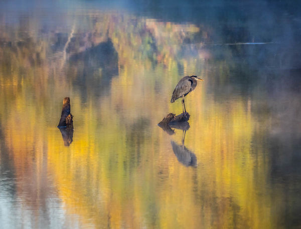
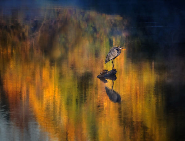
Here is the same blue heron as in the Quiet post, http://www.uglyhedgehog.com/t-423896-1.html, sitting in his same spot but with a different focal length from a different angle to maximize the colors in the reflection. I wasn't all that happy with the compositional choices, but I wanted the little spot of color in the water that was available only from this awkward angle. He refused to turn around and face me, too, the stubborn bird. So I settled for what is more of a nature abstract than anything else. I even thought of moving him (or trying to), but to where? Any advice, suggestions, or edits are appreciated.
Nov 18, 2016 13:35:40 #

The balance of the stump and the bird in the frame weren't doing anything for me; I was spending most of my time bouncing between the two and not looking at the reflection colors. Also, it seems the stump is the more prominent element of the two because of darkness and saturation.
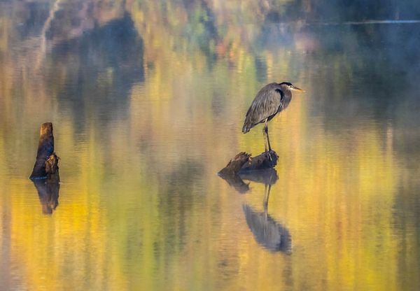
I tried another way to present both (I'd suggest removng the horizontal white line near top right). I'm on a Chromebook so I didn't try to lessen the vibrance of the stump, but somehow this crop allows me to move on from the stump to the bird + take in the whole scene better than the original composition.
Regarding your mention of "nature abstract," it would be interesting to see the stump and bird smaller in the frame, and less distinct (lighter, less vibrant), to push the mood more in that direction.
Nov 18, 2016 15:44:22 #
minniev wrote:
Here is the same blue heron as in the Quiet post,... (show quote)
I really like this photo. I think the colors are spectacular and the bird is right there in the middle of all that color to keep our attention. The only thing I might do is crop a tiny bit from the top. Not a deal breaker by any means; but I might explore it just the same.
Erich
Nov 18, 2016 16:08:03 #
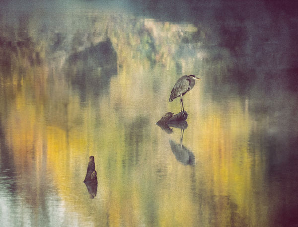
I moved the stump and made it a little smaller. I thought there were several interesting looks in Nik Vintage film. Both of these have the bird and stump with reduced saturation and lighter prior to the filter. #1 has some masking to allow brighter color in a couple of places. If I were working these further, I would try to replace the rock-looking dark area in upper left with more of the tree-shaped reflections (I did try once, but it wasn't a great result).
As always, thank you for the opportunity to explore new frontiers, Minnie!
As always, thank you for the opportunity to explore new frontiers, Minnie!
Nov 19, 2016 09:22:37 #

I see what attracted you Min, but much prefer the Quite post. The composition is uncomfortable in this one, and not too keen on the colours, which seem a bit overdone?
Nov 19, 2016 09:29:37 #
Min, I have never seen green and yellow looks so good. That Heron makes it home and personal, I like the idea of strategically placing the stump, your colors are very nice. I wish I could make a Heron friend!!
Nov 19, 2016 13:33:00 #
ebrunner wrote:
I really like this photo. I think the colors are spectacular and the bird is right there in the middle of all that color to keep our attention. The only thing I might do is crop a tiny bit from the top. Not a deal breaker by any means; but I might explore it just the same.
Erich
Erich
Thanks Erich, I'm glad you like it. You and I both have some affection for blurred stuff and reflections, and that's really the story here, with Mr. Blue as window dressing. I knew the composition was less than ideal when I shot it, I'll do what I can with various crops to give it a slightly better composition.
Nov 19, 2016 13:36:16 #
Linda From Maine wrote:
I moved the stump and made it a little smaller. I ... (show quote)
Thank you for taking a hand at the edits. I knew there was a fundamental flaw with how I framed this one, but I didn't think of relocating or revising the stump. You've given me some ideas to pursue. We have so little foliage color here, I wanted to try to salvage this if i could.
Nov 19, 2016 13:40:27 #
magnetoman wrote:
I see what attracted you Min, but much prefer the Quite post. The composition is uncomfortable in this one, and not too keen on the colours, which seem a bit overdone?
Thank you for your thoughts! I agree with you about the composition being awkward,and I think Linda may have some help on what to do to get a better result. I may post a redo and see if I'm getting anywhere. Some awkwardness just can't be overcome though.
Nov 19, 2016 13:43:57 #
pfrancke wrote:
Min, I have never seen green and yellow looks so good. That Heron makes it home and personal, I like the idea of strategically placing the stump, your colors are very nice. I wish I could make a Heron friend!!
Thank you Piet, I just couldn't NOT shoot this, with those colors, but I may have to take liberties with Mr. Blueheron as Linda has demonstrated. Keep visiting a Blueheron neighbor, they do become more accustomed to us in time. It makes them more comfortable if you sit still for long periods of time, and don't make any quick moves. (You'll have better luck without the dogs in tow, too). I met a blue once that allowed me to stand right beside him. I could have touched him if I'd tried.
Nov 19, 2016 13:53:11 #
I like this, but, the stump has the richer, stronger colors and contrast and visually out weighs the heron. The gray mass in the background puts up a pretty good fight for attention too but, it's the least appealing element.
Viewing the image through squinted eyes (I do this often) is noted five distinct elements in the composition: the dark gray mass, the dark stump and the vertical arrangement of three connected objects: heron, log and reflection. Neither stump nor mass have anything in common nor are they connected in any way- not by shape, color or placement. They independently distract from the subject.
To me, the heron is the subject but a subject that doesn't compete well- a featherweight against the solidity of the dark stump and dark gray mass, so, why not simplify and pump up the colors- which adds to the heron's stature as well, and balance his posture with color? His direction really doesn't matter...
Nov 19, 2016 13:56:20 #

I like the muted colors in the water. Once I downloaded it I liked it even more. I find the stump a nice balance with the bird. This is nature and what one would find along a shoreline. To me without the stump all you have is a bird hanging out ignoring you.
Nov 19, 2016 16:11:49 #
NJFrank wrote:
LOL, at least he tolerates Minnie's presence. My own birds and critters fly away as soon as I slow down the car ... without the stump all you have is a bird hanging out ignoring you.

Nov 19, 2016 16:25:36 #
fuminous wrote:
I like this, but, the stump has the richer, strong... (show quote)
Thanks for a detailed response that is very interesting and I agree with your assessment of the elements and the balance. While reading the responses, I'd wondered about going to a portrait orientation that moves Mr. Blueheron out of the far right of the frame. Or even moving HIM, which might be possible or might not. The stump, while it is not an unpleasant item, is just in the wrong place. I fear I was more enamored of the colors and the reflection than the heron, and it shows.
Nov 19, 2016 16:27:30 #
NJFrank wrote:
I like the muted colors in the water. Once I downloaded it I liked it even more. I find the stump a nice balance with the bird. This is nature and what one would find along a shoreline. To me without the stump all you have is a bird hanging out ignoring you.
Well, you have given me a pass on the stump! I hadn't thought of it that way. Without it, there is just Mr. Blue giving me the cold shoulder yet again. I will look at some of these ideas about balancing it better, though. And yes, the color in the water was what I was really after. The bird just happened to be in the middle of them.
If you want to reply, then register here. Registration is free and your account is created instantly, so you can post right away.